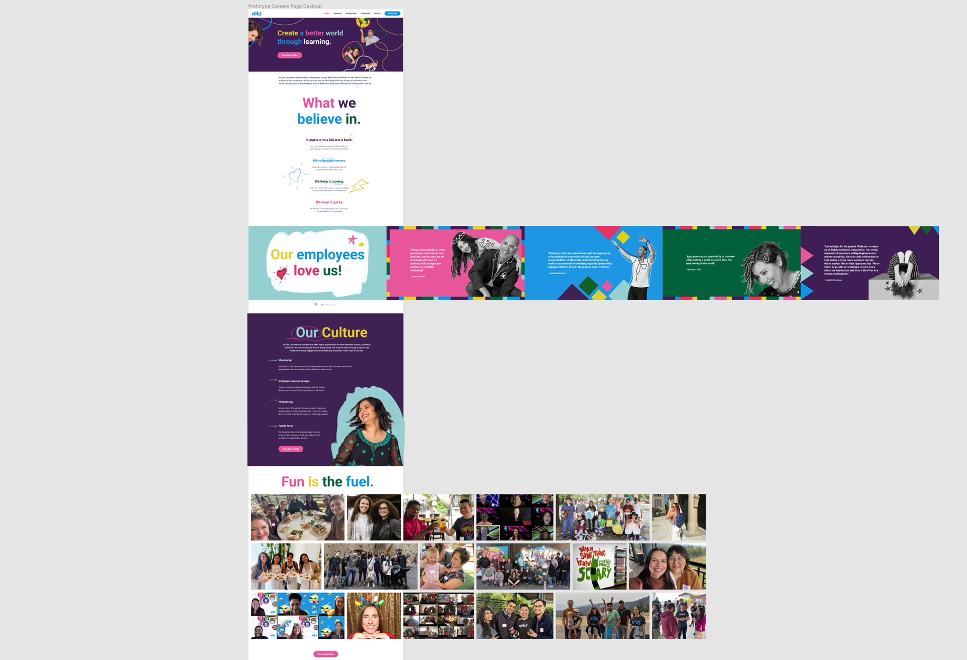
As the Art Director/Lead Designer for this project, my role involved collaborating with multiple teams such as HR, Brand, and Engineering to deliver a polished page that showcased Epic's culture, philosophy, and commitment to employee wellness. Our goal was to attract high-quality talent.
The HR team was not familiar with the creative design process. To address this, I met with the HR team, along with a copywriter and another designer, to establish the scope and messaging. We provided the HR team with a list of data and images required to complete the project.
To ensure that we delivered a page that stood out from our competitors, we conducted a competitive analysis, examining other brands' career pages in the kids' space and across industries.
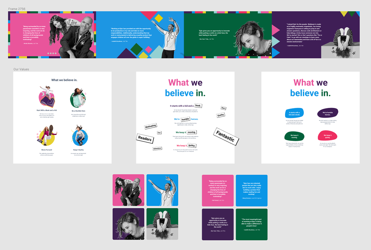
Our primary focus was to give visitors a sense of the company's culture. To achieve this, we showcased some of the brand attributes established during the brand refresh. I assisted in selecting quotes that spoke to the culture and opportunity while also art directing and contributing to the illustrations.
One of the challenges we faced with the job section was that we were limited to using the underlying job board system already in place. However, we were still able to refine it and employ highlighting, which was not done previously. This feature aided in indicating the job the user was hovering over, ensuring that they clicked on the desired job.
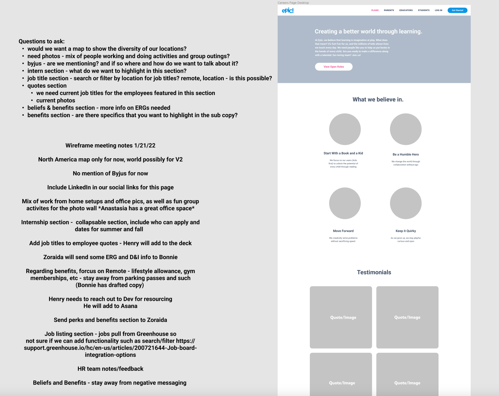
Wireframes
We designed wireframes and shared them, accompanied by the questions that emerged during the design process. We also emphasized any outstanding items that we still required from the stakeholders. During the review, we diligently took notes and successfully gained buy-in for our recommendations.
Explorations
My co-designer, copywriter, and I collaborated closely to experiment with various layouts. We utilized Figma's collaborative features to work concurrently on the file while frequently discussing and exchanging ideas on Zoom.
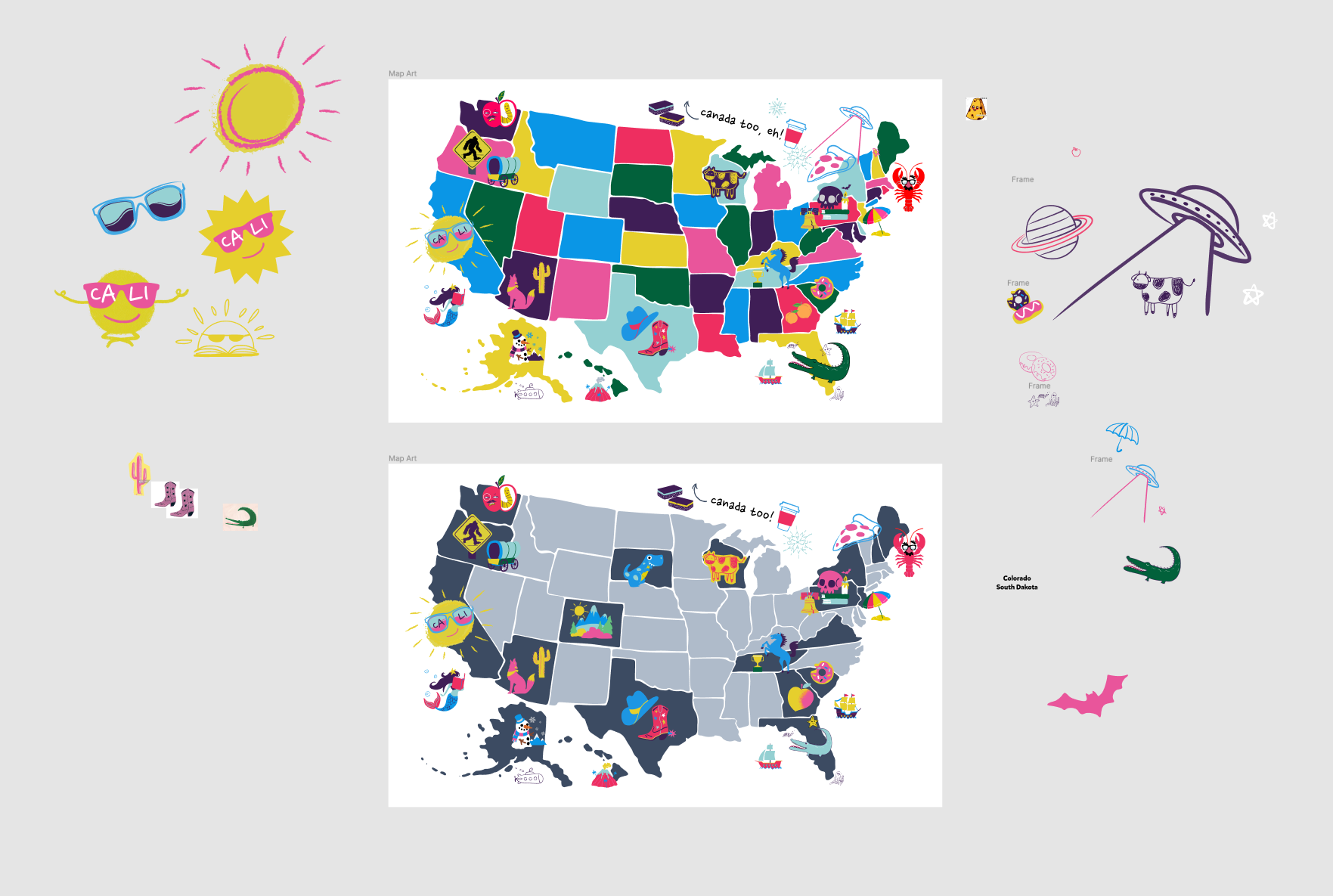
The HR team wanted us to highlight the opportunity to work remotely, which we achieved by designing a map to showcase our widespread team. During our weekly collaborative meetings, my direct reports and I created illustrations for the map, giving it a personal touch.
Prototype
In order to reduce vertical space we used a photo grid and slider which we prototyped.
This project sparked the discussion of wide screen behavior which I made sure we designed for all web projects moving forward. I encouraged the rest of the team to use this widescreen sized template on all future projects.