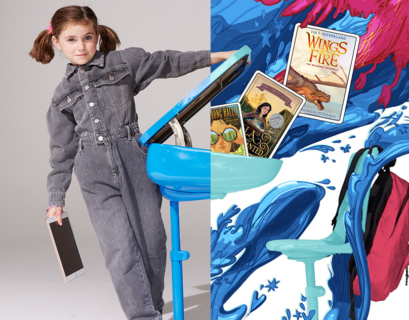
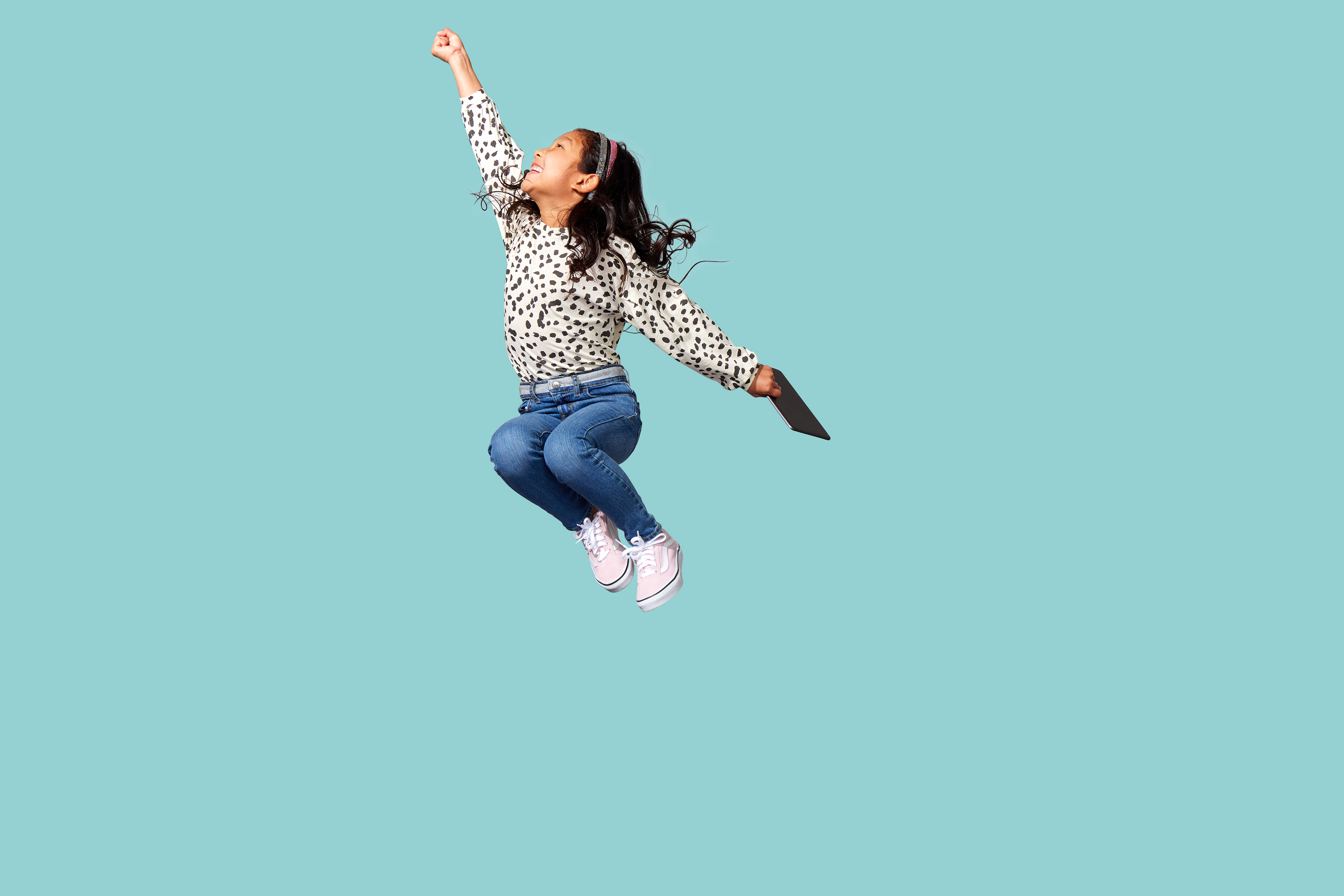
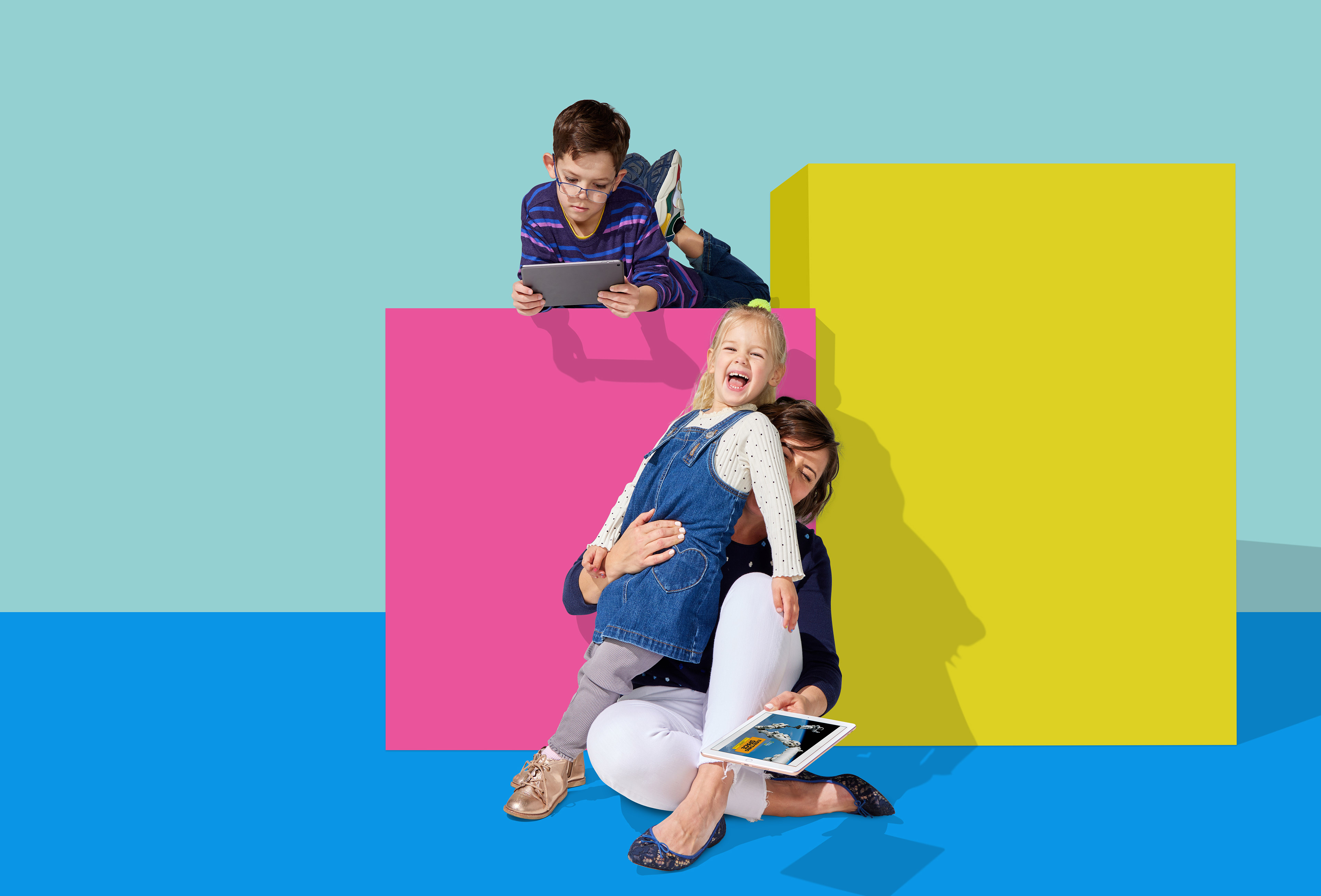
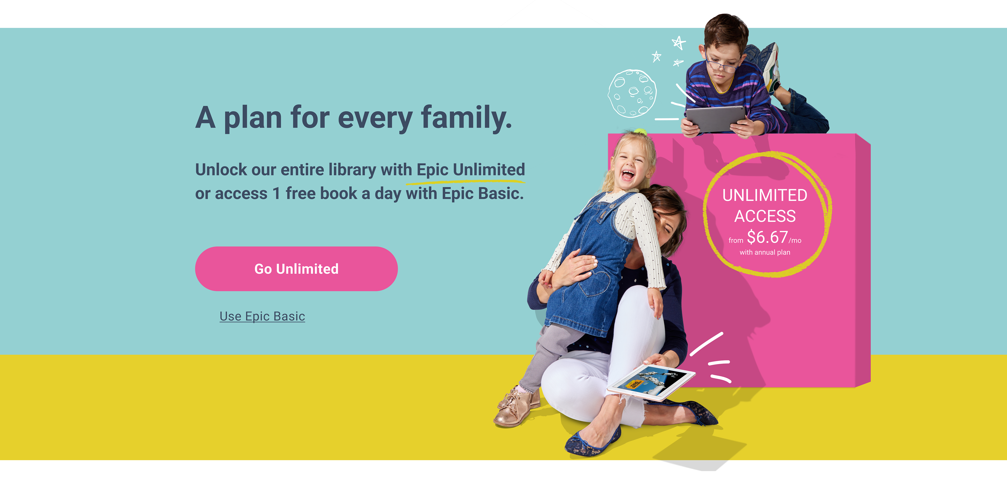
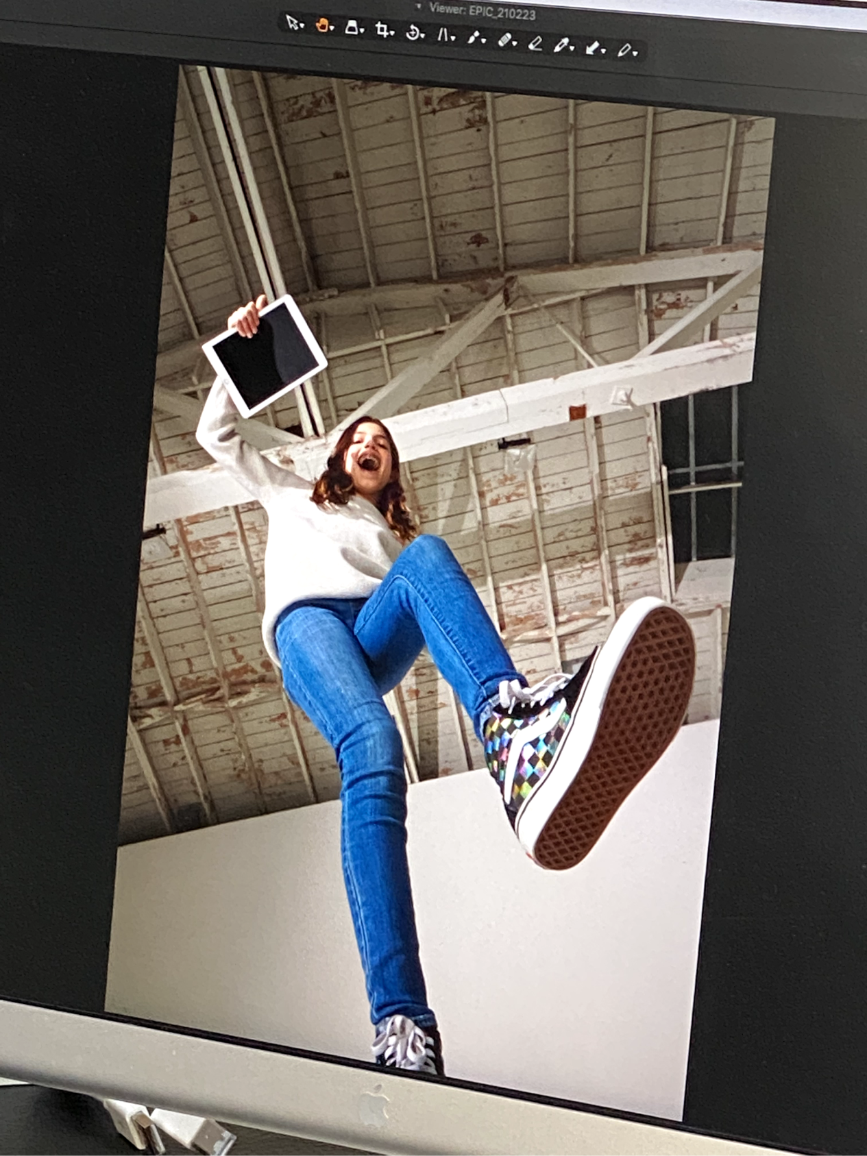
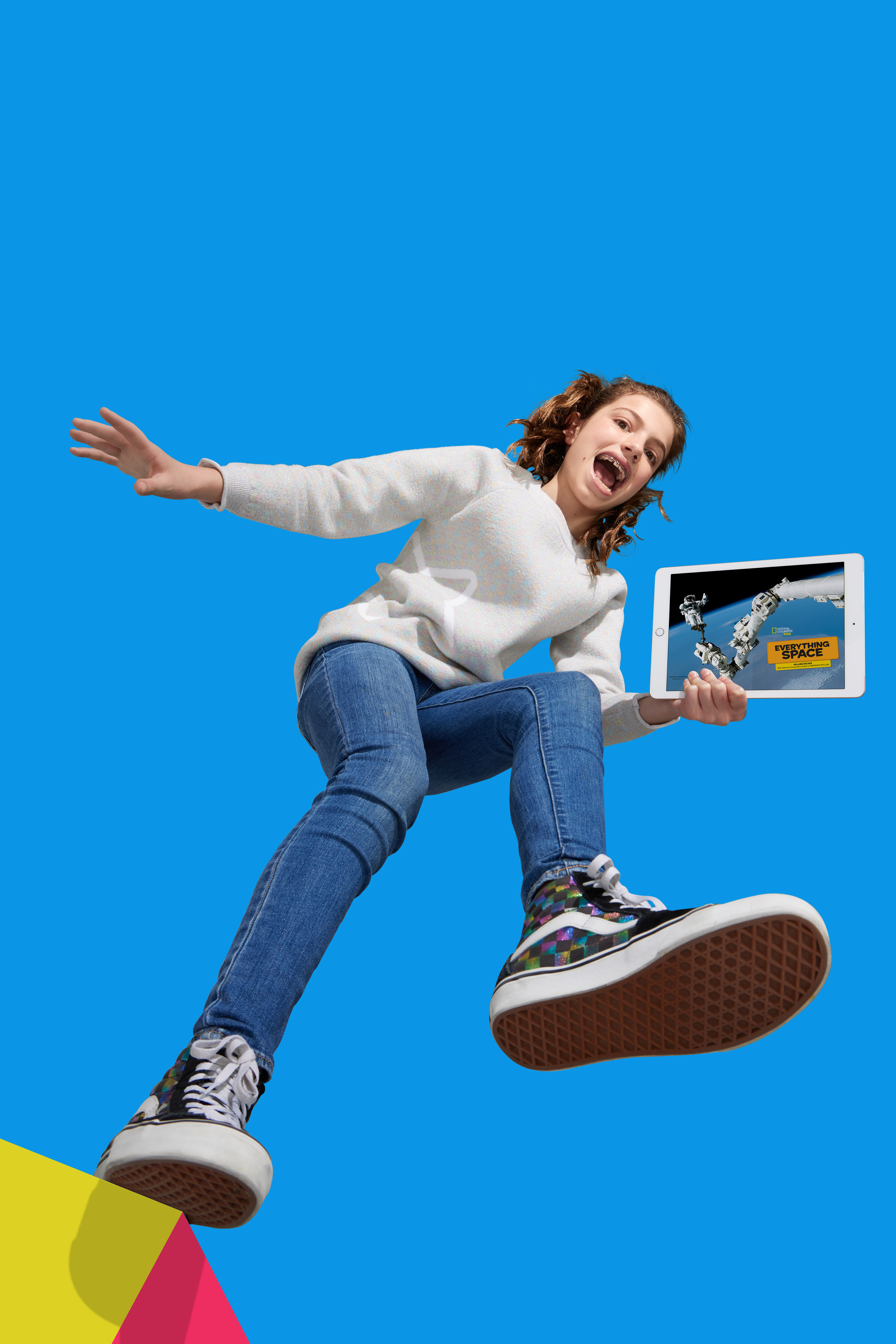
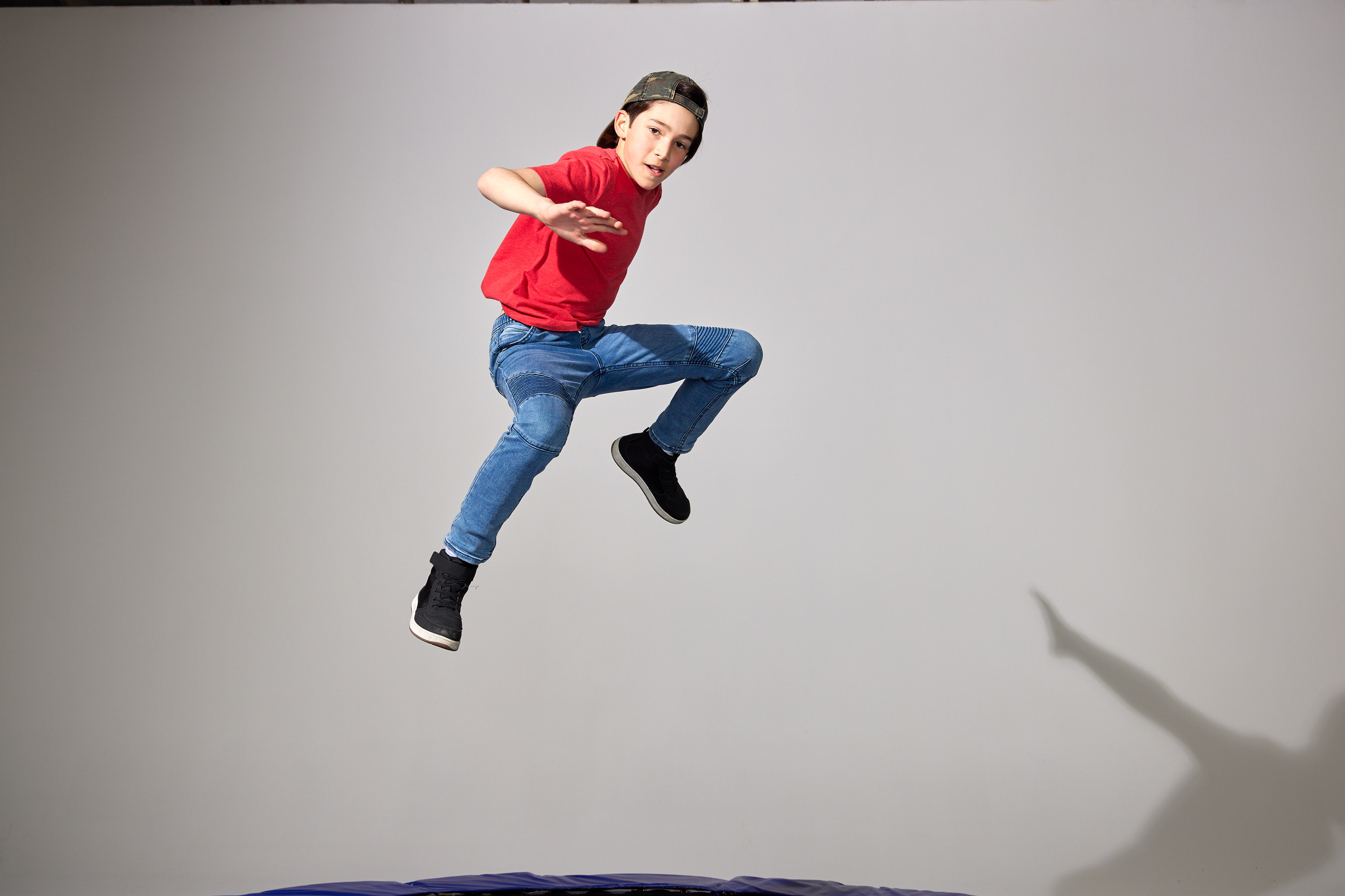
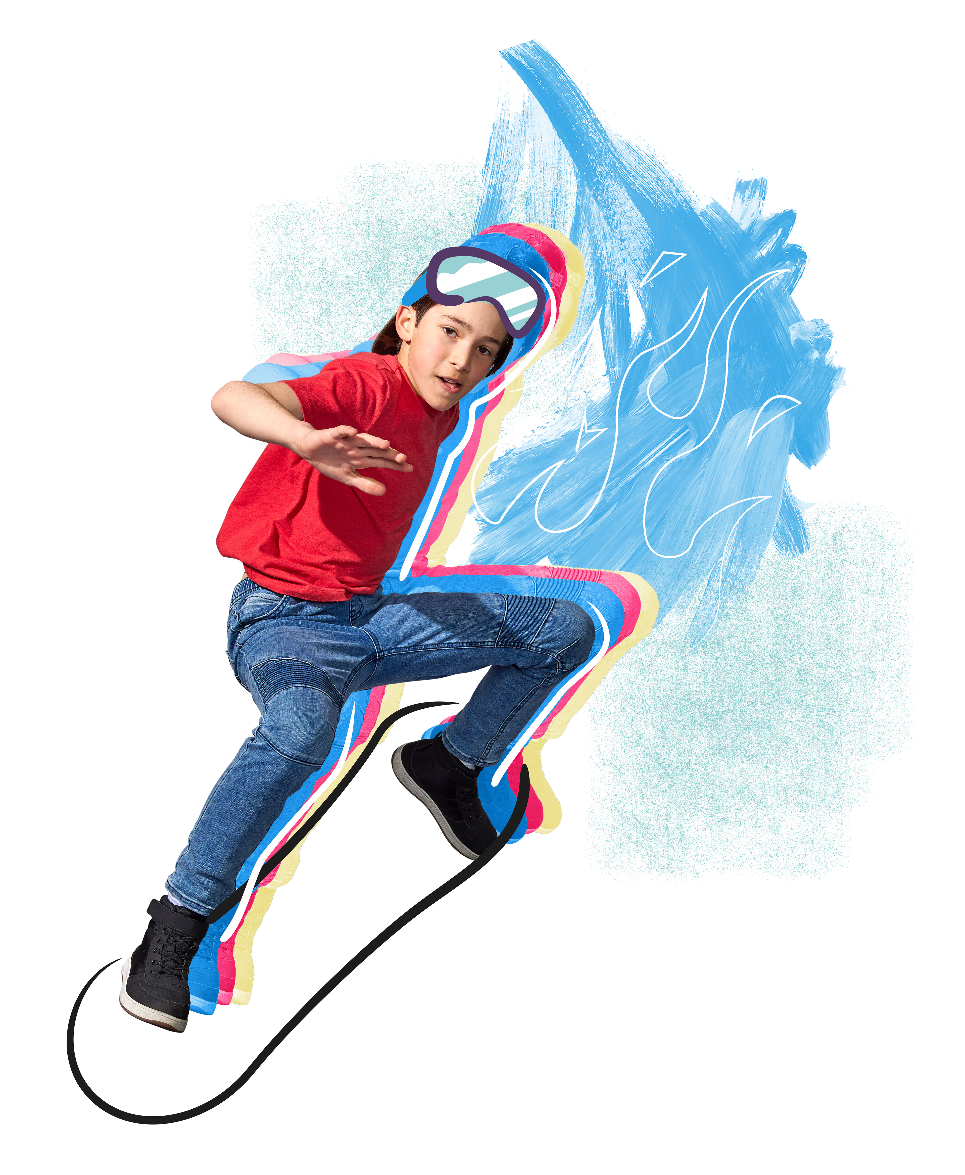
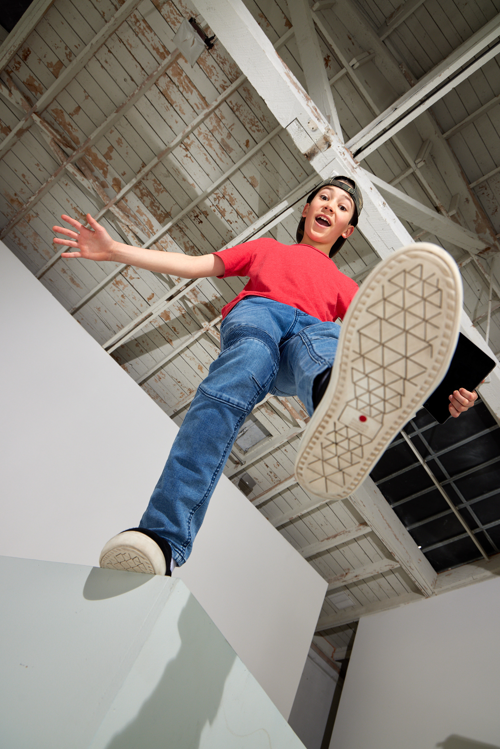
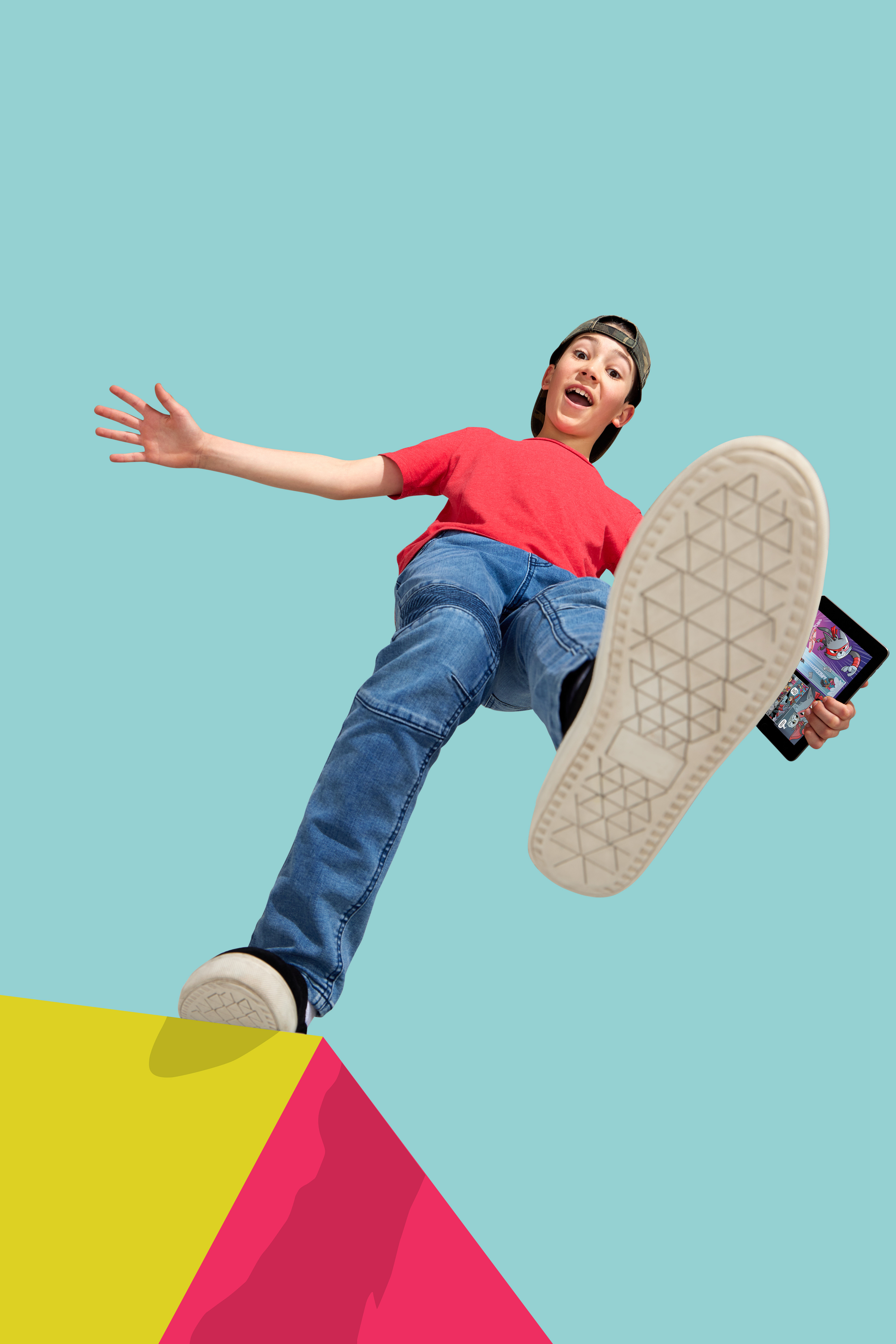
This image shows the transformation from set to final asset.
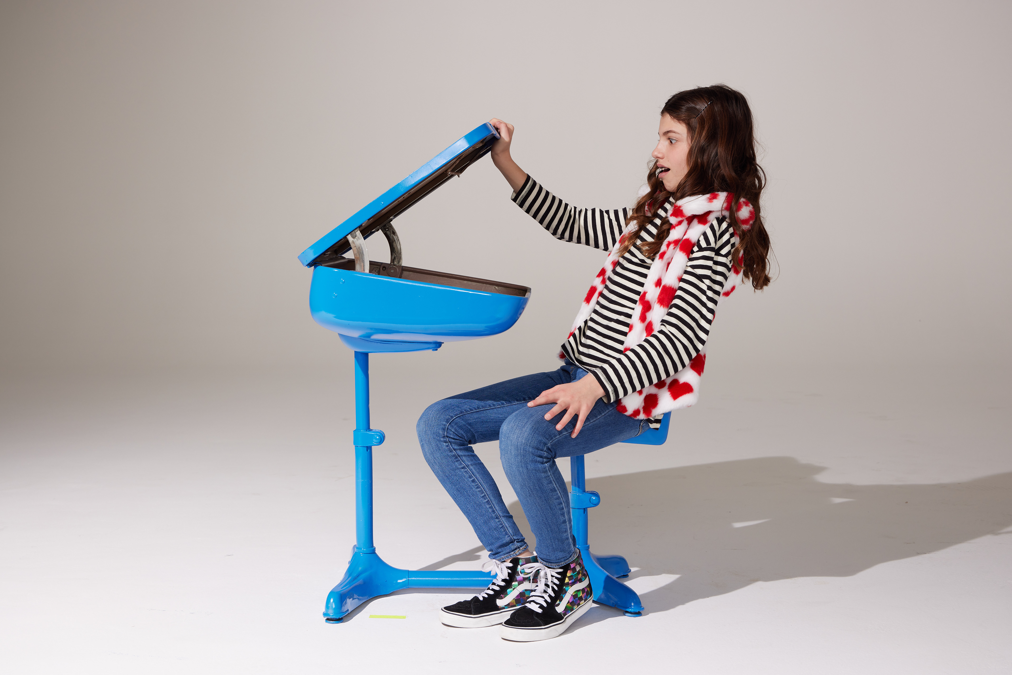
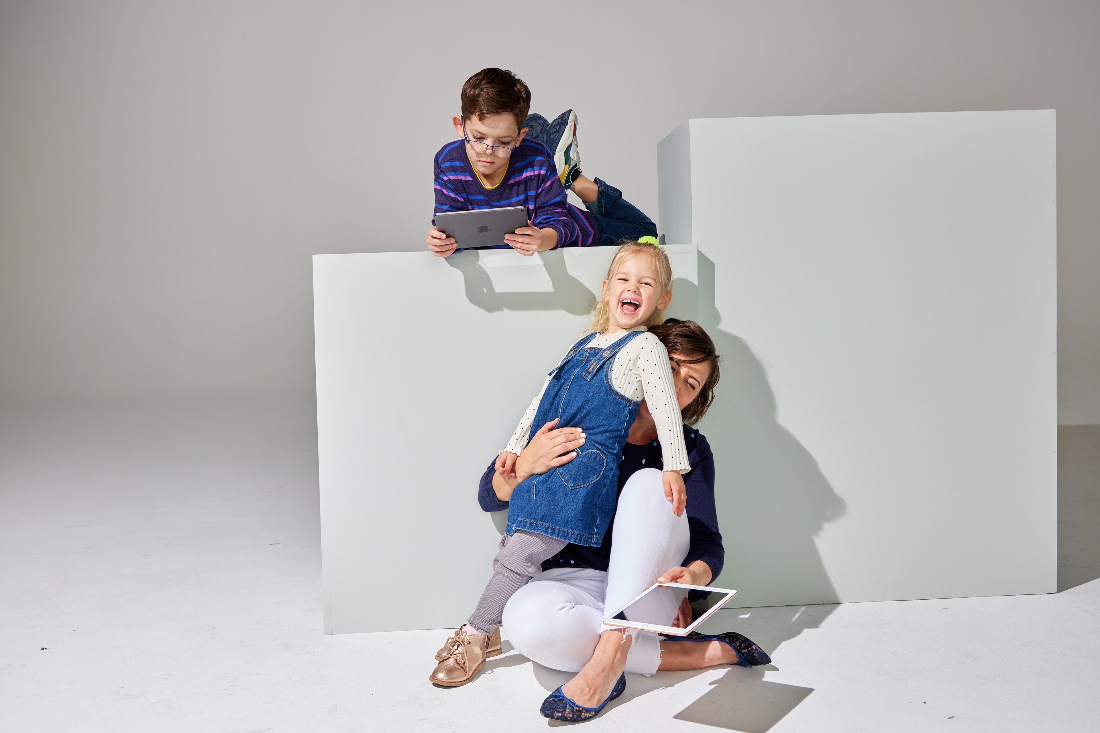
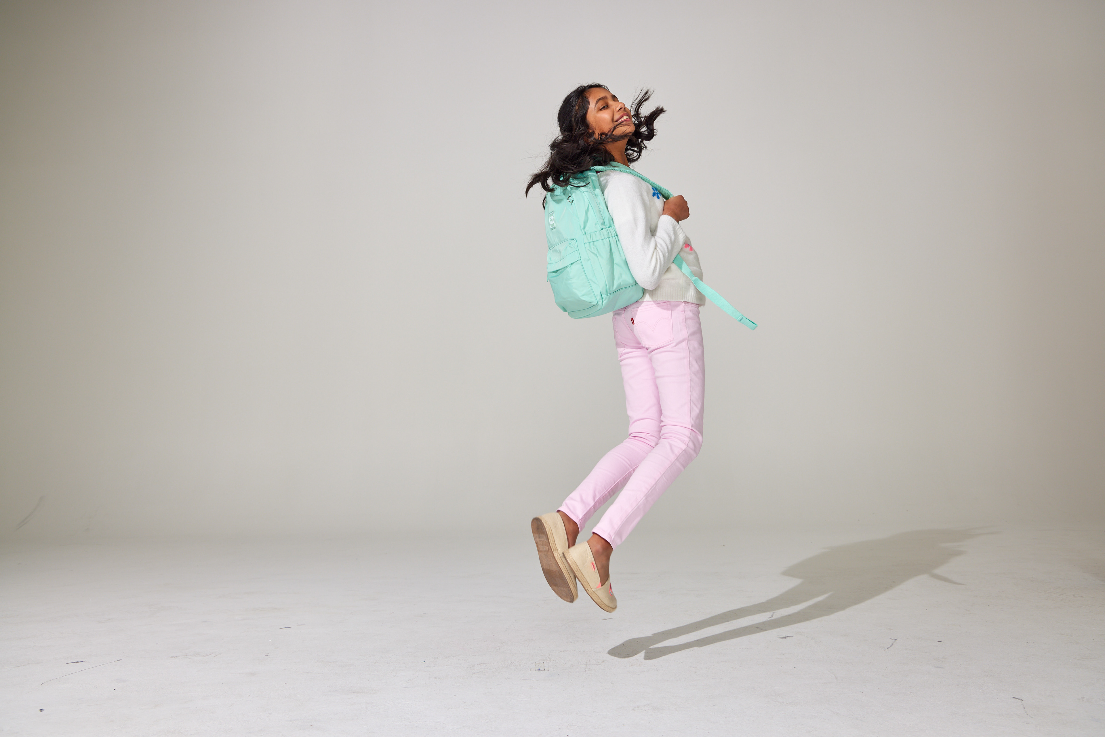
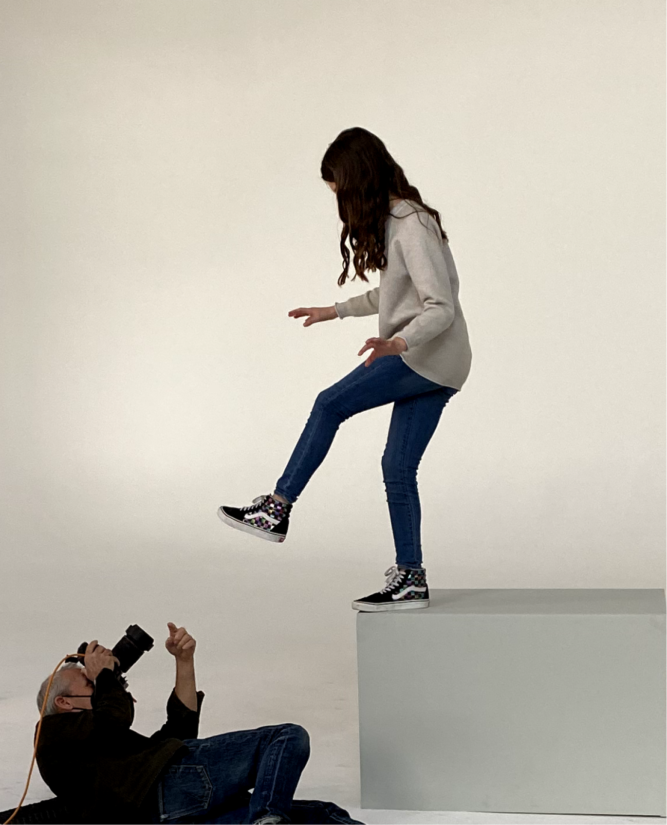
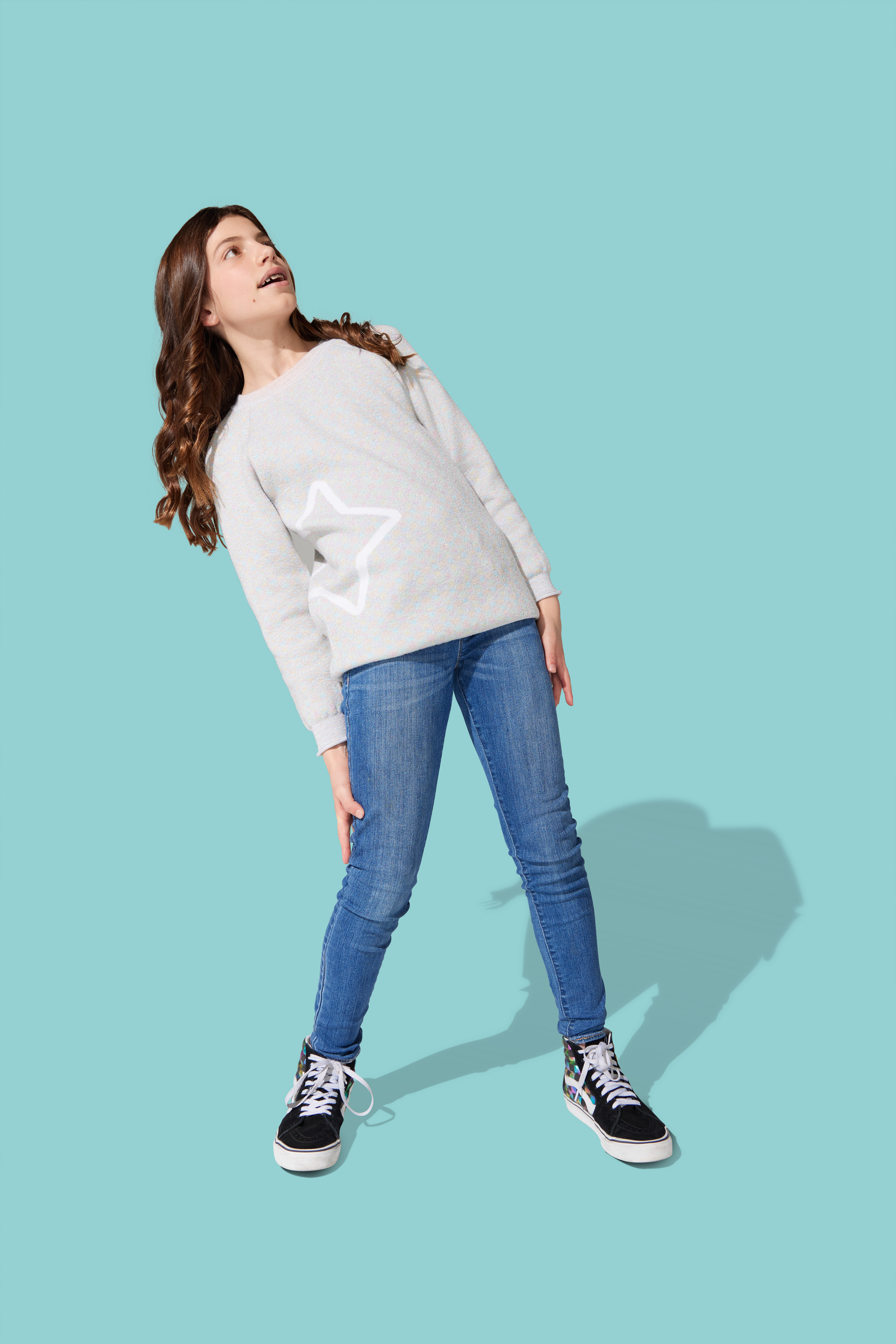
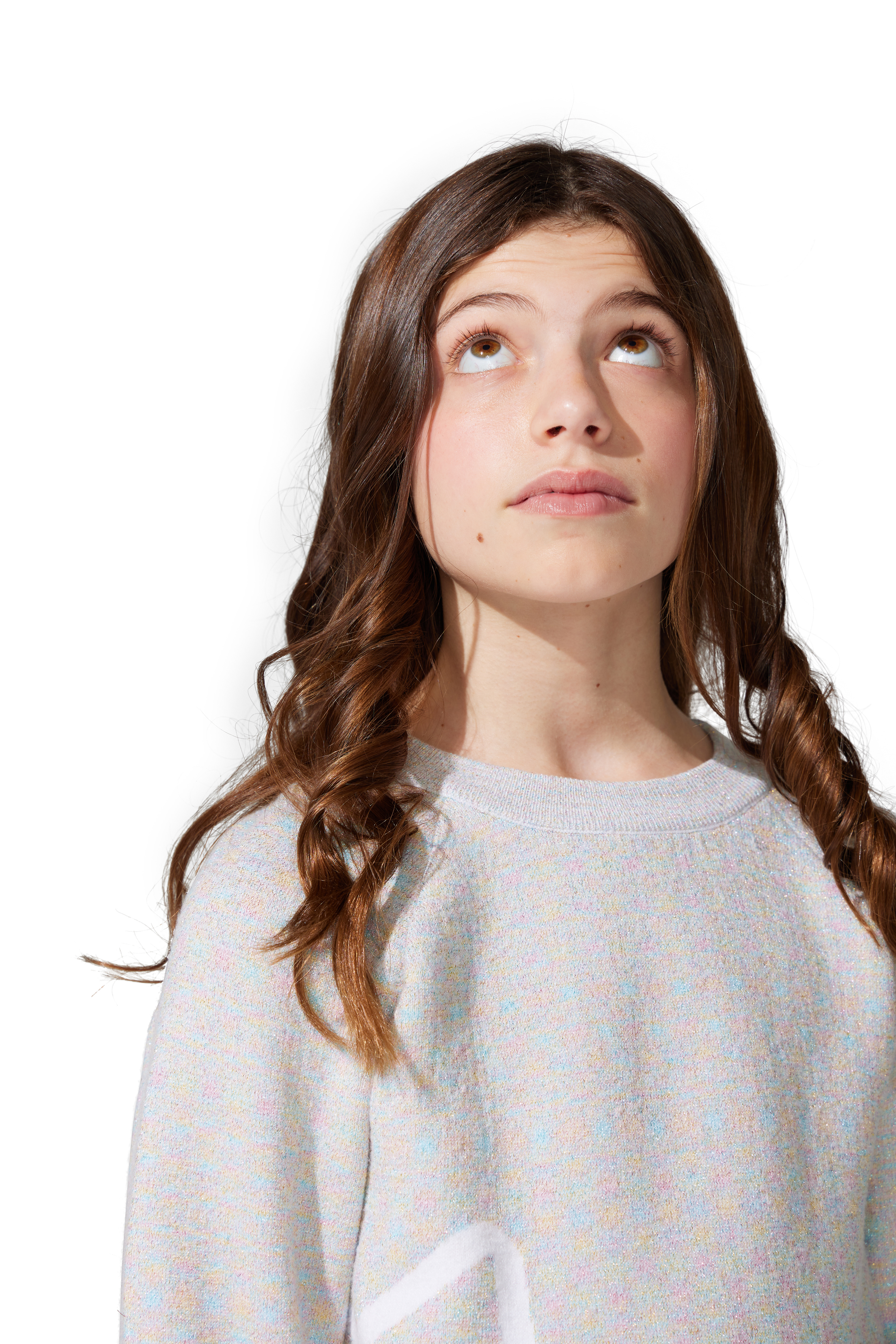
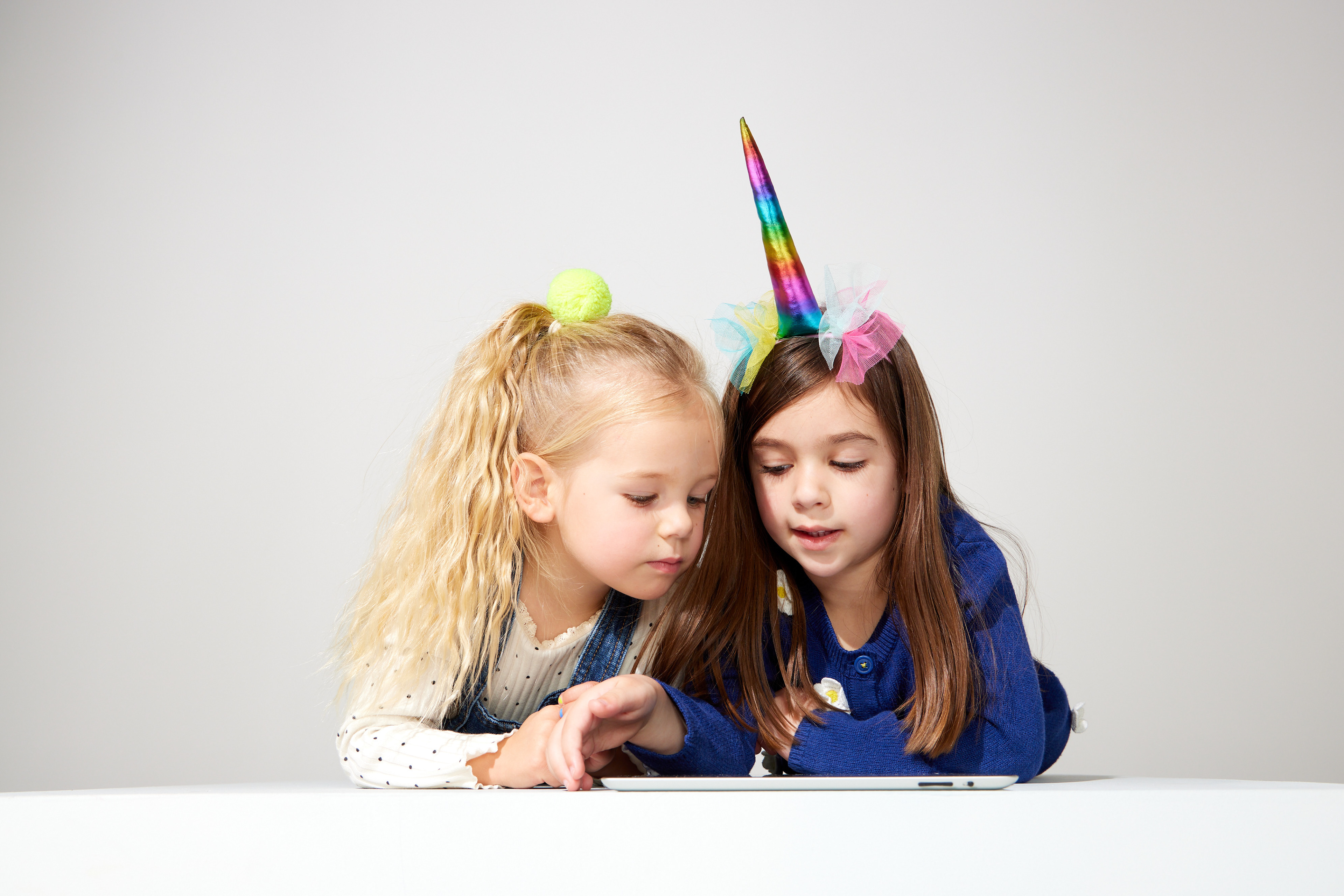
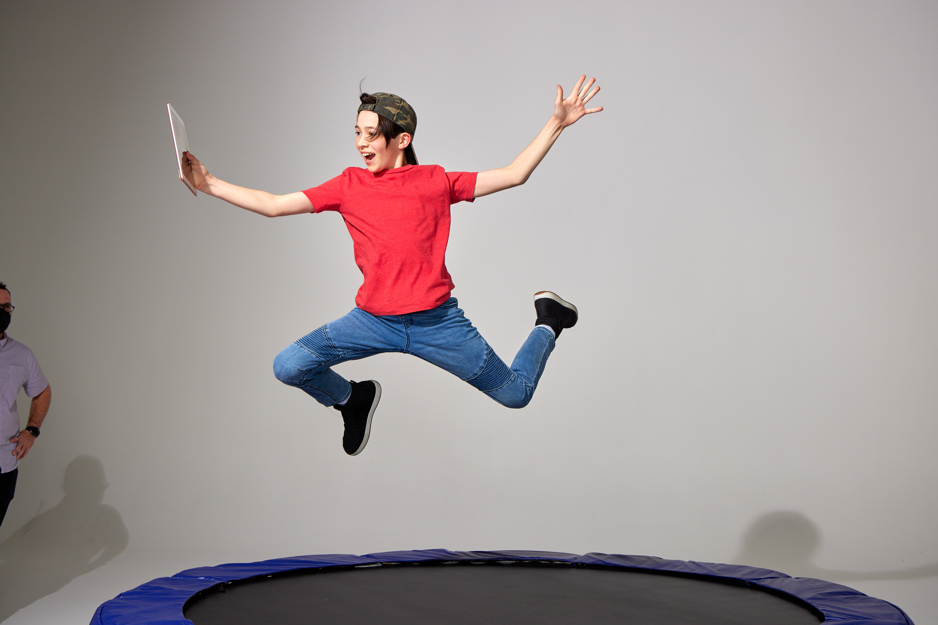
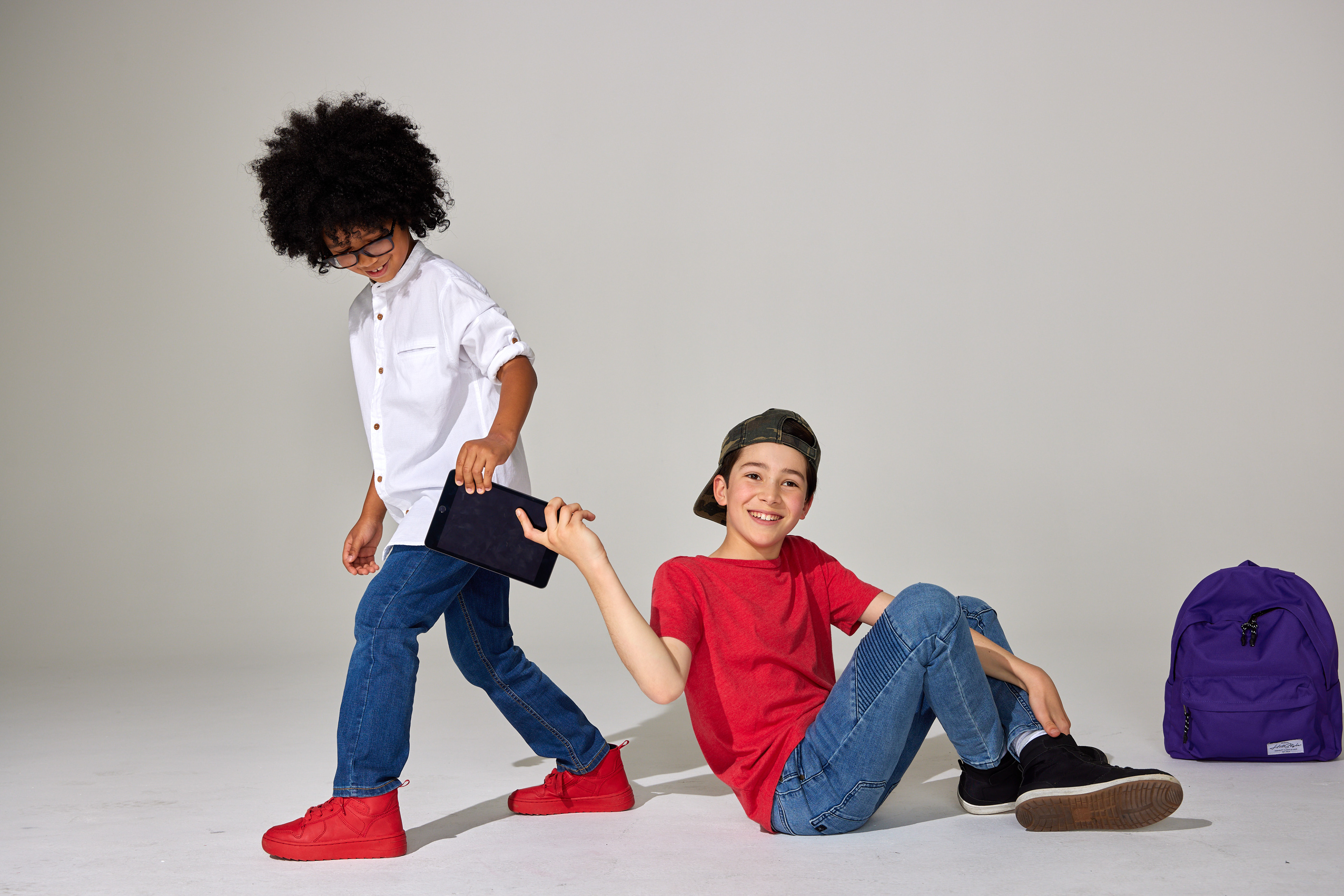
My idea to hire teachers and kids who use Epic to read added authenticity to the photos, but working with inexperienced talent brought challenges. On set, I directed them, sometimes explaining the end result and other times making them laugh or showing them how to pose. In this case, by adding an additional kid to the mix helped loosen up the vibe, resulting in more playful and confident expressions.
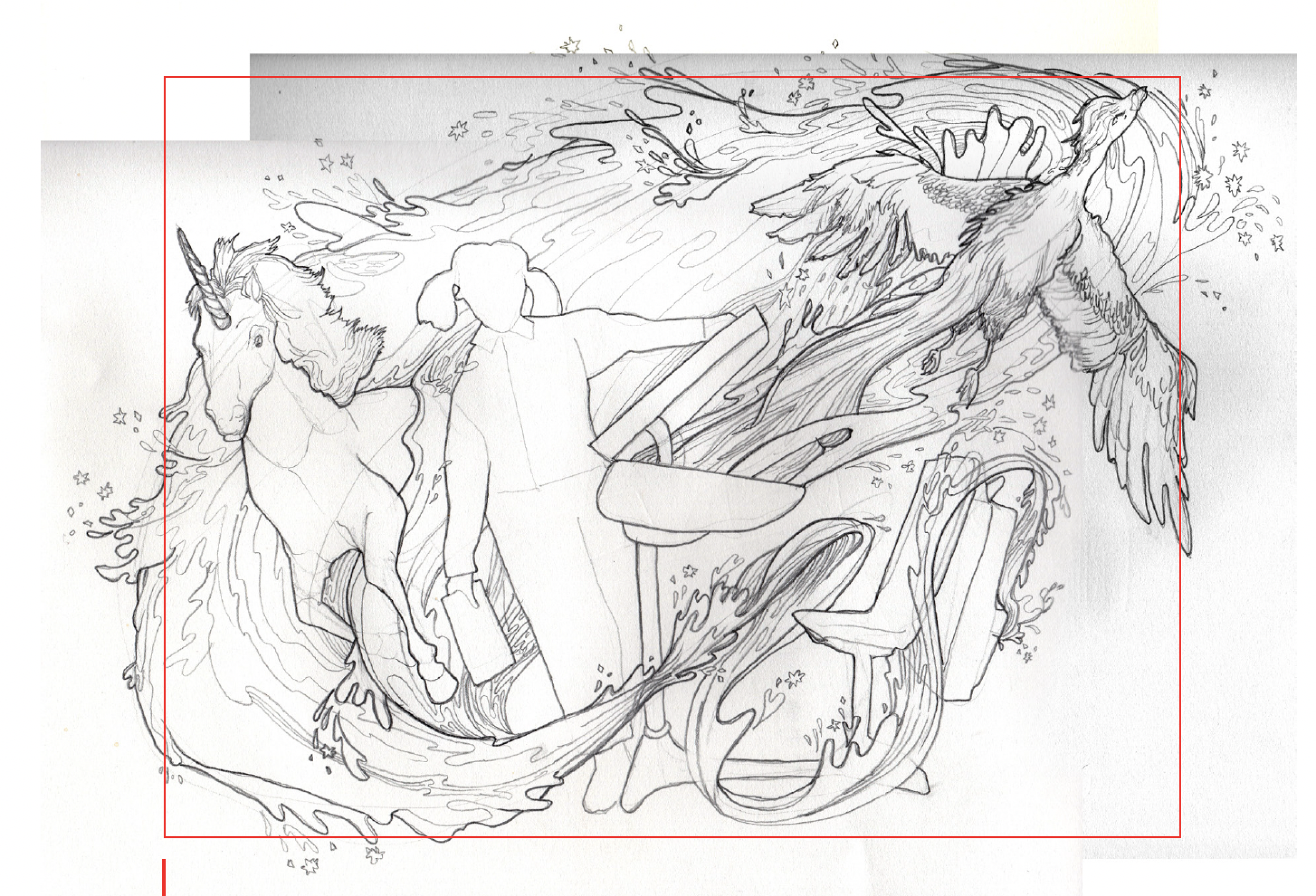
After the shoot was complete I worked with artists on the team, did some illustrations myself and hired local artists to contract for specific pieces. This is an example of one of the first sketches that we got back from a contracted illustrator.
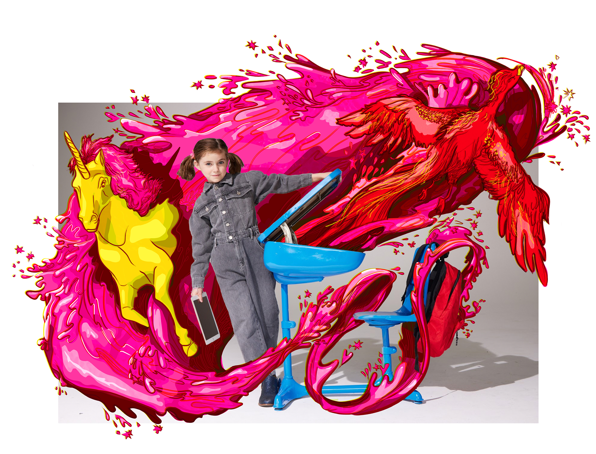
This was the final piece of art we received from the illustrator.
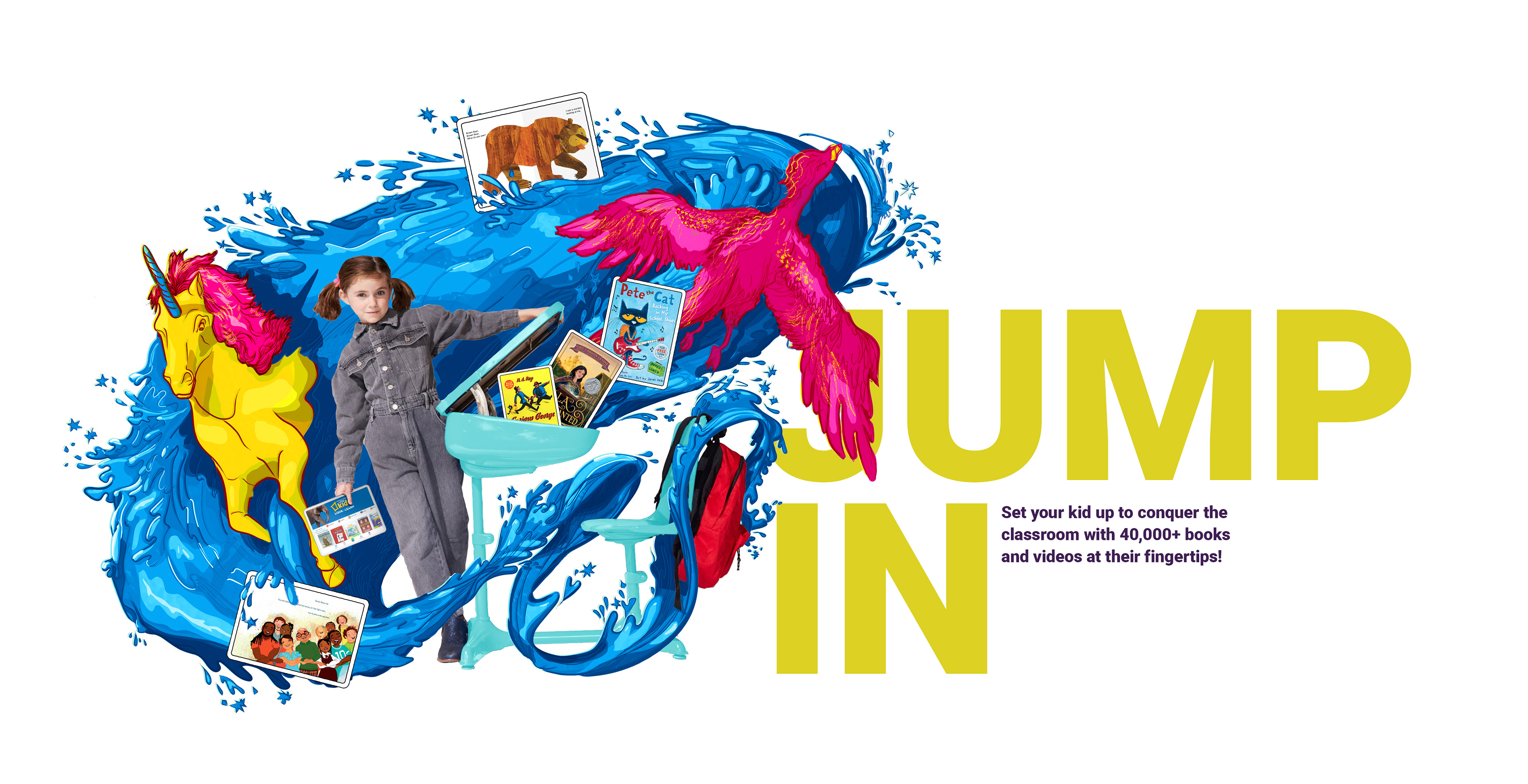
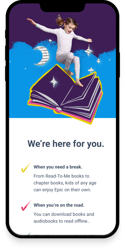
This is how we applied it to our brand. This JUMP IN concept was about jumping into reading and learning and into the new school year with confidence and excitement.
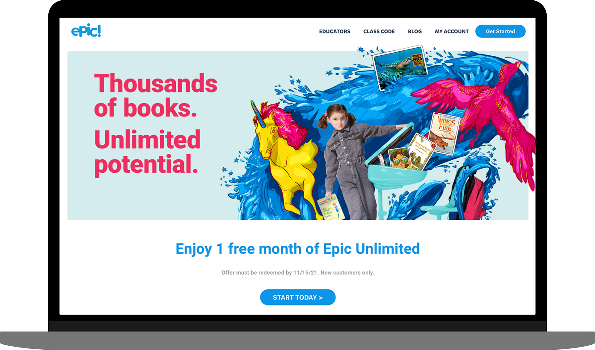
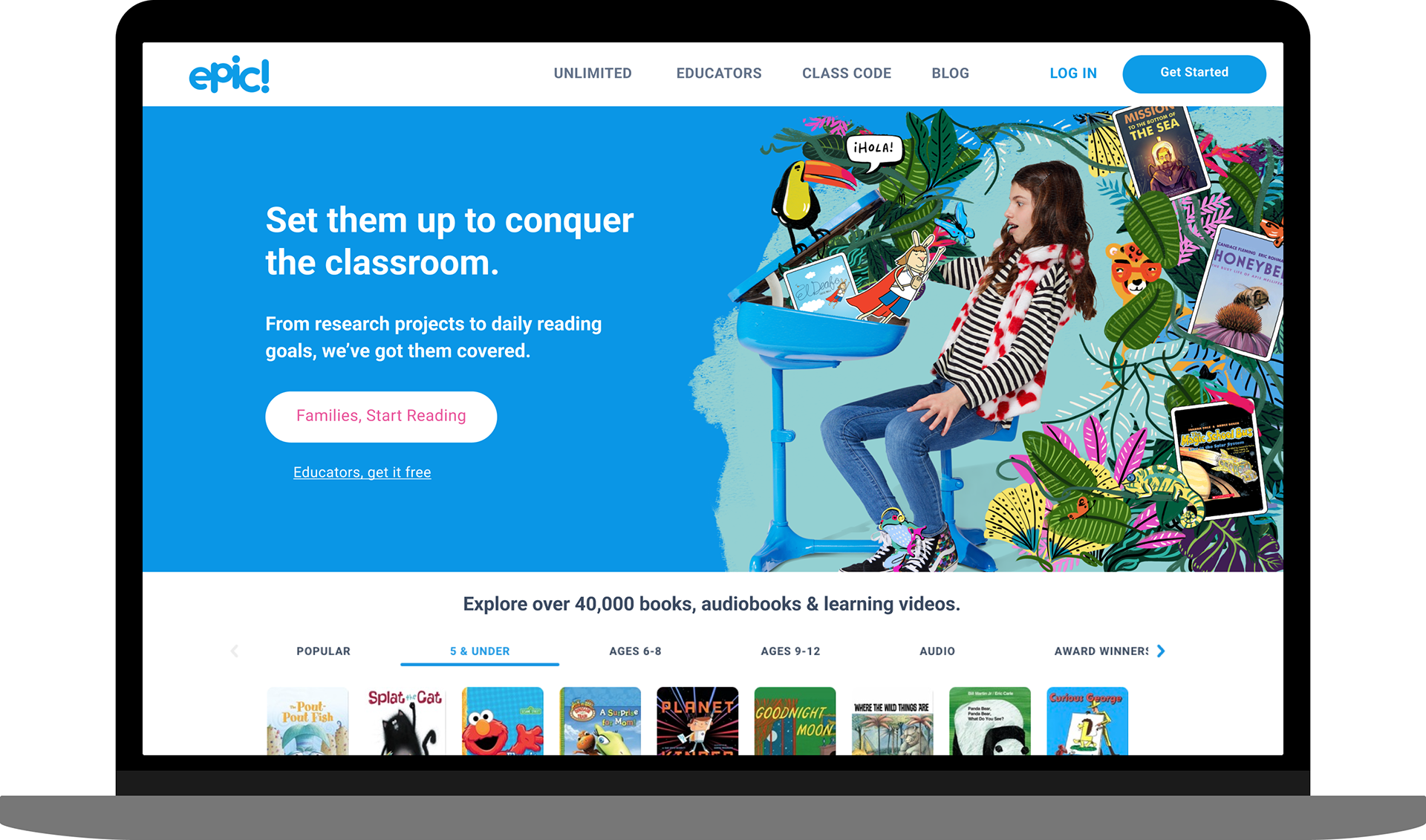
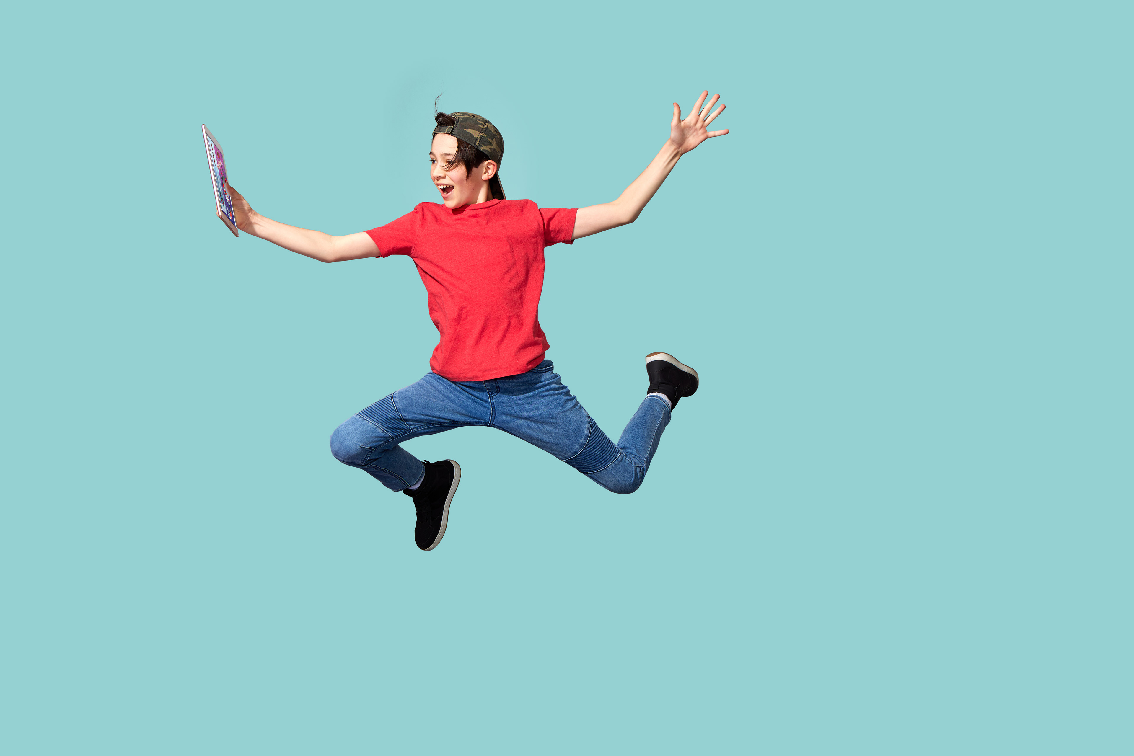
I designed landing pages and ads with the photography that came out of the shoot. This is one instance of how this concept played out as a heading to a promotional landing page.
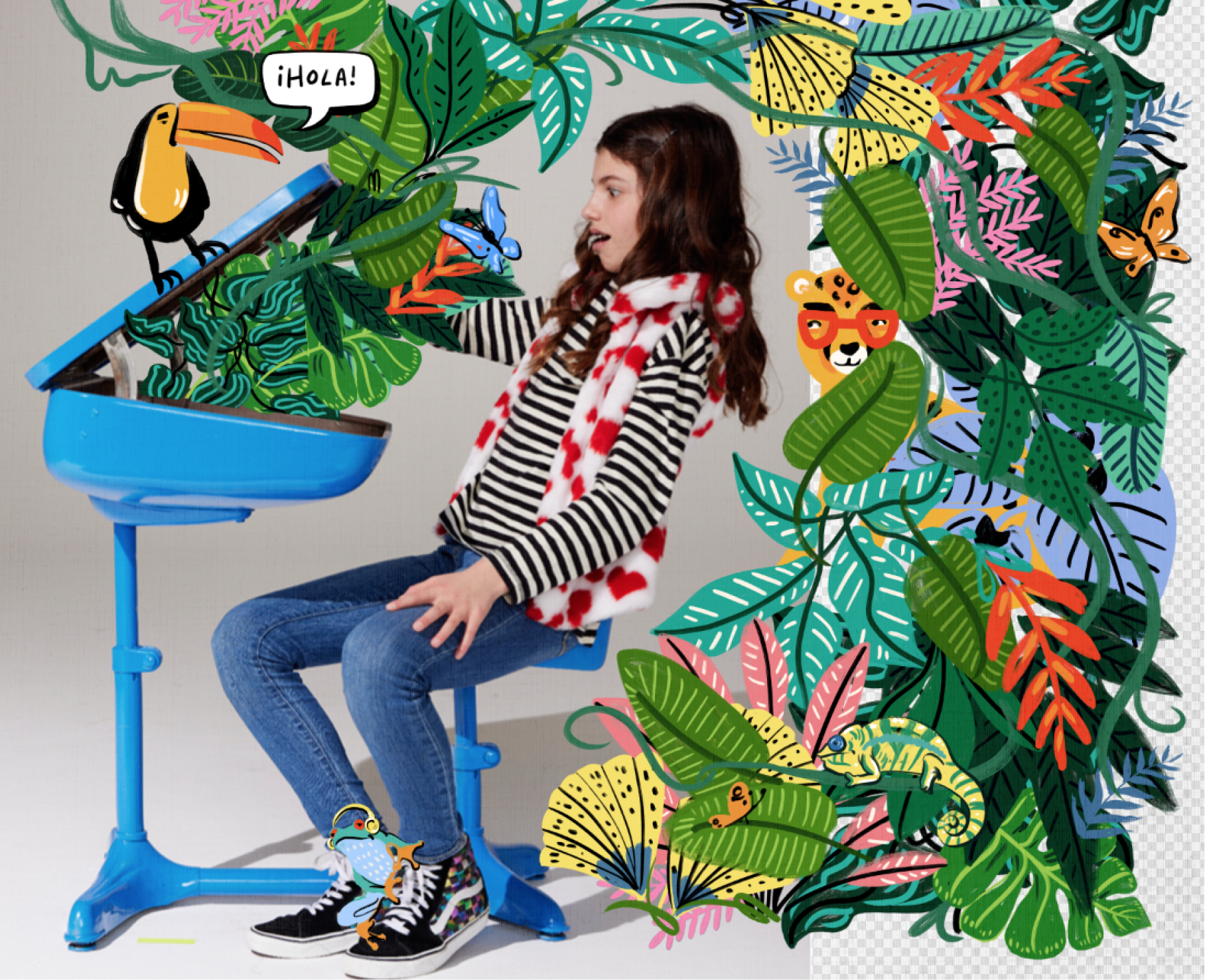
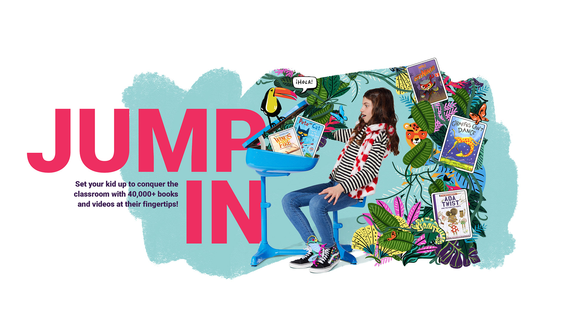
This is another example of how we brought these photos to life using the JUMP IN to back to school concept where they are transported into a new world / jungle of learning.
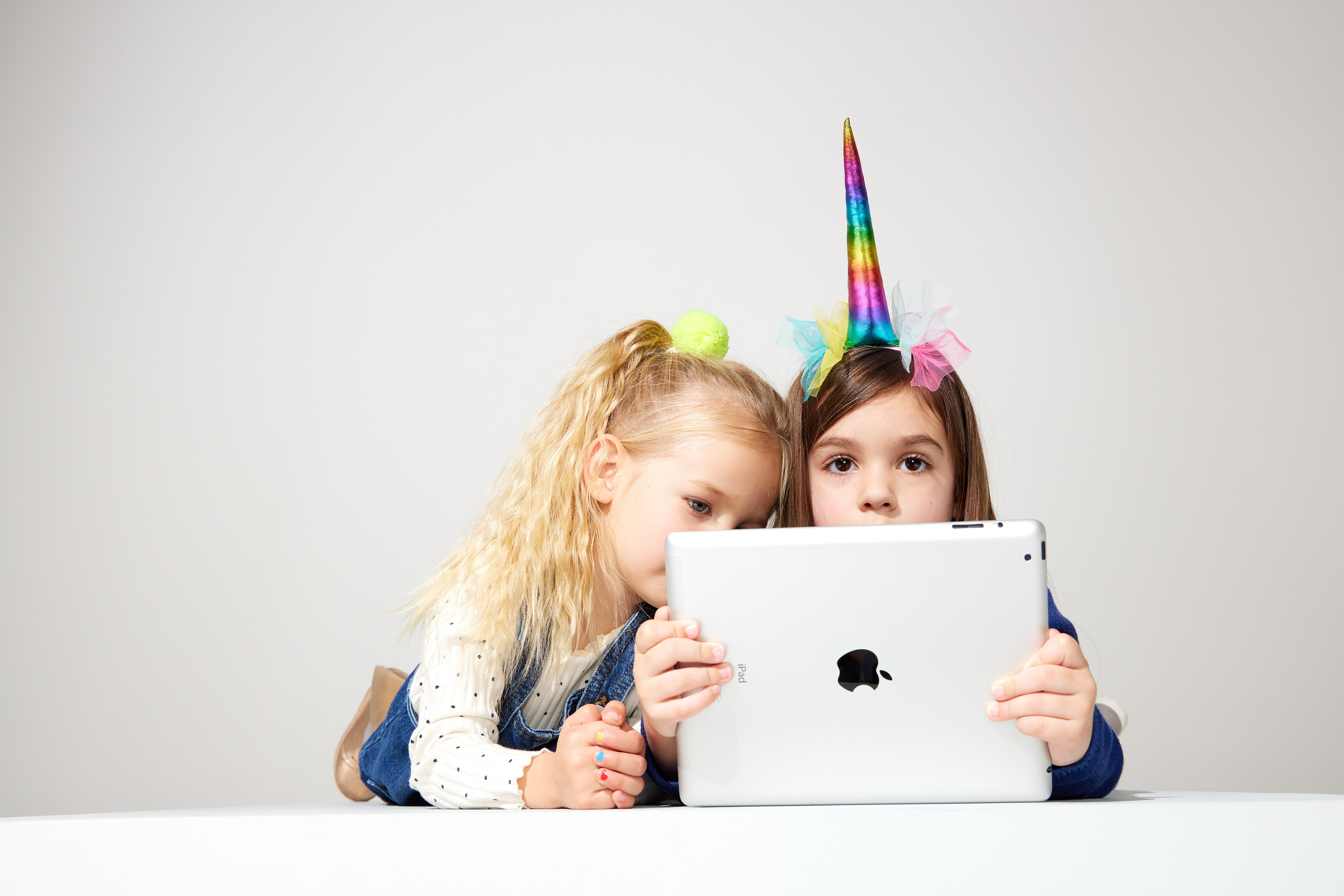
In planning the shoot I collaborated with the creative director and various other designers from the product and brand teams. I also collaborated with marketing & HR. I gathered business use cases to ensure we had assets that would work for all our needs and channels. In this case, another designer on the team used motion design to help bring this concept to life.
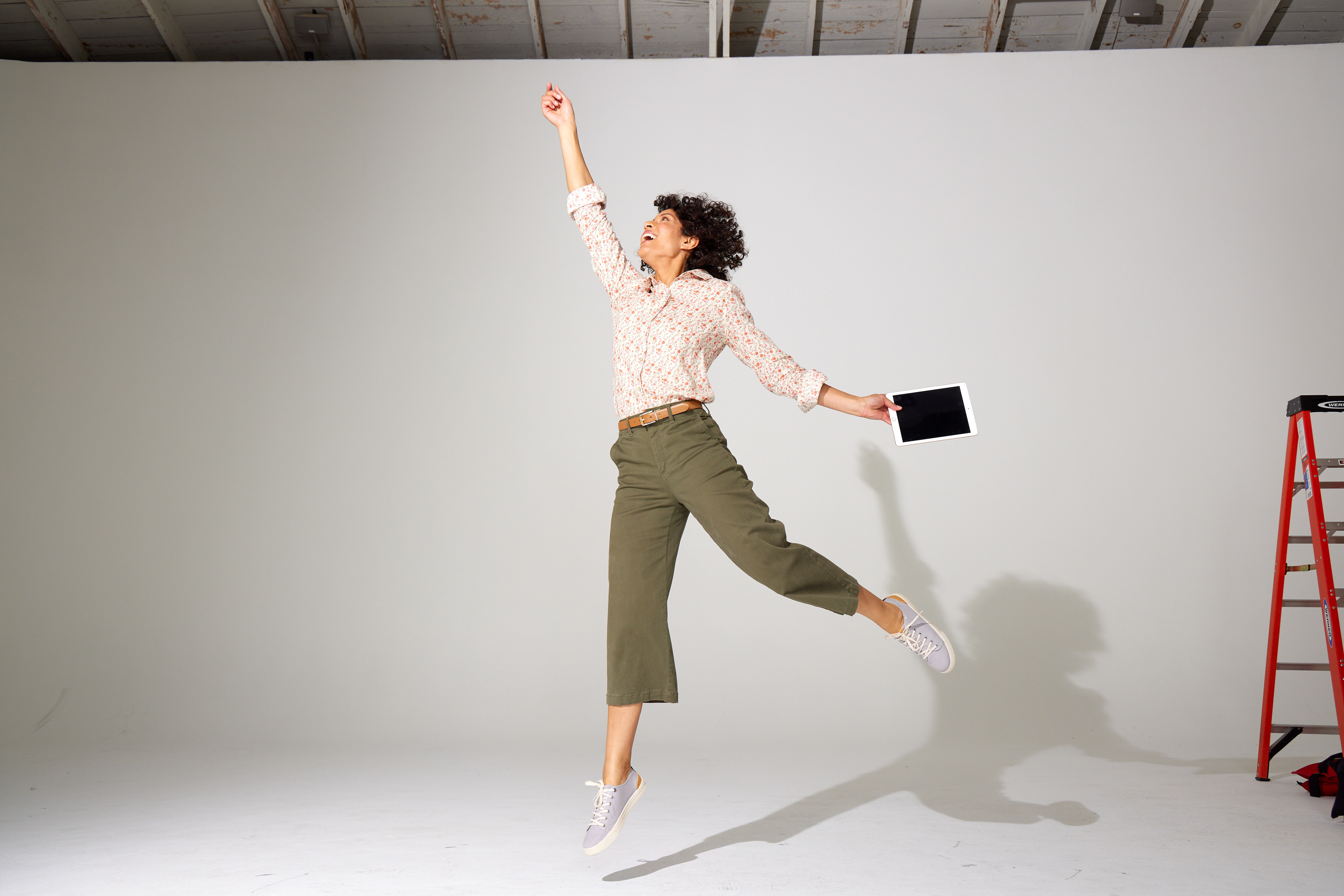

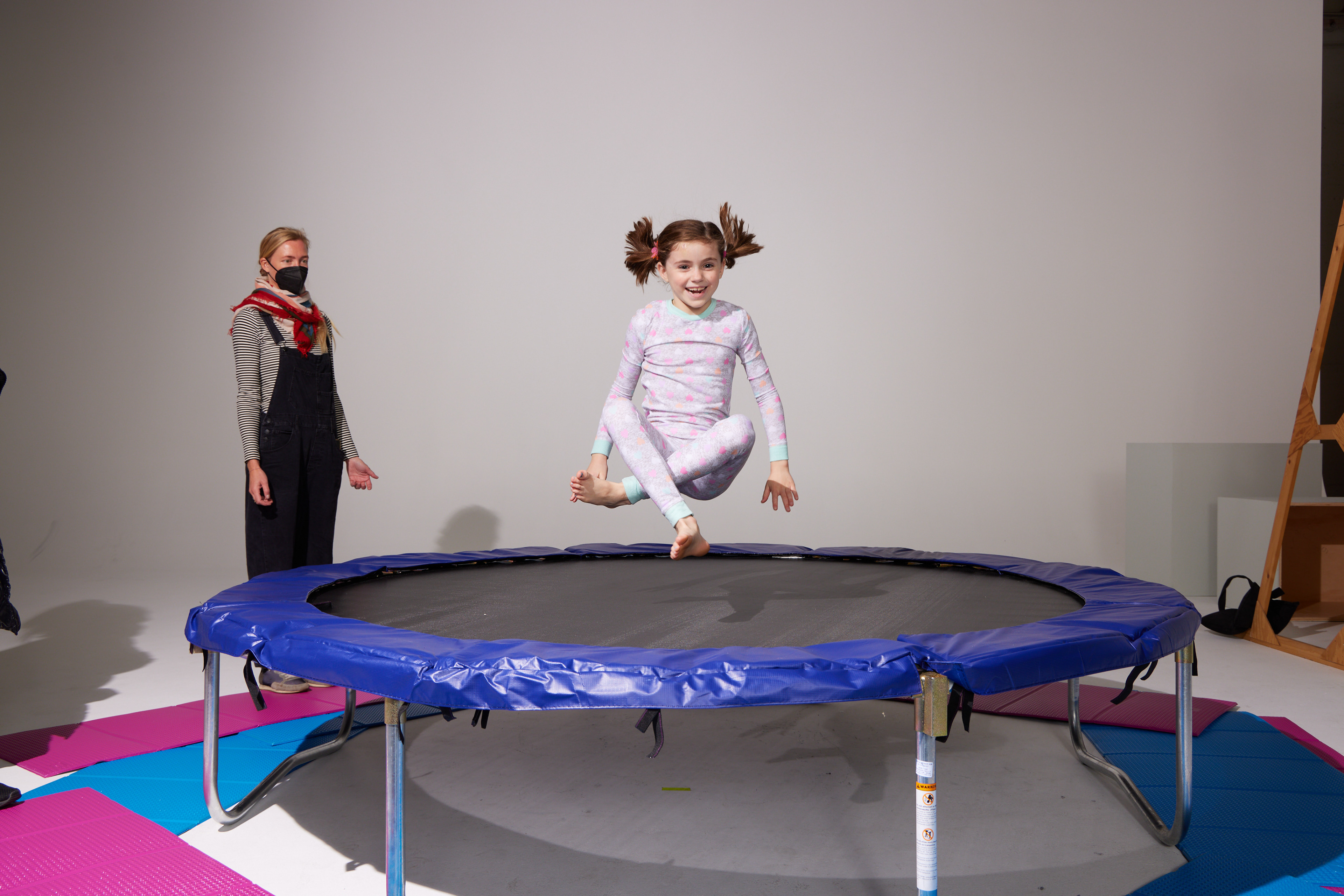
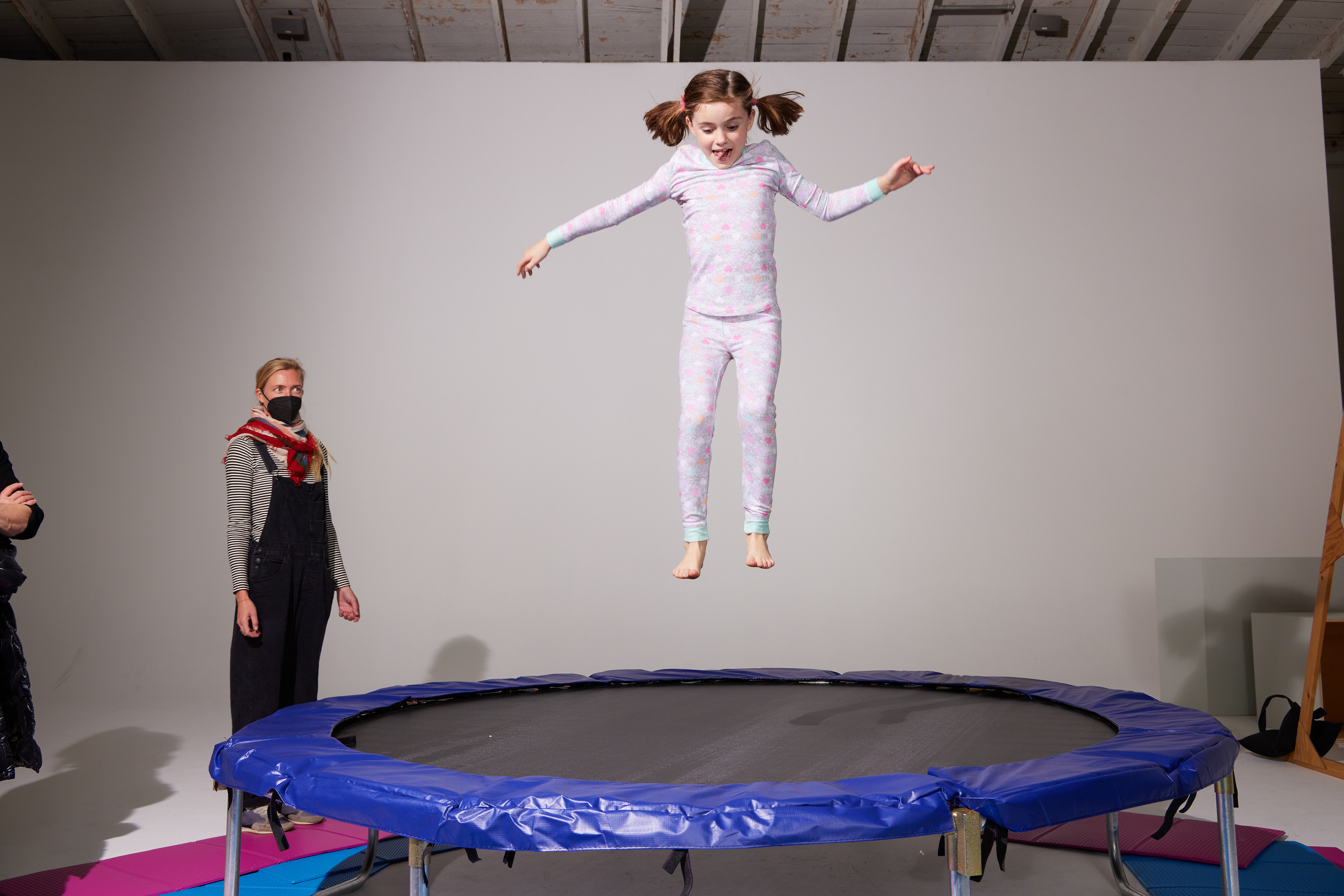
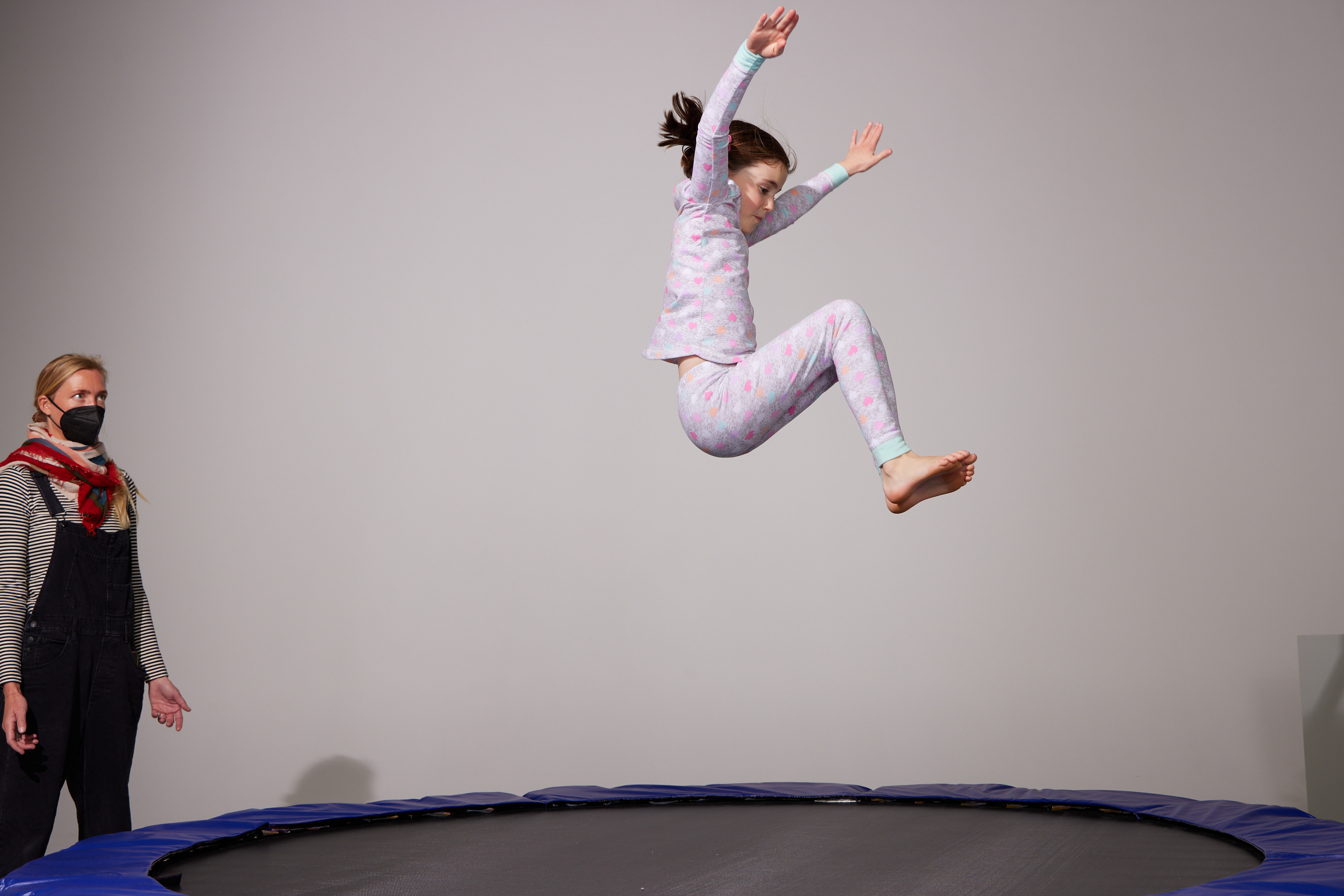
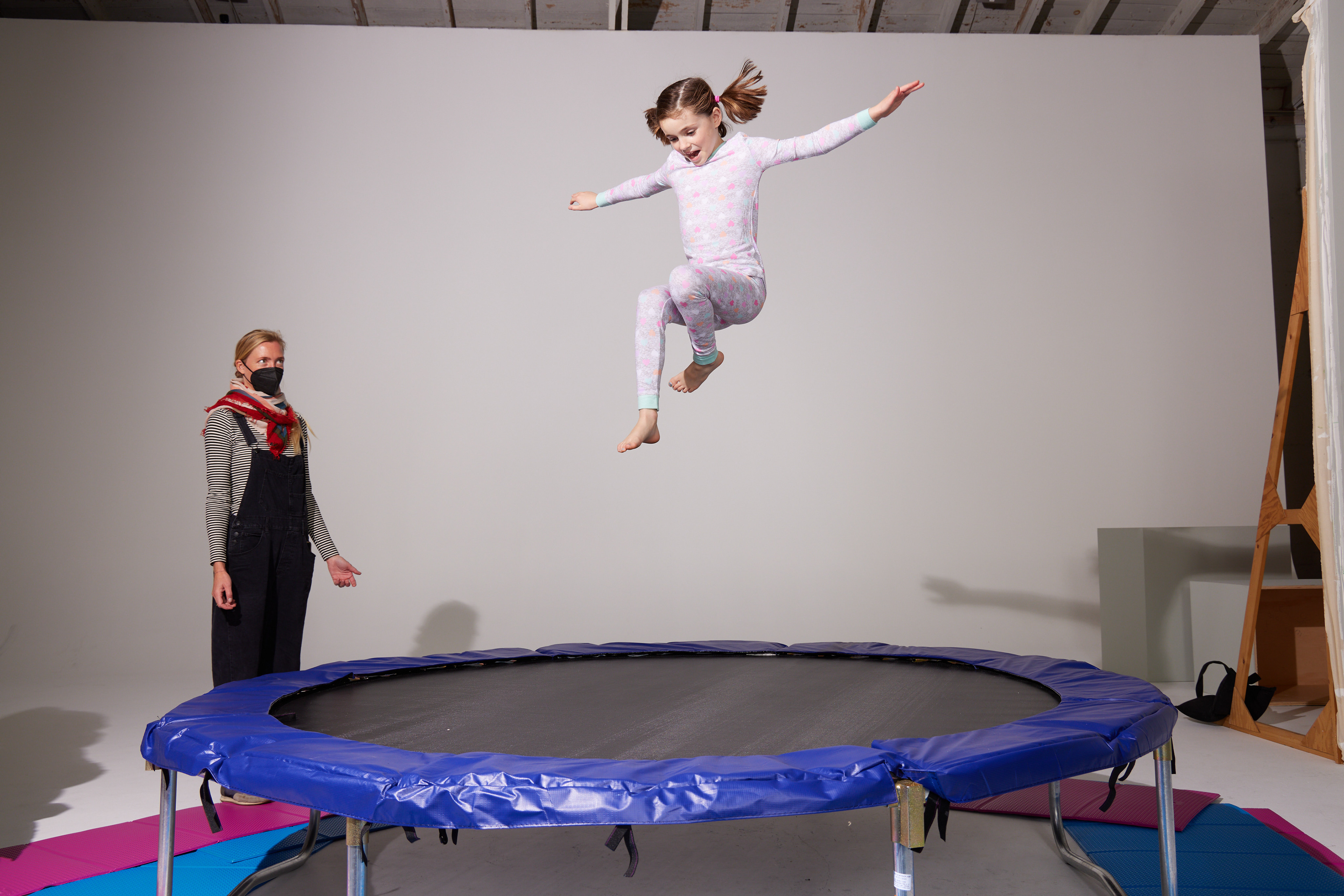
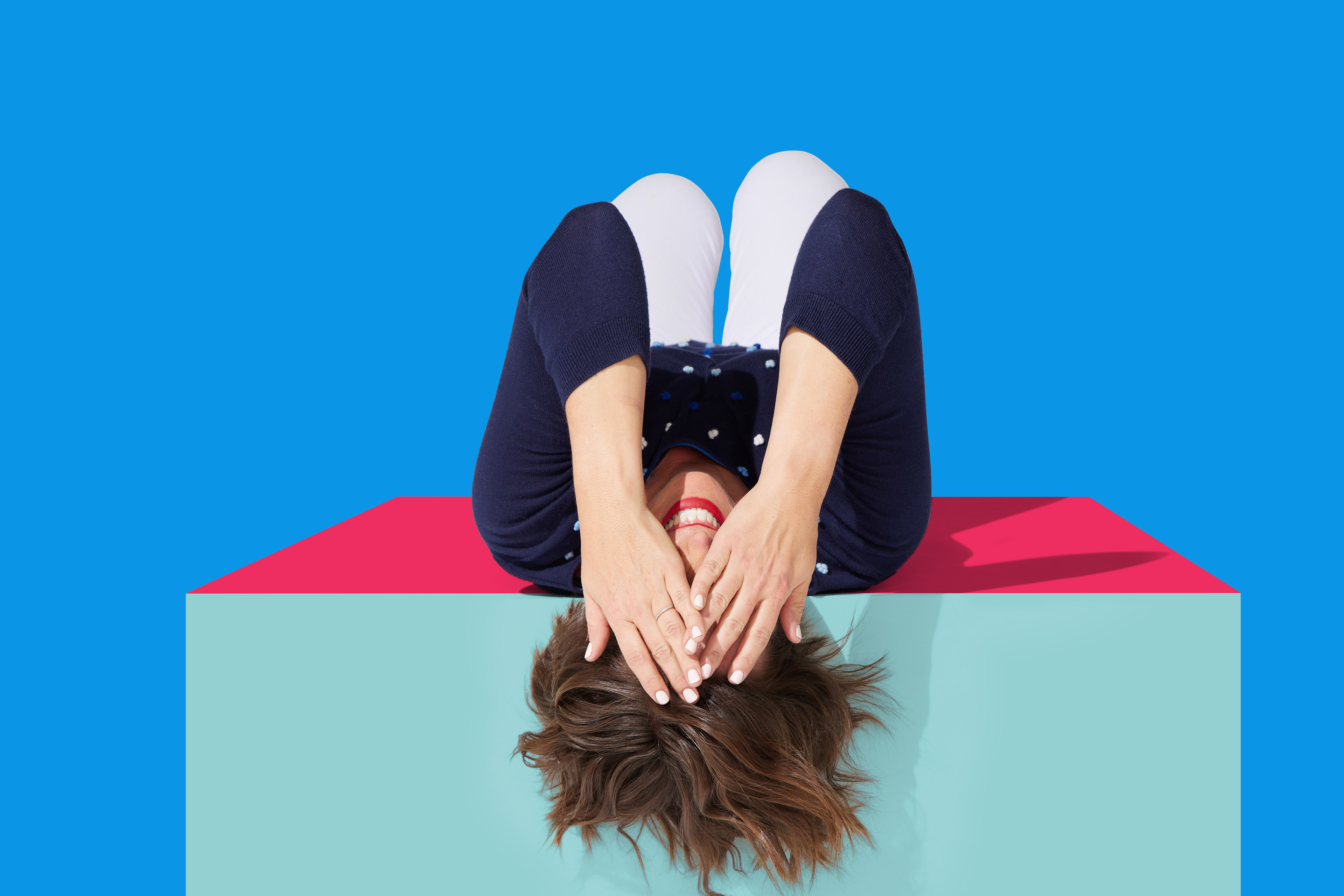
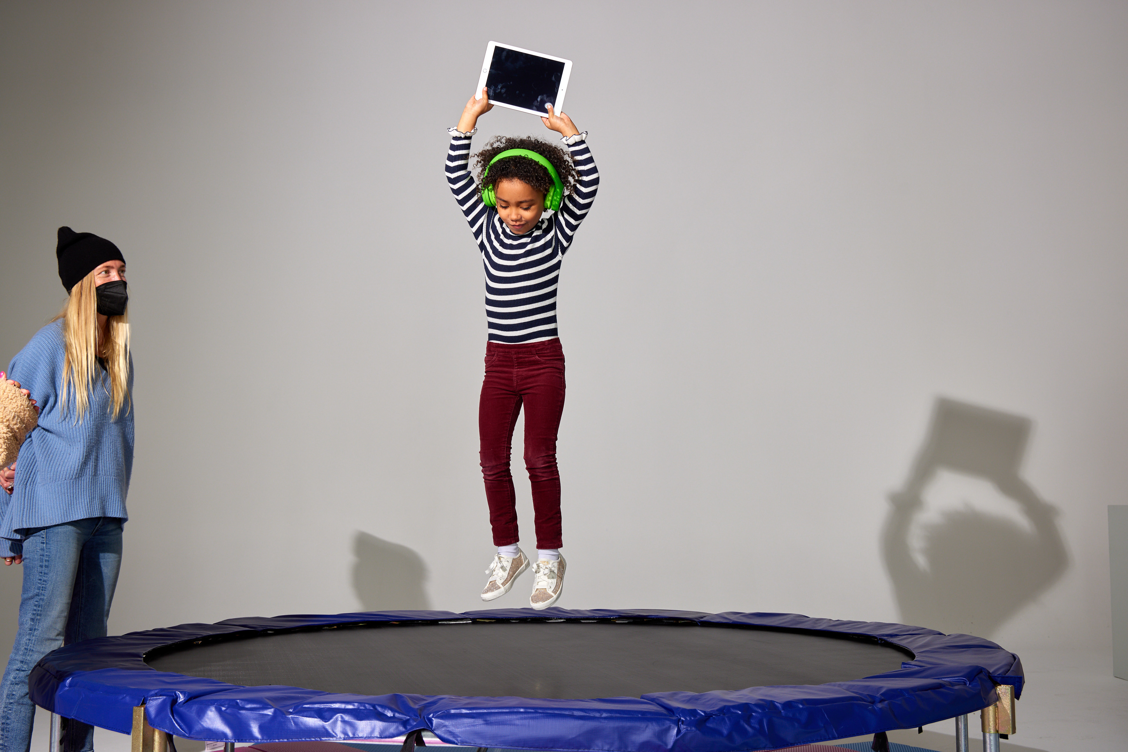
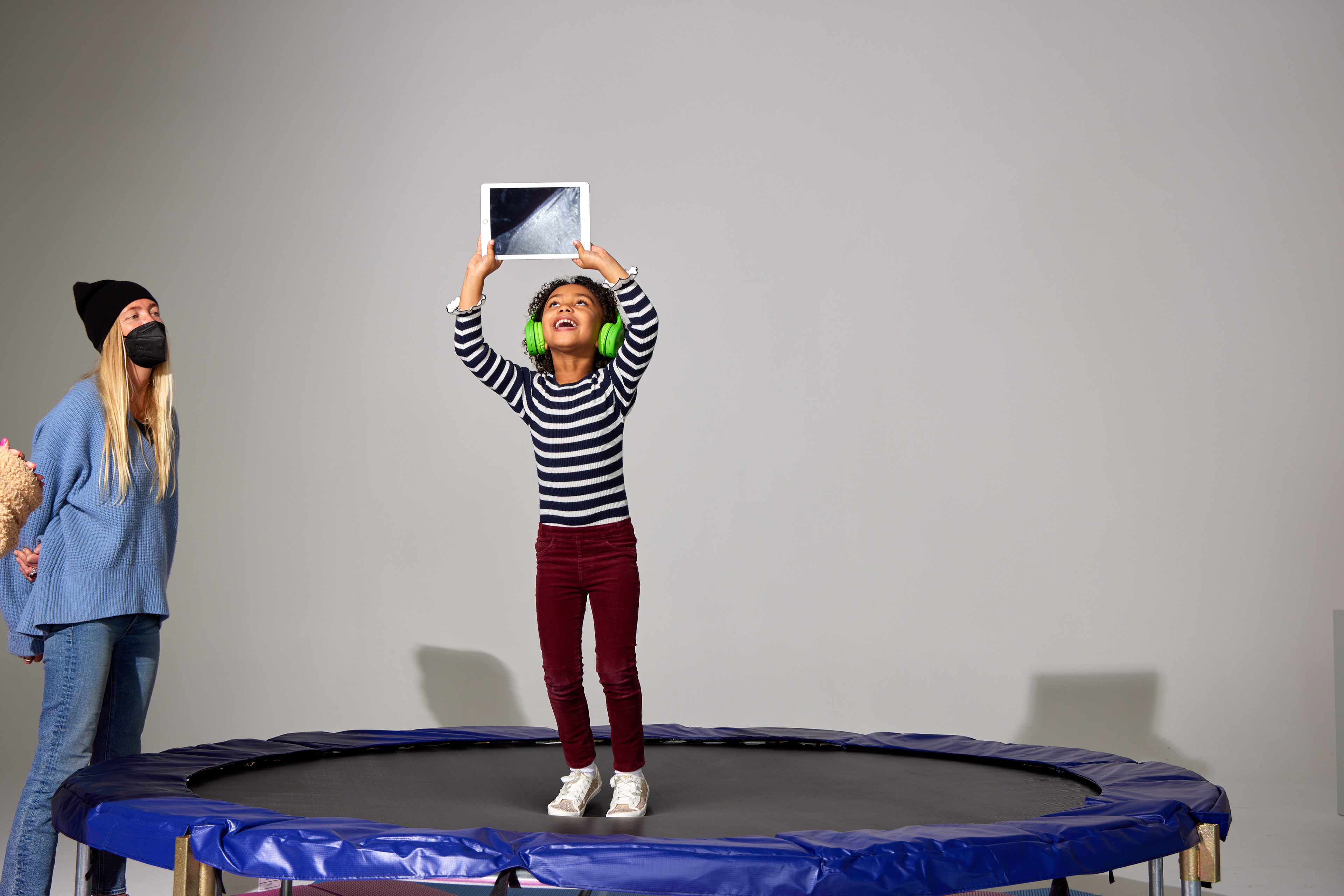
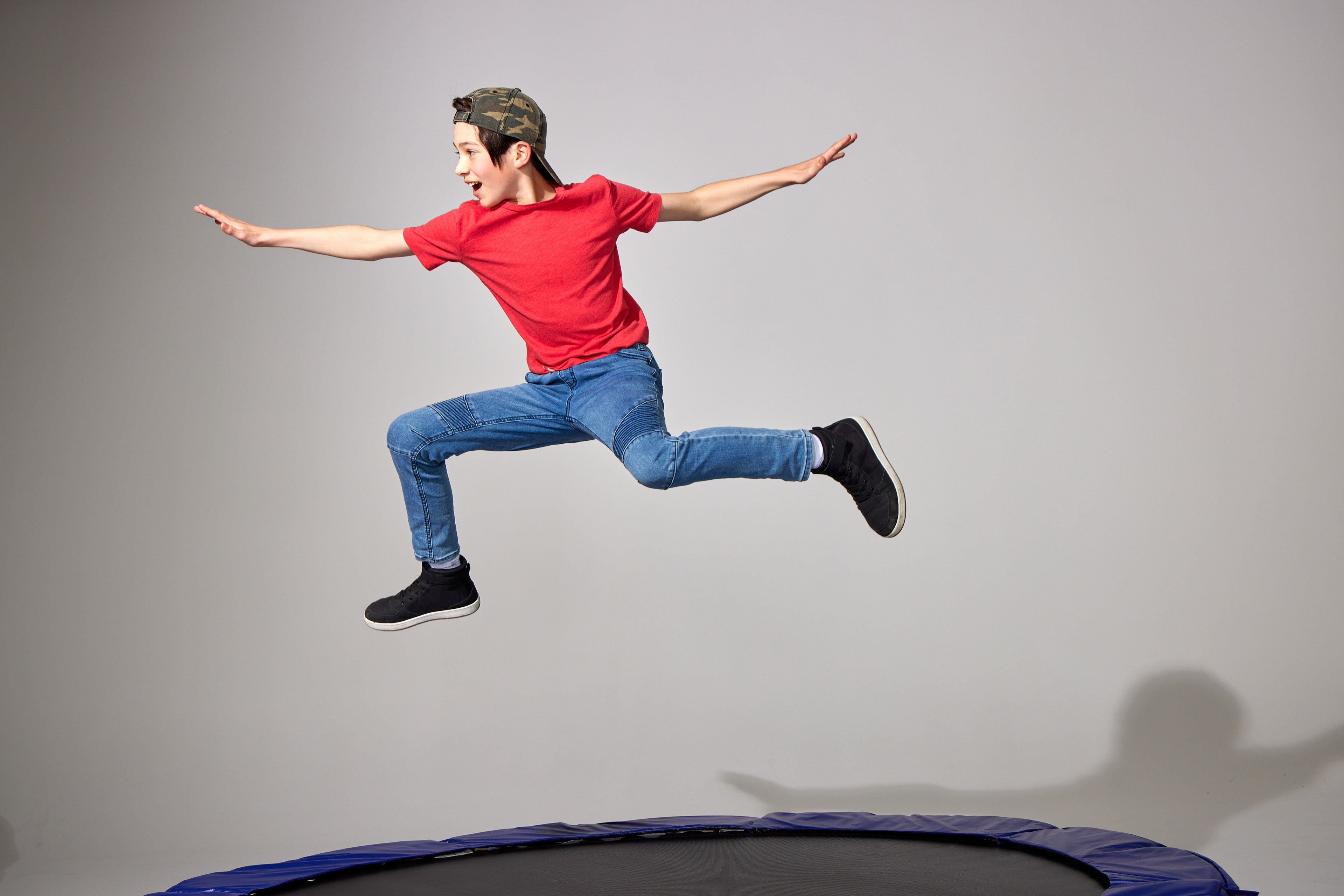
During the shoot, my priority was to make efficient decisions and devise innovative strategies to reduce costs and save time while considering several variables. For instance, to avoid tiring out the model prematurely, I aimed to capture expressive headshots before she started jumping around. Additionally, I wanted to avoid disrupting the photographer's flow by pausing for makeup and hair touch-ups. Therefore, I ensured that we took the headshots before the jumping shots. Moreover, I suggested trying the jump without the trampoline first, which saved time, money, and resources required to set it up. This approach allowed us to capture the shot without the trampoline, which enabled us to excuse the model earlier than expected.
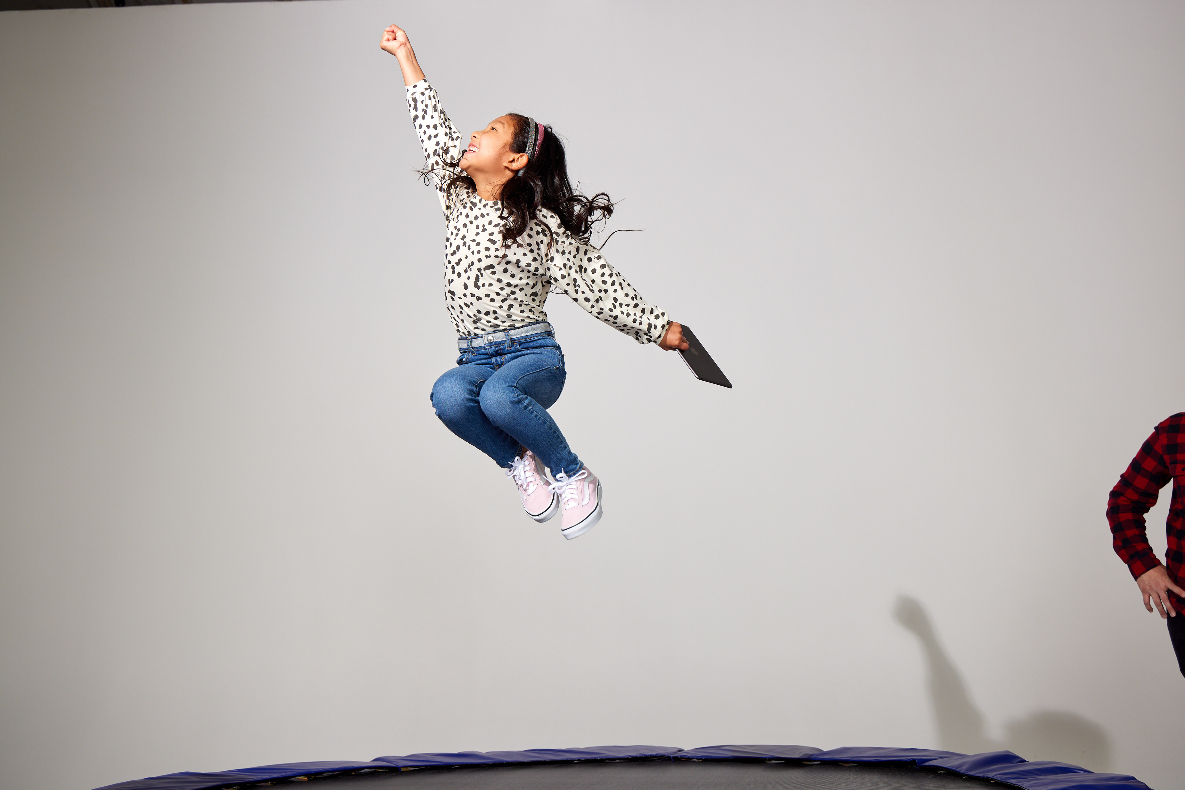
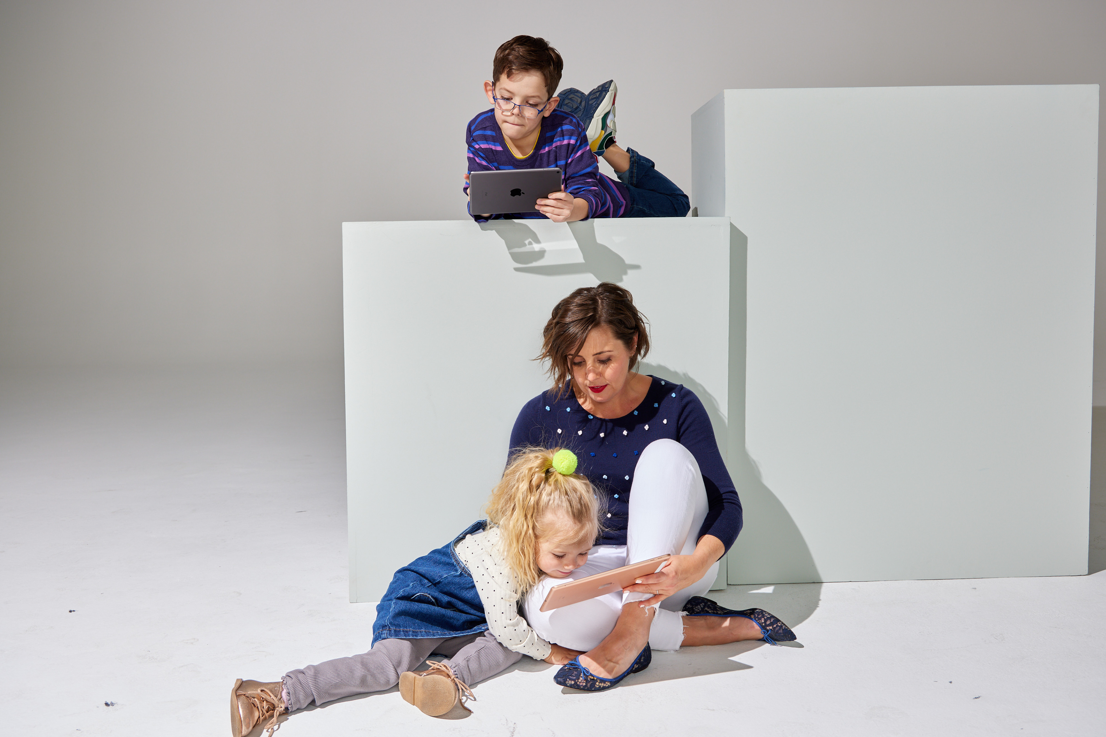
With the younger kids, I treated the trampoline as a reward for them to look forward to. I was mindful that introducing it too early would result in them wearing themselves out. As a result of this approach, we were able to capture the genuine excitement we were aiming for and keep the kids engaged till the very end.
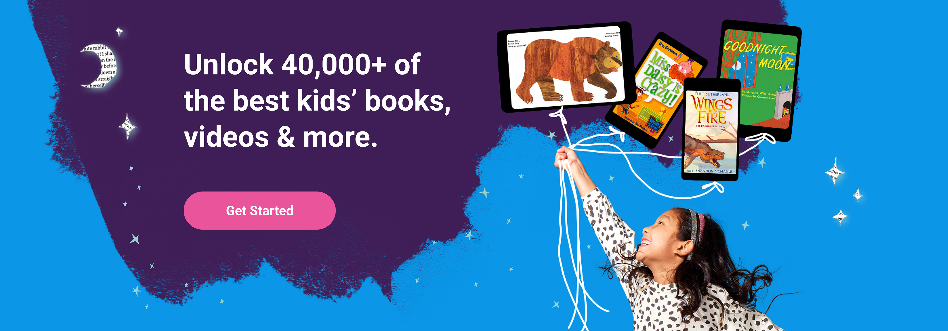
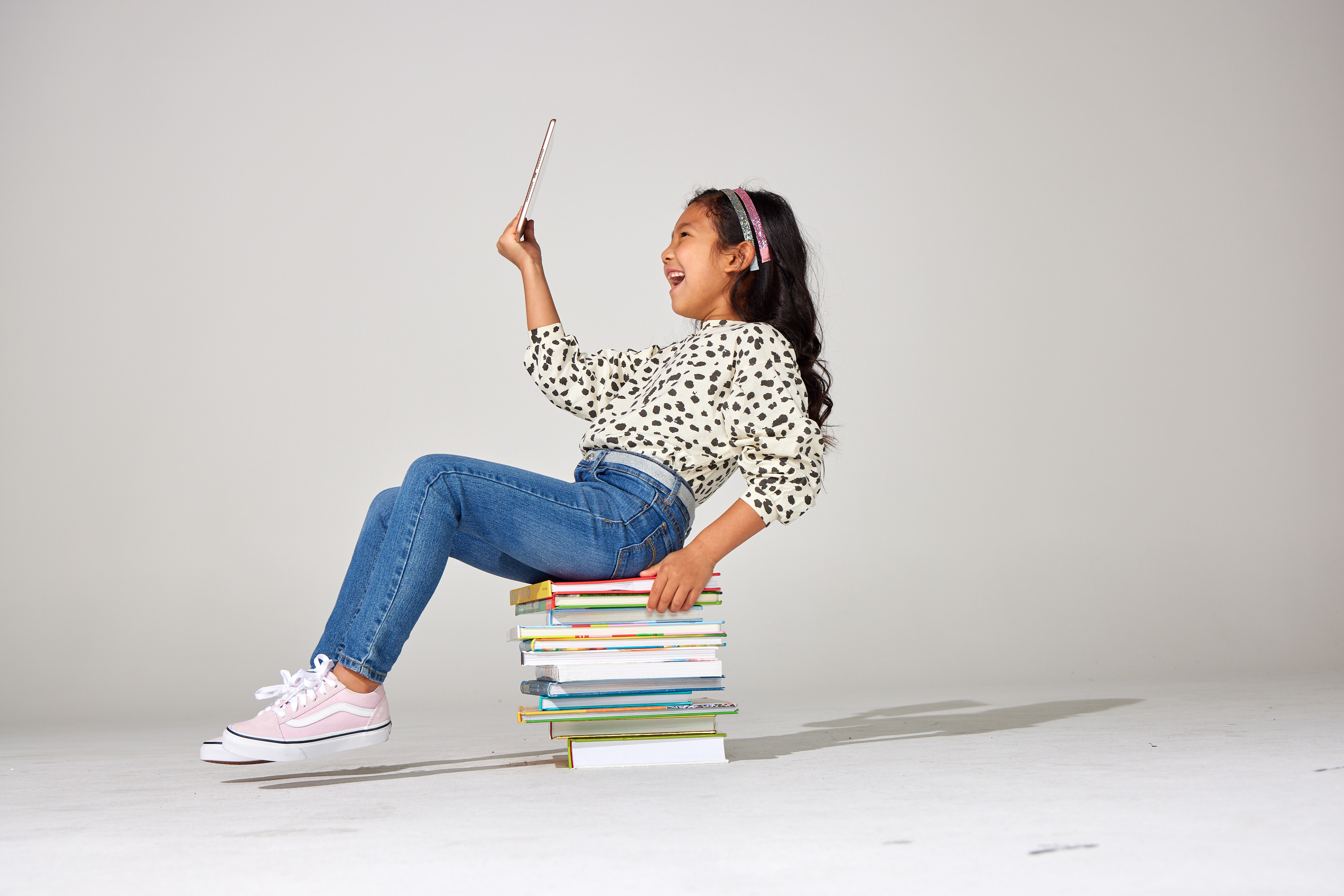
I used this pose to create an image of a book balloon which we used to show a variety of books uplifting the kid in a fun way.
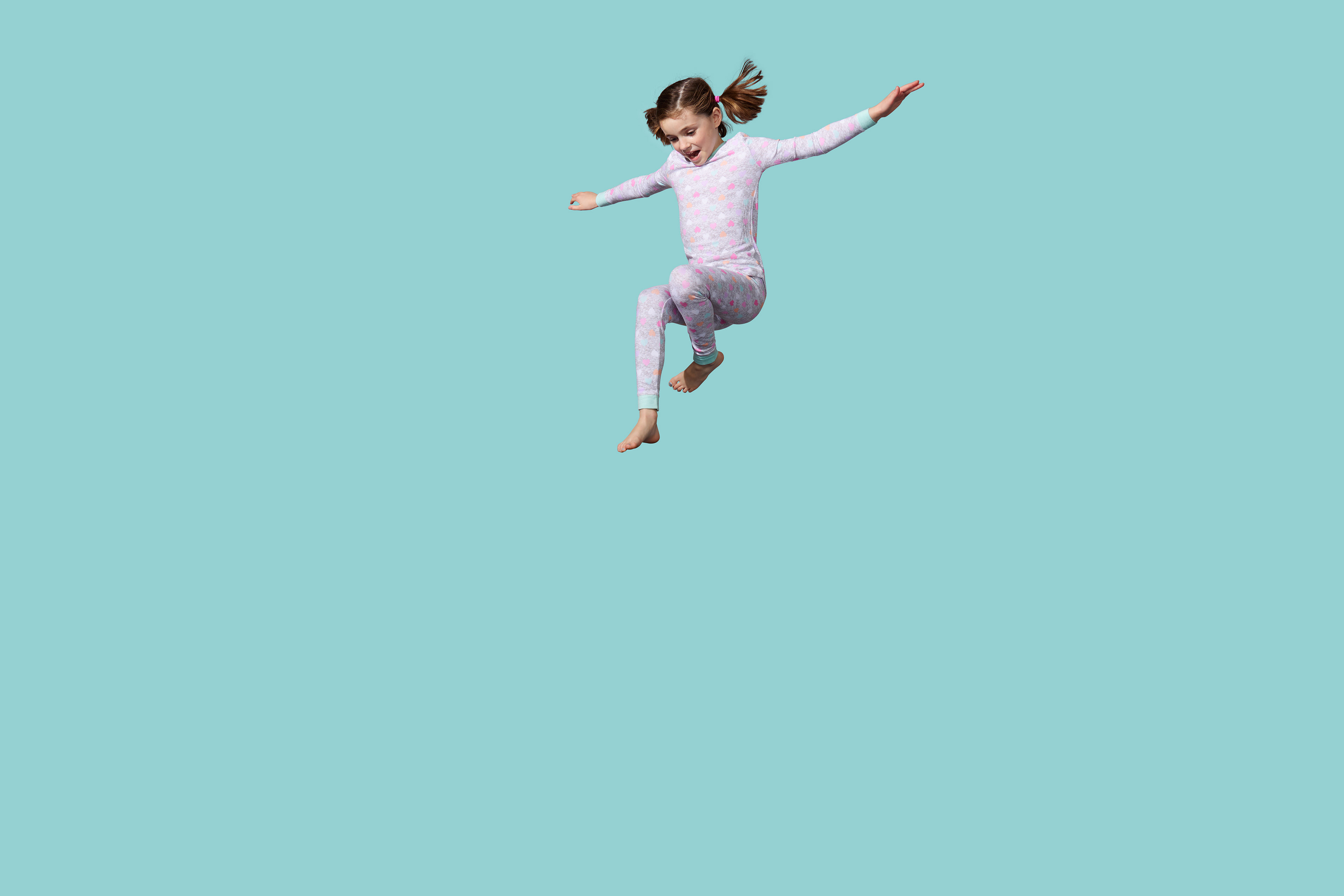
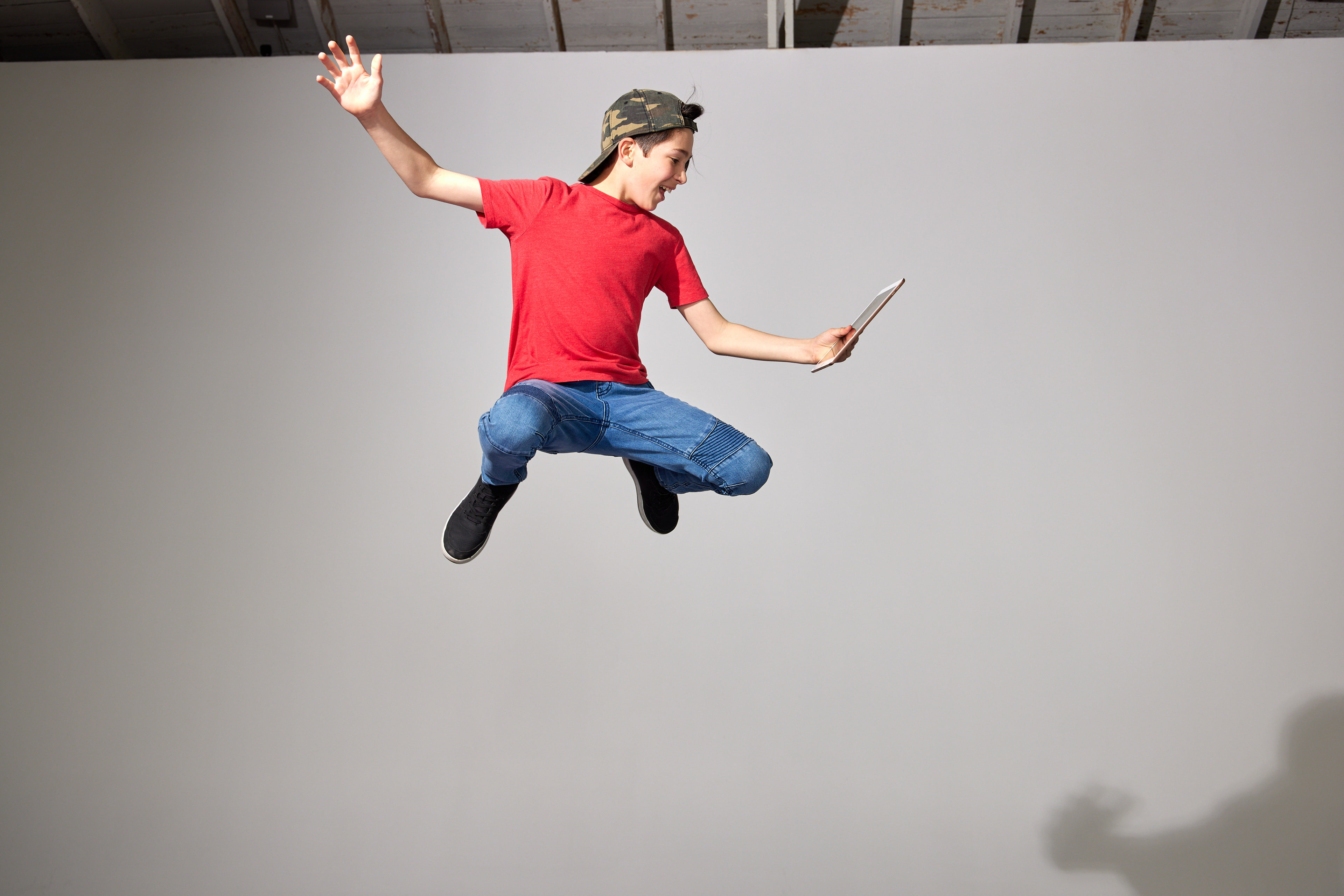
I used this jumping girl to illustrate her jumping into a book which I used in marketing materials that spoke to nighttime reading.
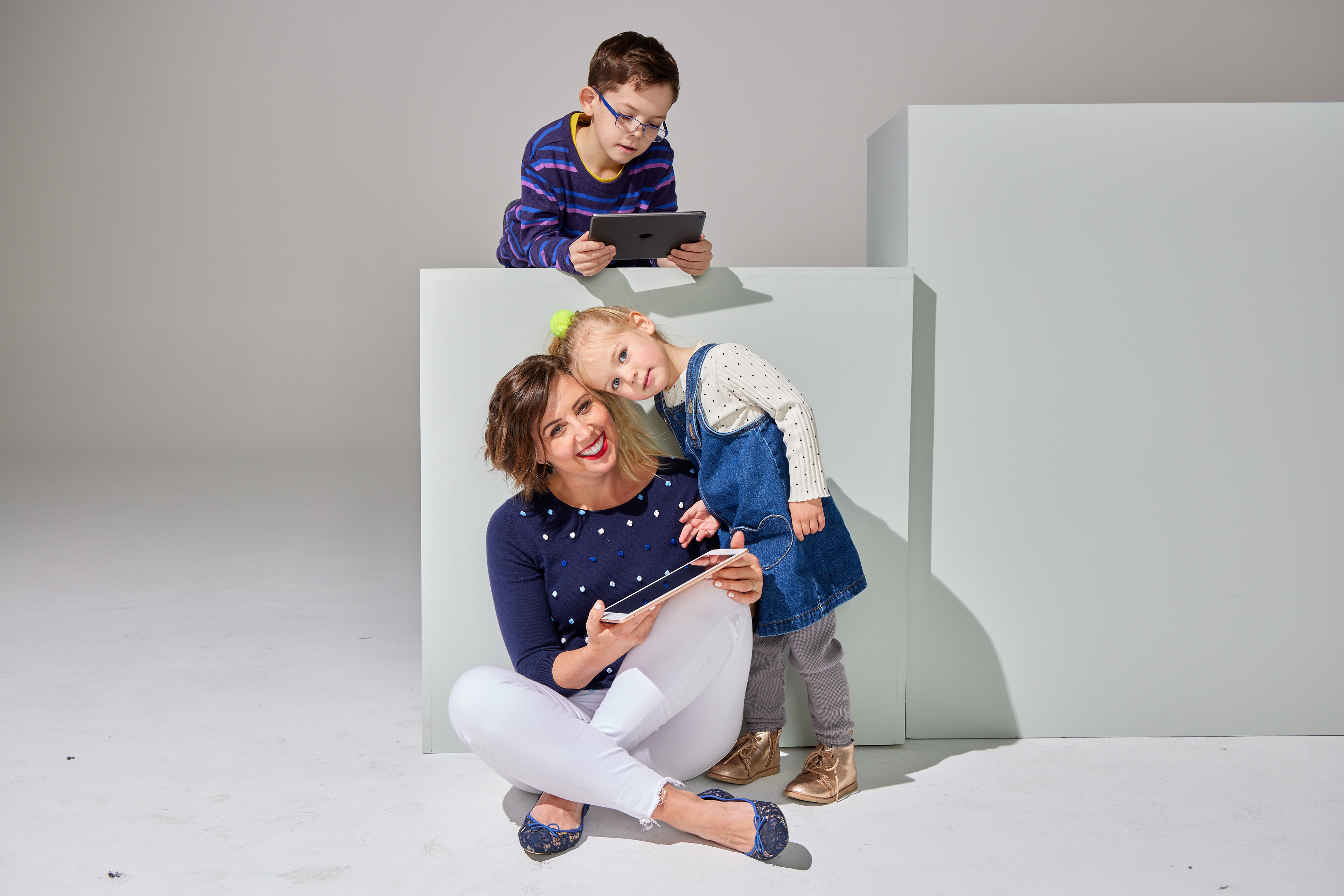
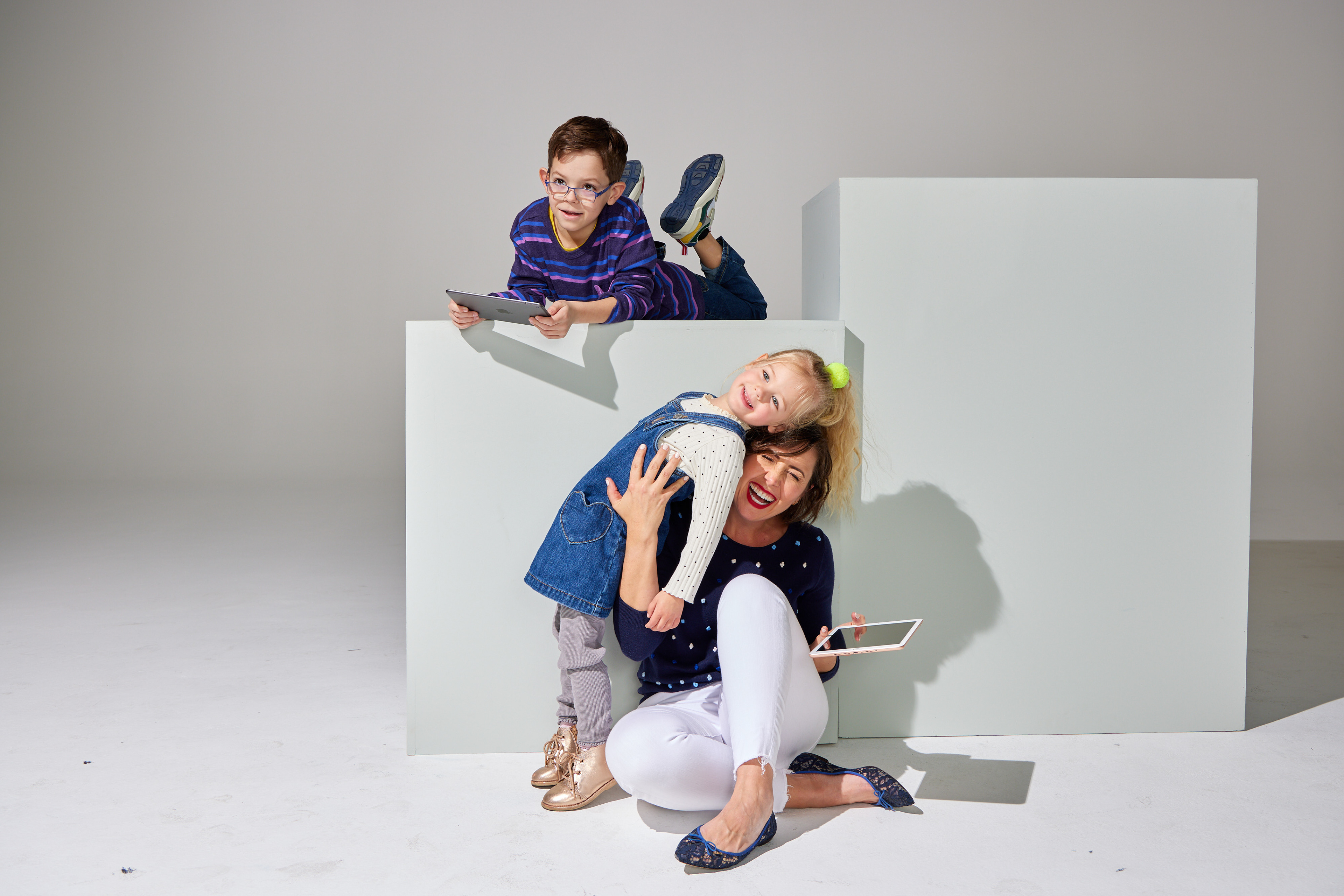
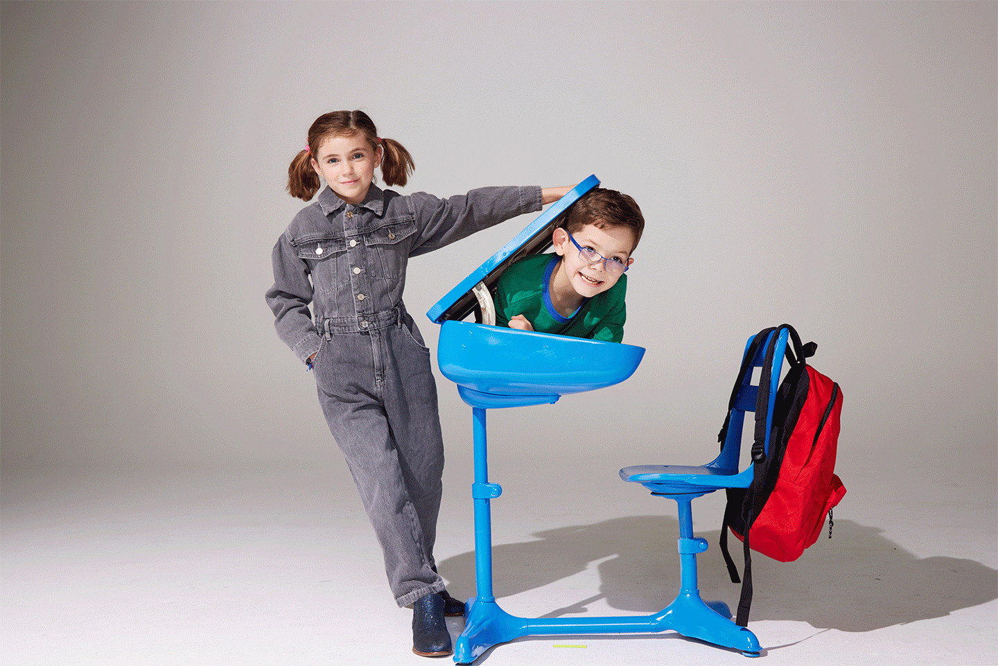
I helped persuade many of our employees with kids to participate and we got great photos of families with kids of all ages using the product.
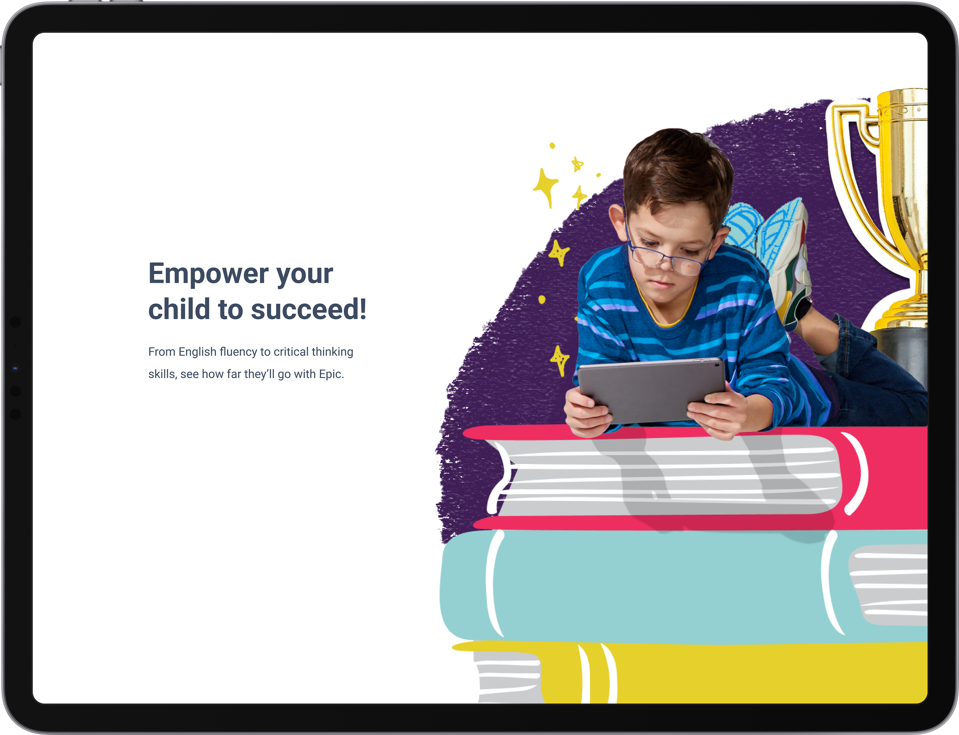
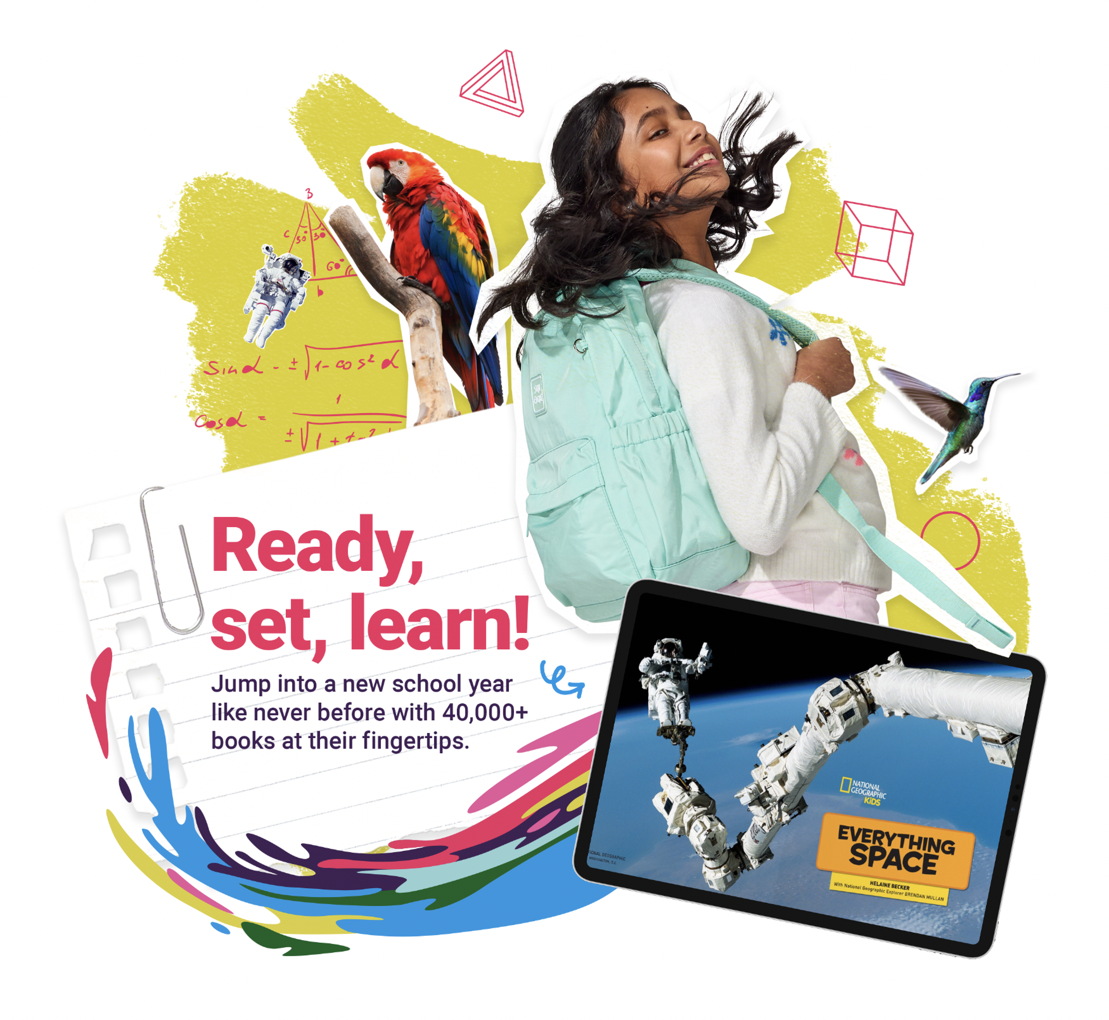
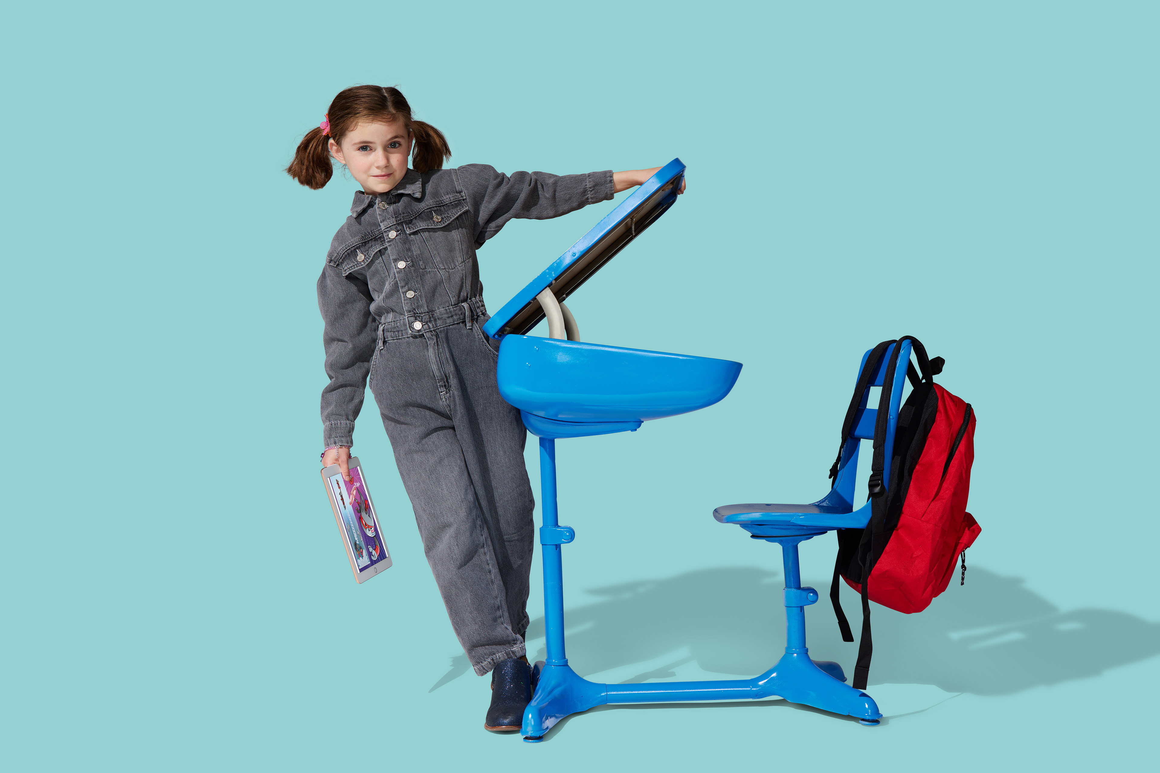
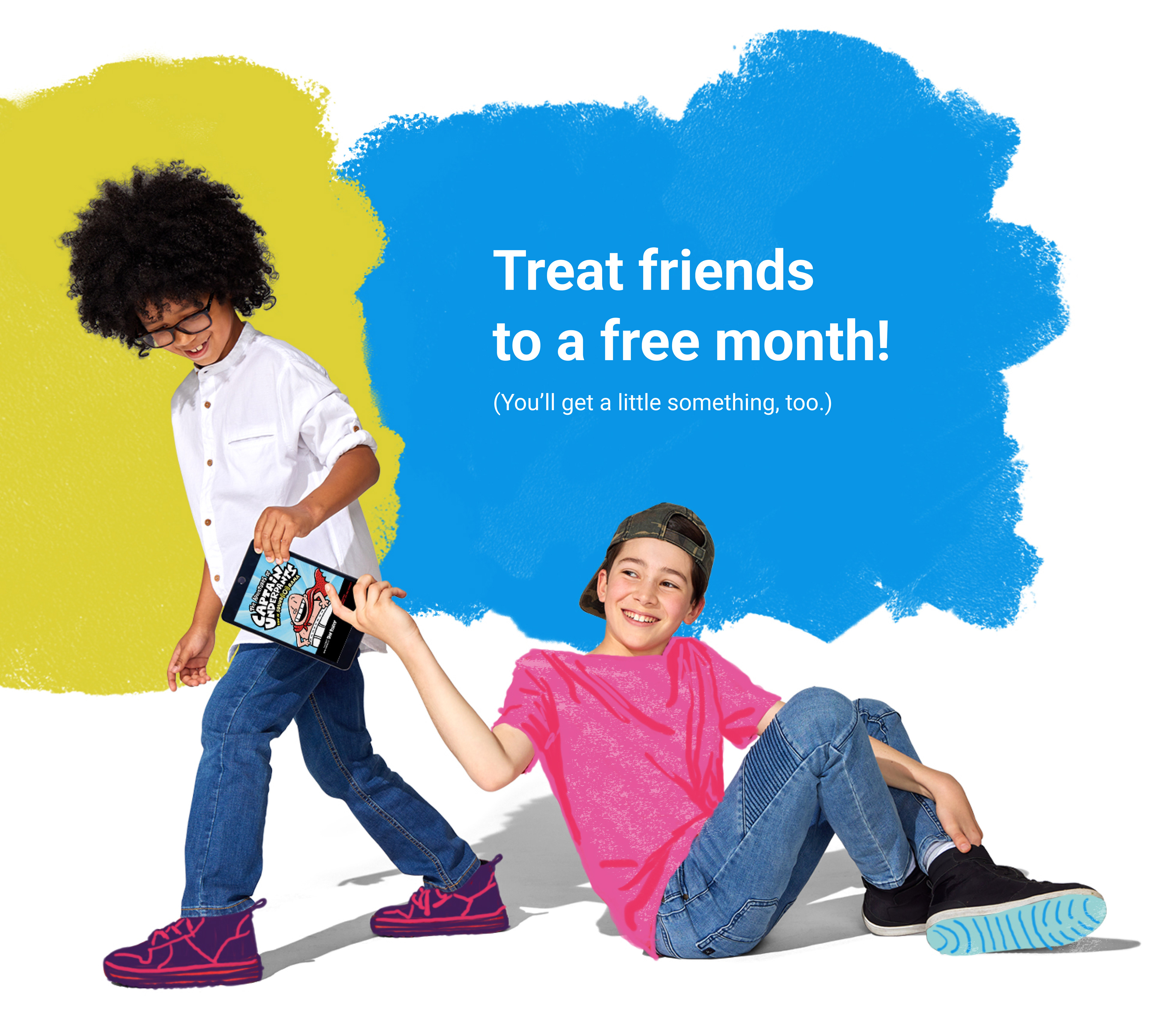
Our team used the collage style, doodle and color swoosh that I helped establish in our new brand guidelines to tie this photo to a back to school campaign.
During the photo shoot, I provided the photographer with guidance on the angles and poses to capture, and we experimented with lighting to ensure a consistent look and feel. Once the shoot was completed, I continued to oversee the project during post-production and asset management. I collaborated with the retoucher, directing them on which book covers, logos, and colors to use, as well as how to set up the files for easy manipulation by other designers. By providing clear direction throughout the project, we were able to produce high-quality assets that could be easily adapted for a variety of uses.

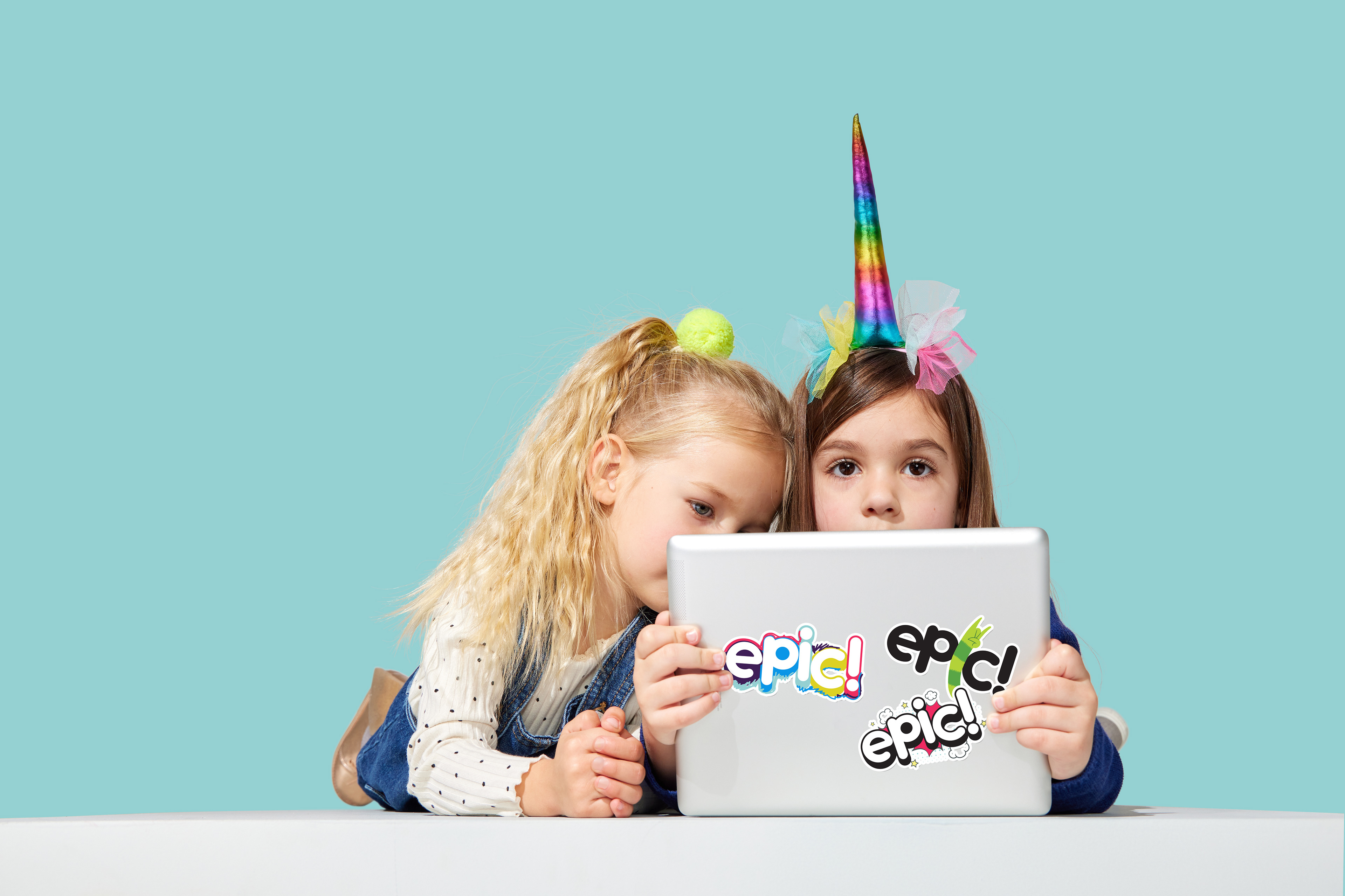
This is a great example of the stickers from our brand book coming to life.

I created this gif for our home page to show how read to me books work on our app.
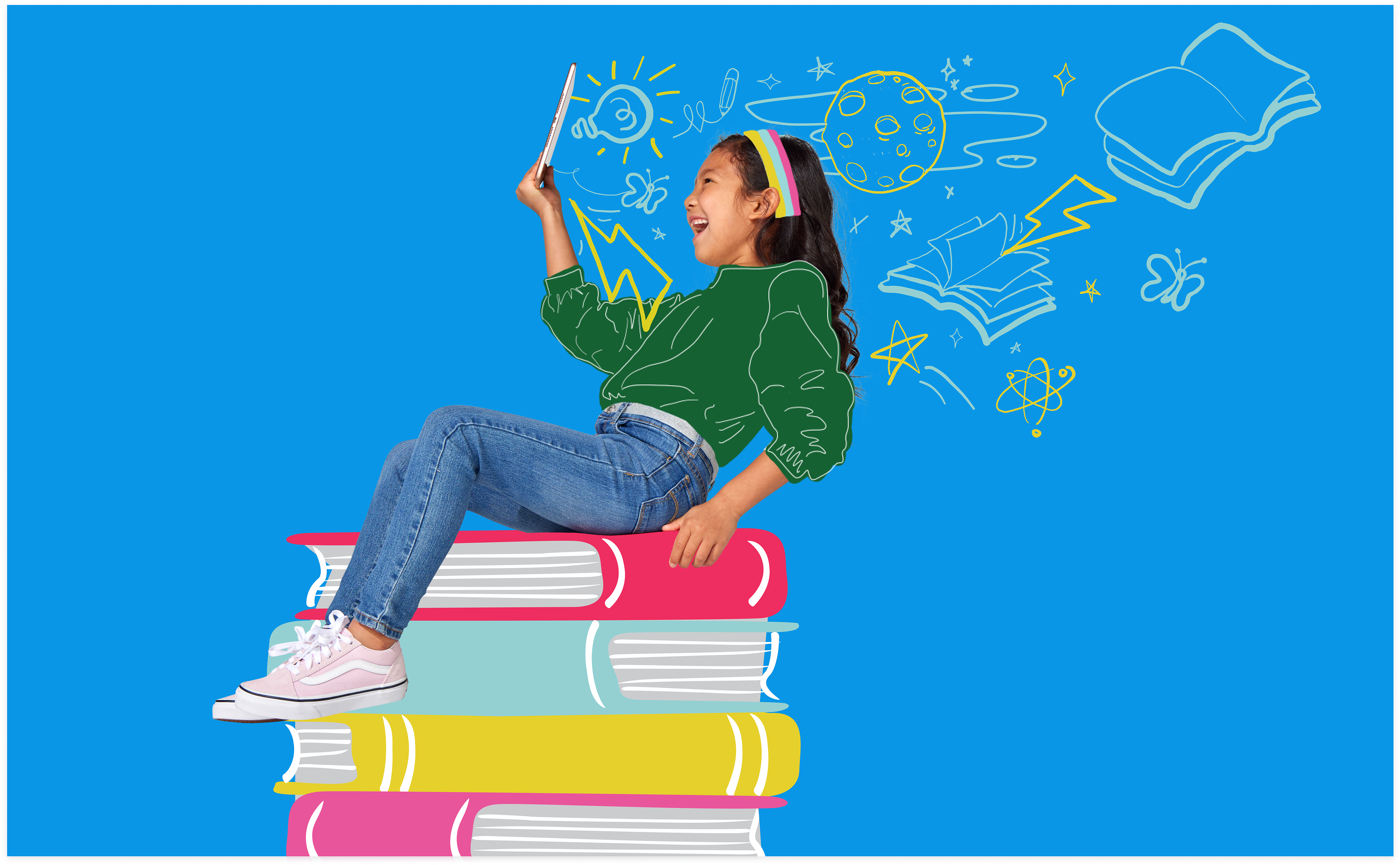
With this illustration I played with scale in order to emphasize reading. I made these doodles as a way to highlight some of the topics like space that she might find on Epic.
For the Olympics campaign I made a selection of photos from this shoot and assigned corresponding sports to each. Then each member of our team chose one to illustrate.
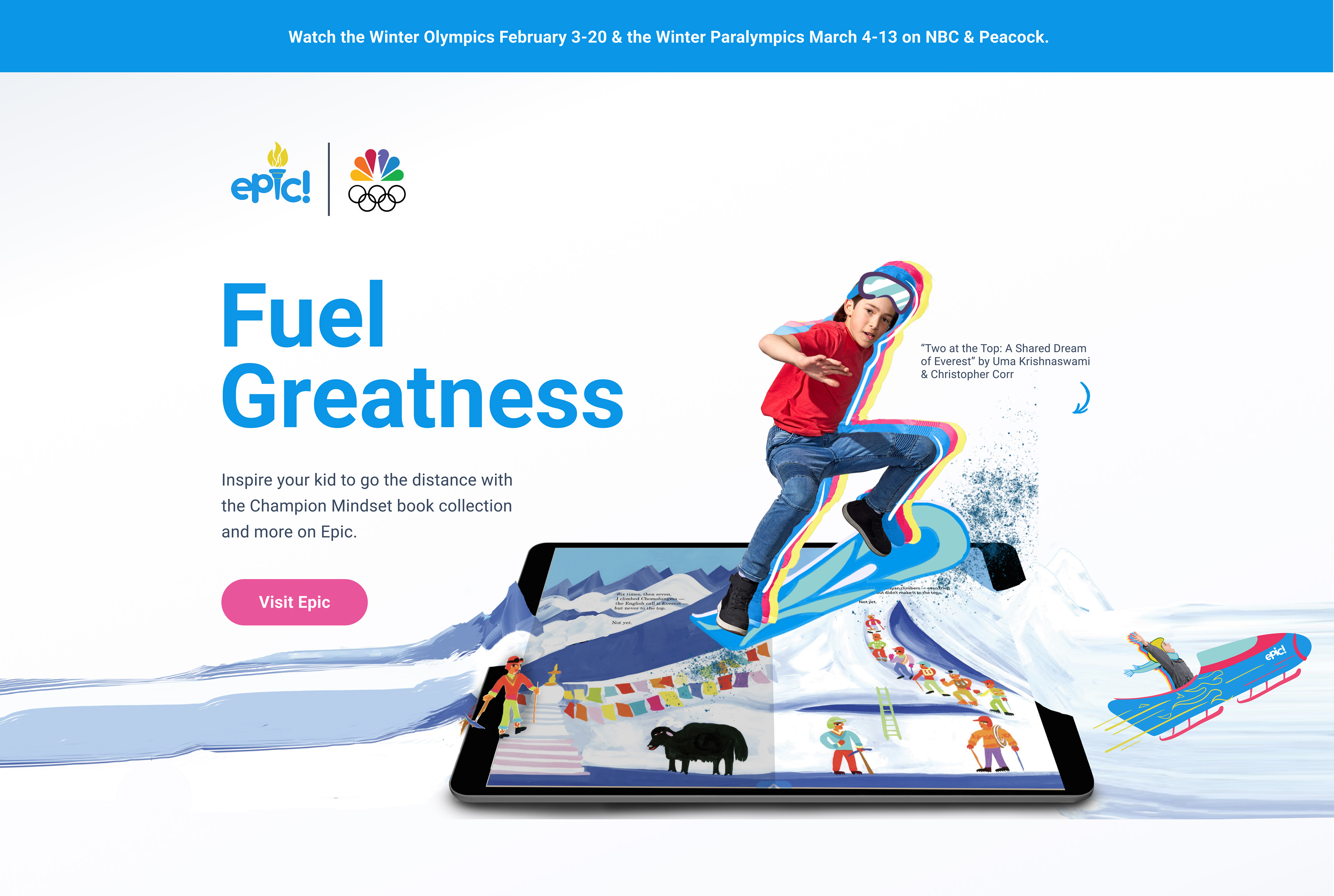
Here is the header for the olympics landing page that I created in partnership with NBC.
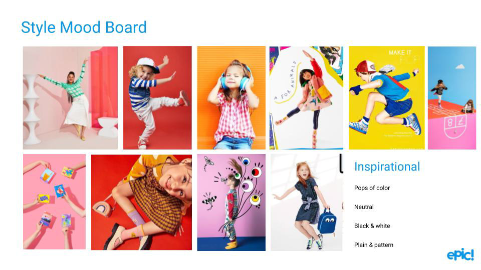
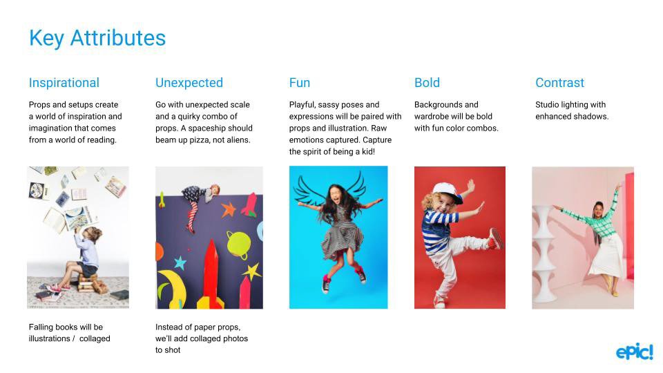
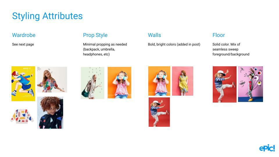
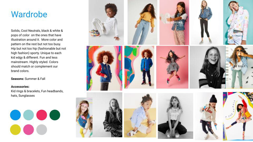
Mood Boards
In planning for this shoot, I took the initiative to communicate my vision to the photographer, set designers, talent agency, producer, and wardrobe stylists in advance. To ensure everyone was on the same page, I created directional mood boards which were shared with the team prior to the shoot. This allowed us to review and discuss the vision in detail, addressing any questions or concerns that arose. I led a meeting where I presented these boards, giving both our team and their team the chance to brainstorm solutions and hammer out details ahead of time. Additionally, I created shot lists that aligned with our business goals, ensuring that our efforts were purposeful and intentional.