This spread marked the beginning of my efforts to visually conceptualize how the brand refresh could be portrayed in a layout. The exploration of this spread helped establish the level of attitude, confidence and quirkiness that ultimately became the defining characteristics of the new brand identity. This pivotal stage served as the foundation for subsequent photoshoots and illustrated final assets, enabling us to fully capture and express the spirit of the brand's new image.
As part of this refresh, a crucial aspect was revamping the way we showcase our app screens and book covers, with the goal of presenting them in a more modernized fashion. The objective was to draw attention to the books while emphasizing the element of enjoyment for children by visually depicting the story through the use of doodles and illustrations, rather than relying solely on written descriptions.
This was done in collaboration with our in-house copywriter in order to capture our new voice and tone. I used rough brushstrokes in order to capture a childlike spirit.
This page illustrates how our various audiences interact both independently and in conjunction with one another.
I directed the creation of this dynamic swirl design which we used to link characters from various original series together. The new branded colors used in the swirl came from an analysis of the colors used in some of our most popular originals series. We used the swirl as a way to show excitement, to connect kids to books and to draw the eye to what we wanted to call attention to in marketing promotions and in the product. The swirl itself became a main building block. 
The collage style ended up being a really fun and effective way to show child like spirit and bring different concepts together this is just one example of how we employed collage to bring together some of our principles. The idea came from stickers on notebooks.

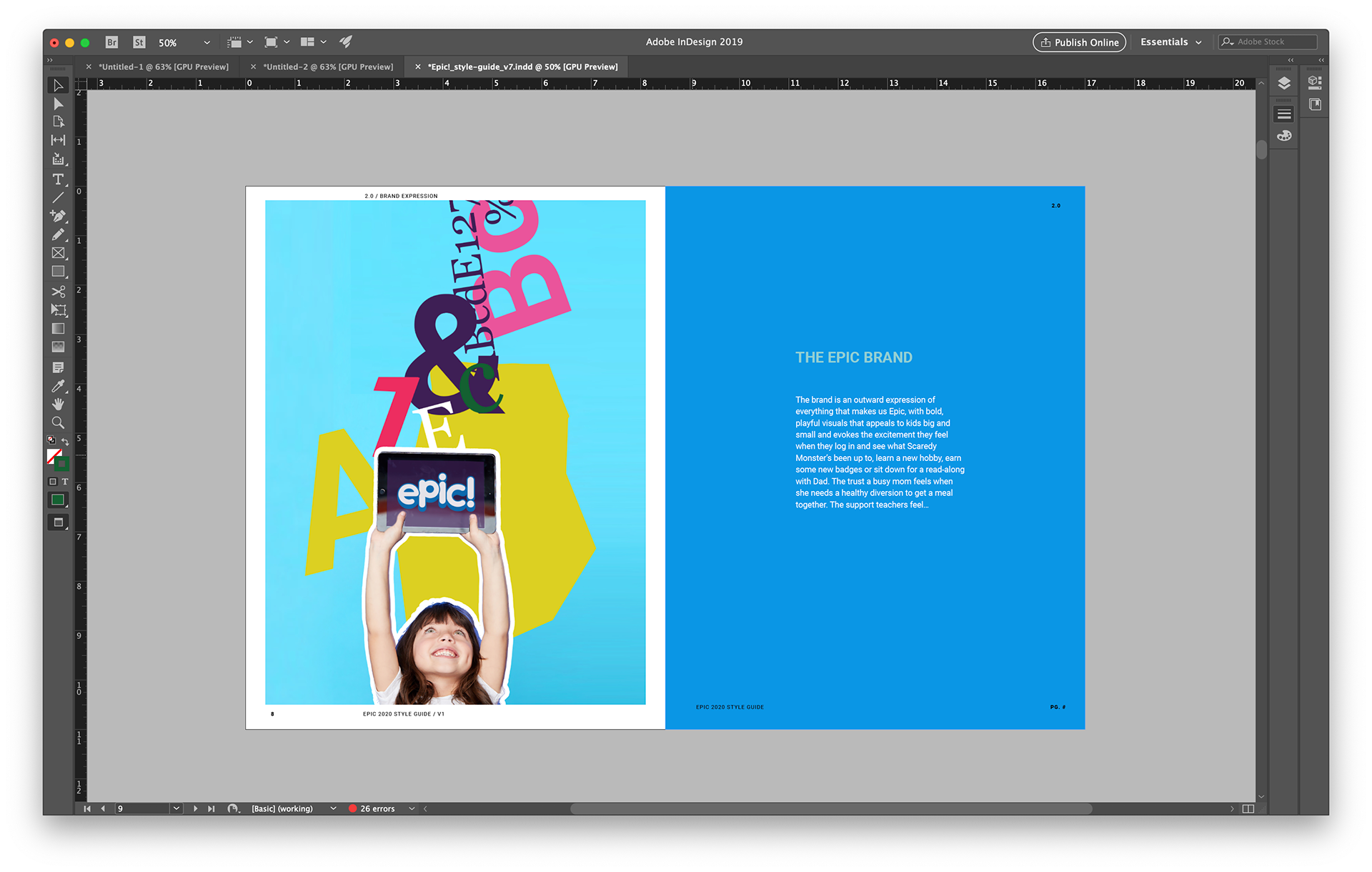
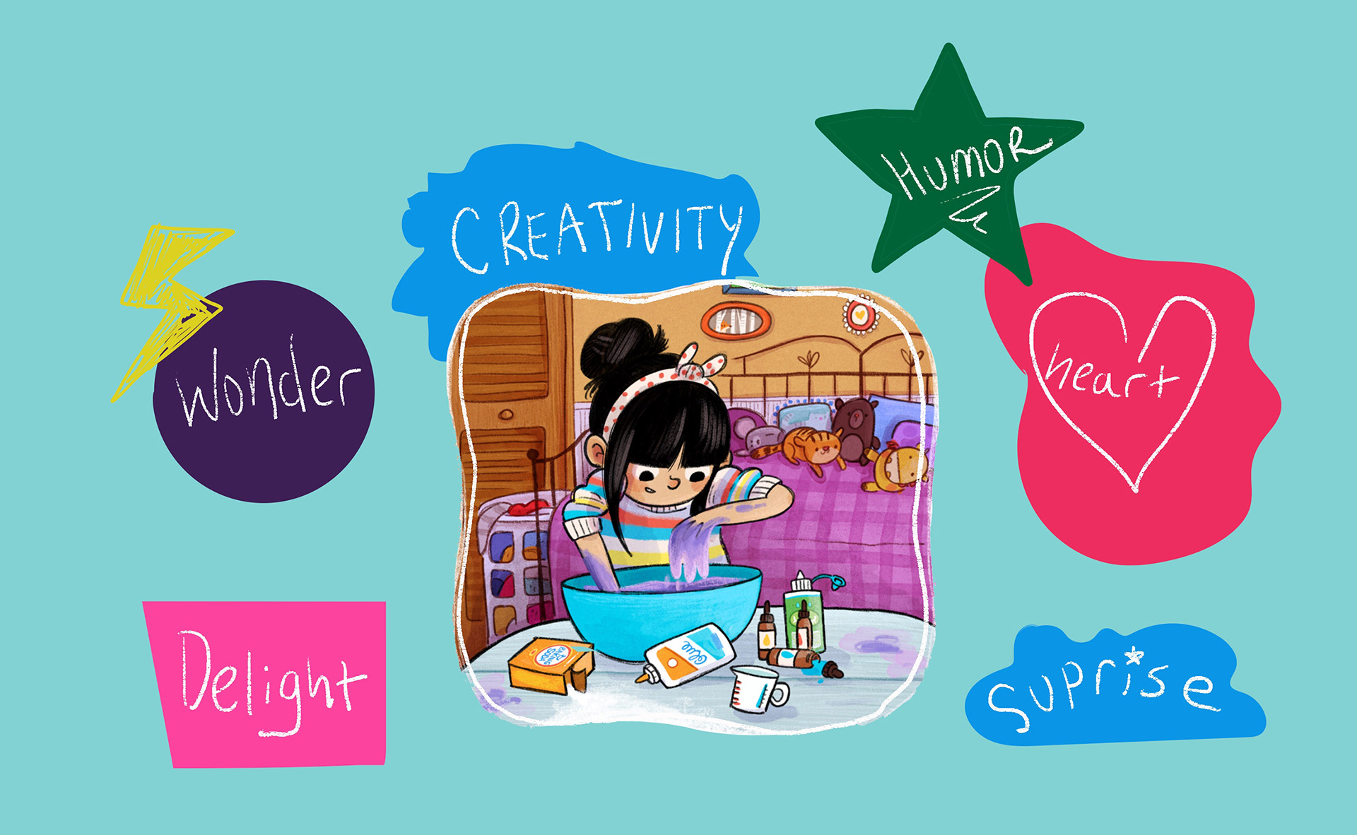
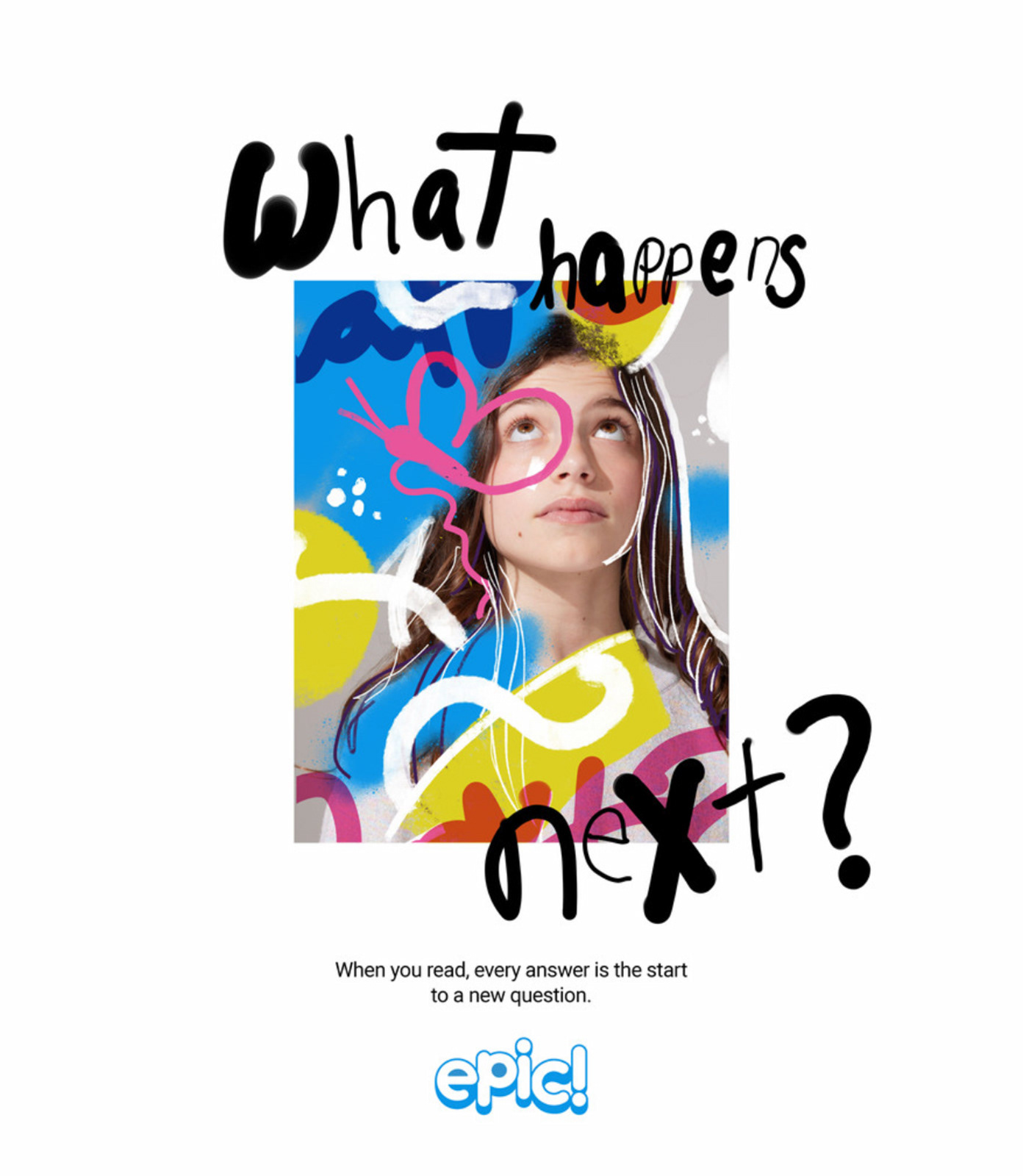
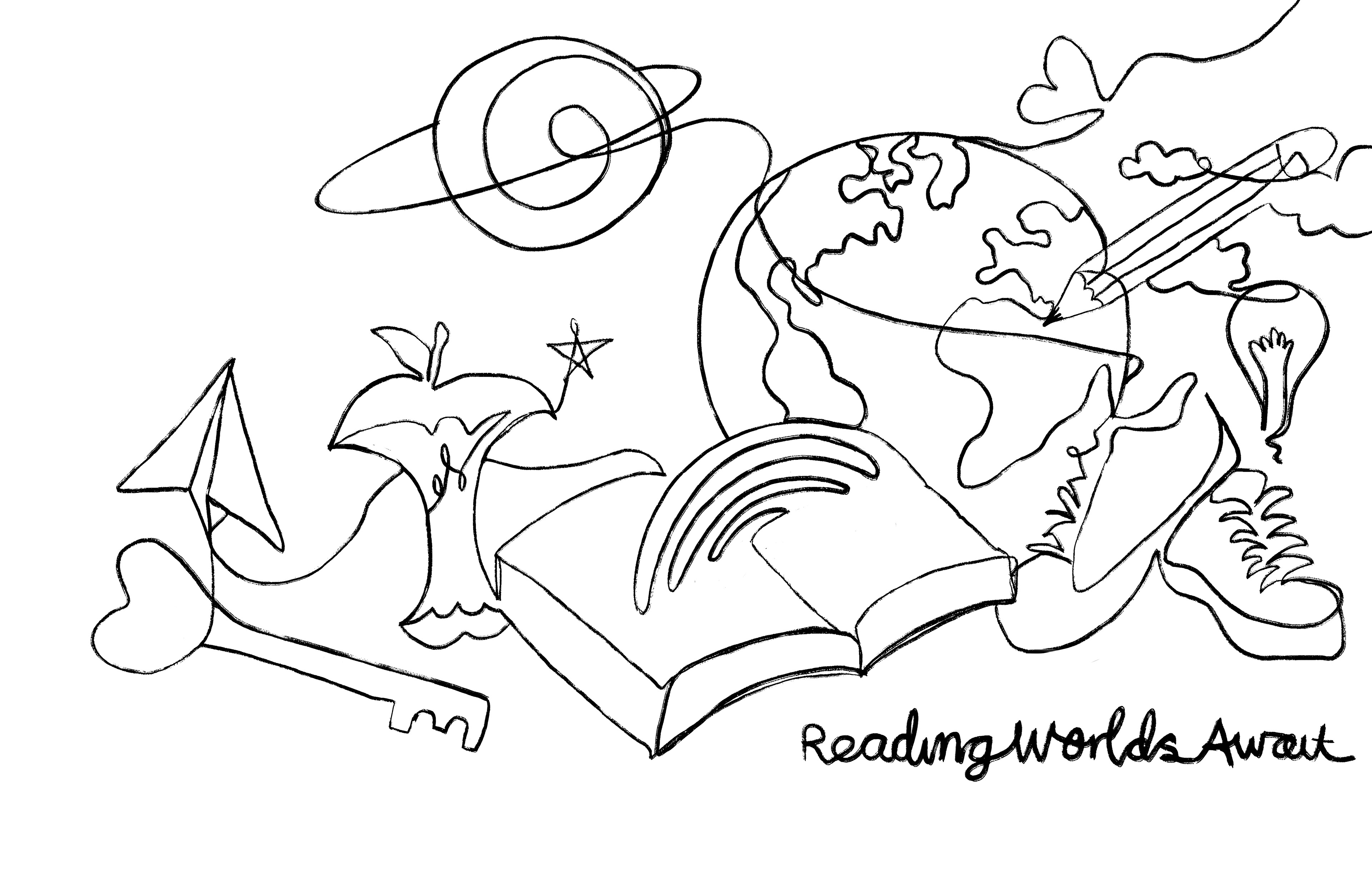
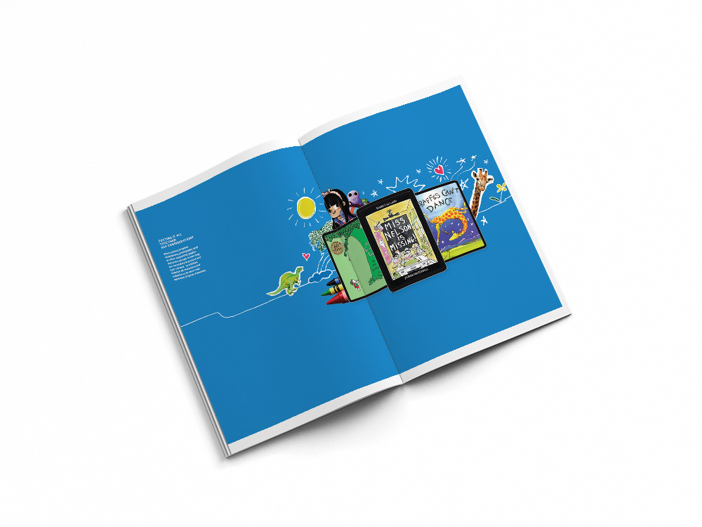
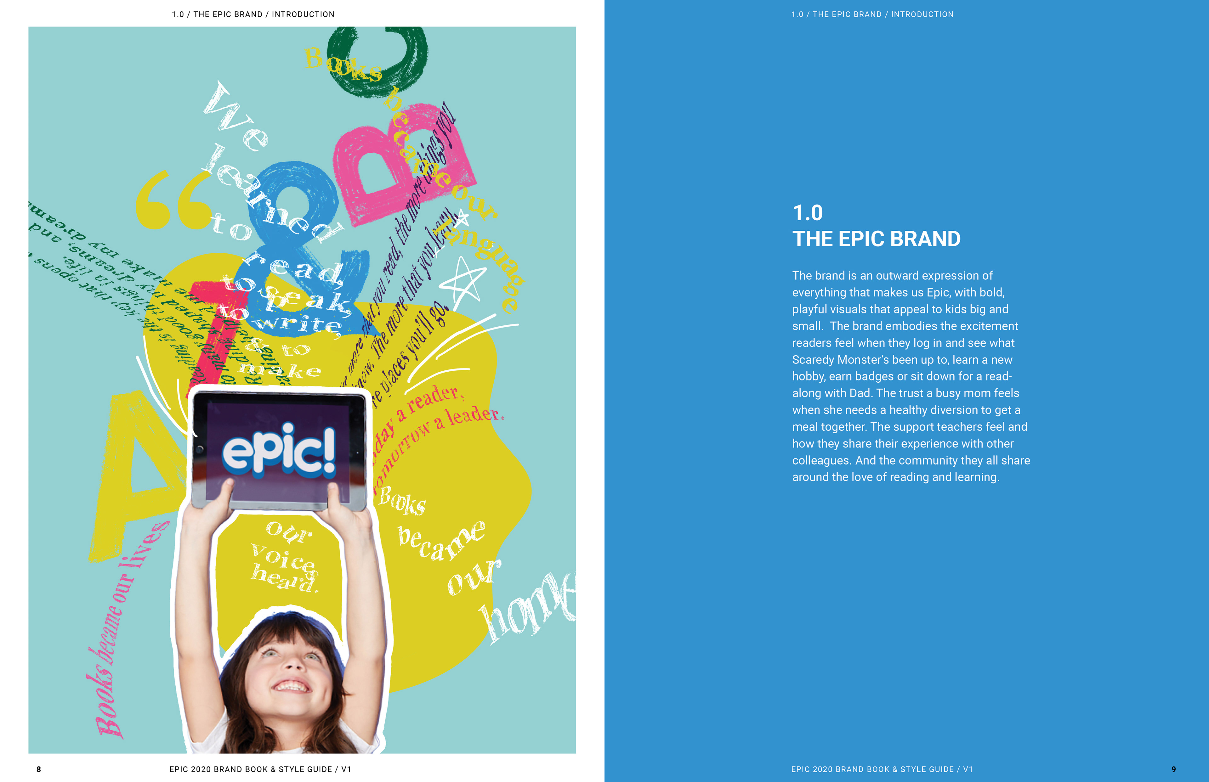
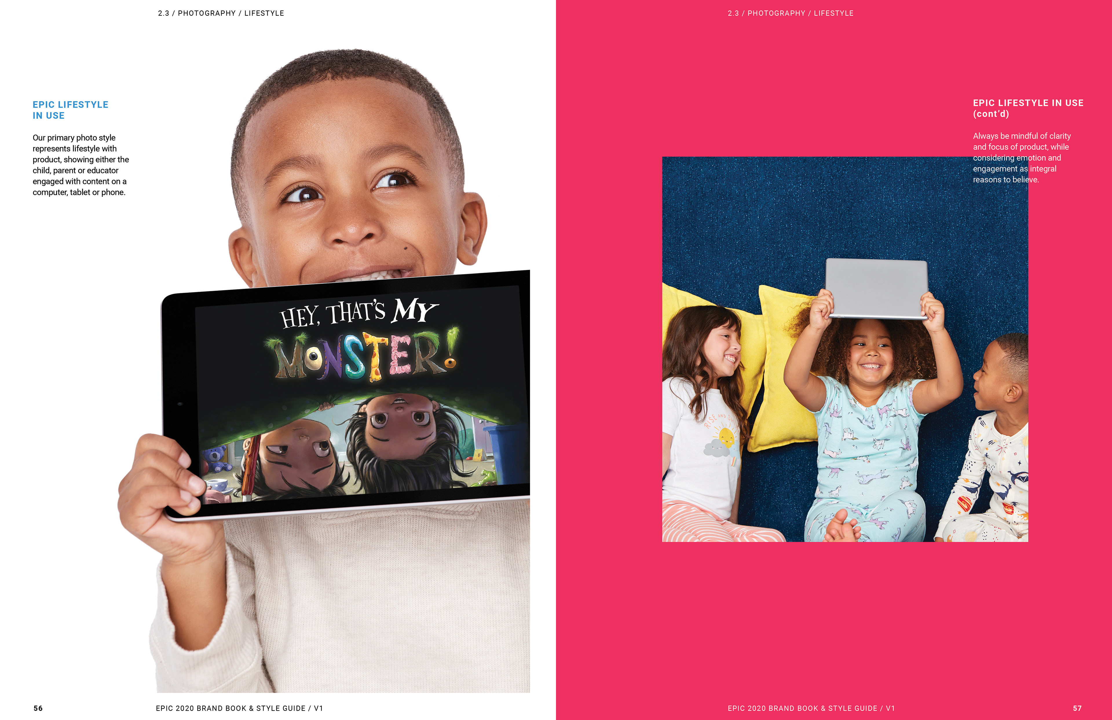
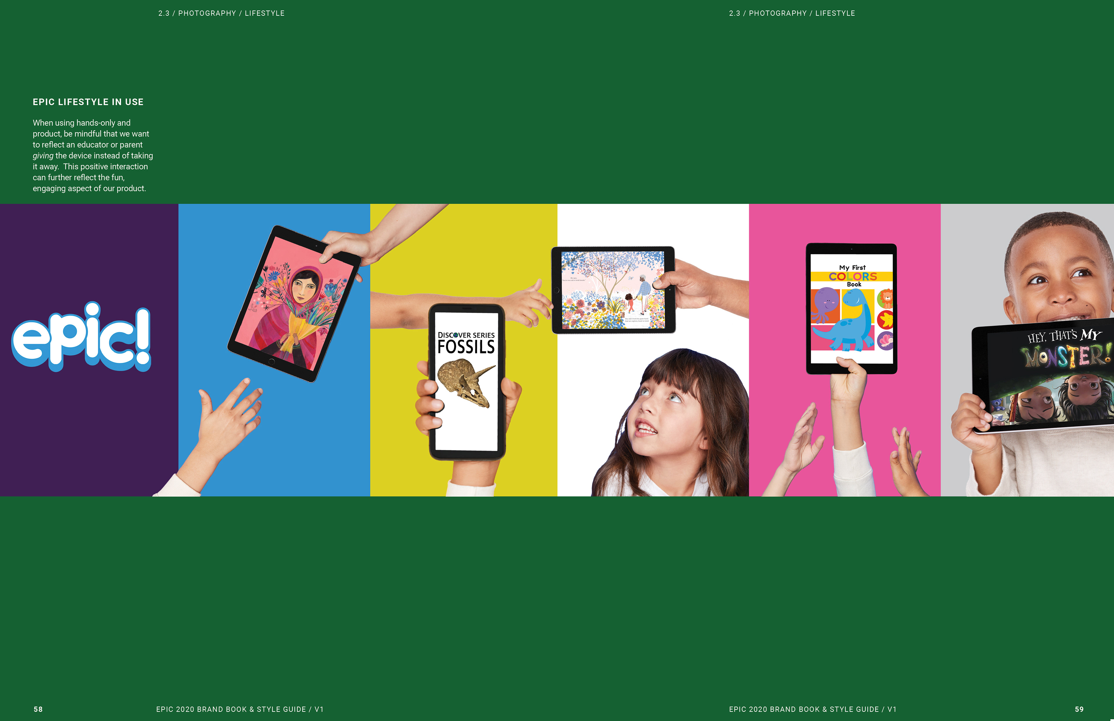
This pose ended up being an effective way to highlight books and show captivated kids full of wonder, both looking up physically and also in a less literal sense towards their dreams and goals. One of the ways I balanced the chaos of the fun childlike messiness and a streamlined educational brand is by tracing the brand fonts on my iPad.

These next 3 images tell who we as a brand while showing different ways our font can live with characters, lifestyle photography and with illustration.
When re-designing the logo I felt it was important to keep the old exclamation point because it visually and in search separated us from other brands with the name of epic. Additionally I believed that it helped to capture the childlike spirit of our brand. To take that spirit one step forward we built the logo to be flexible so that we could alter it for different promotions. Although I myself didn’t design the logo I had a heavy hand in the decision to keep the exclamation point. I also helped refine it for legibility and helped make alternate versions.

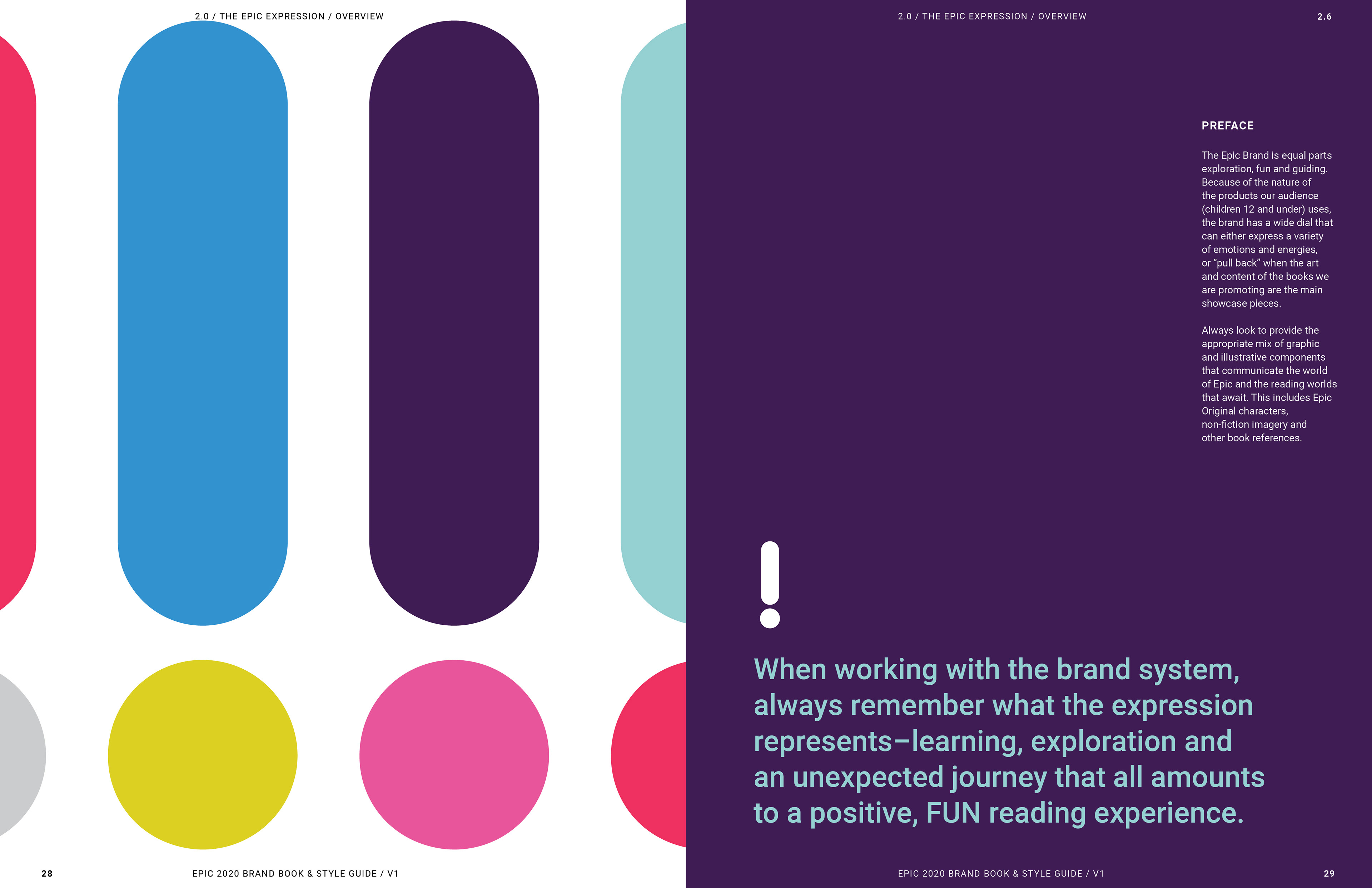
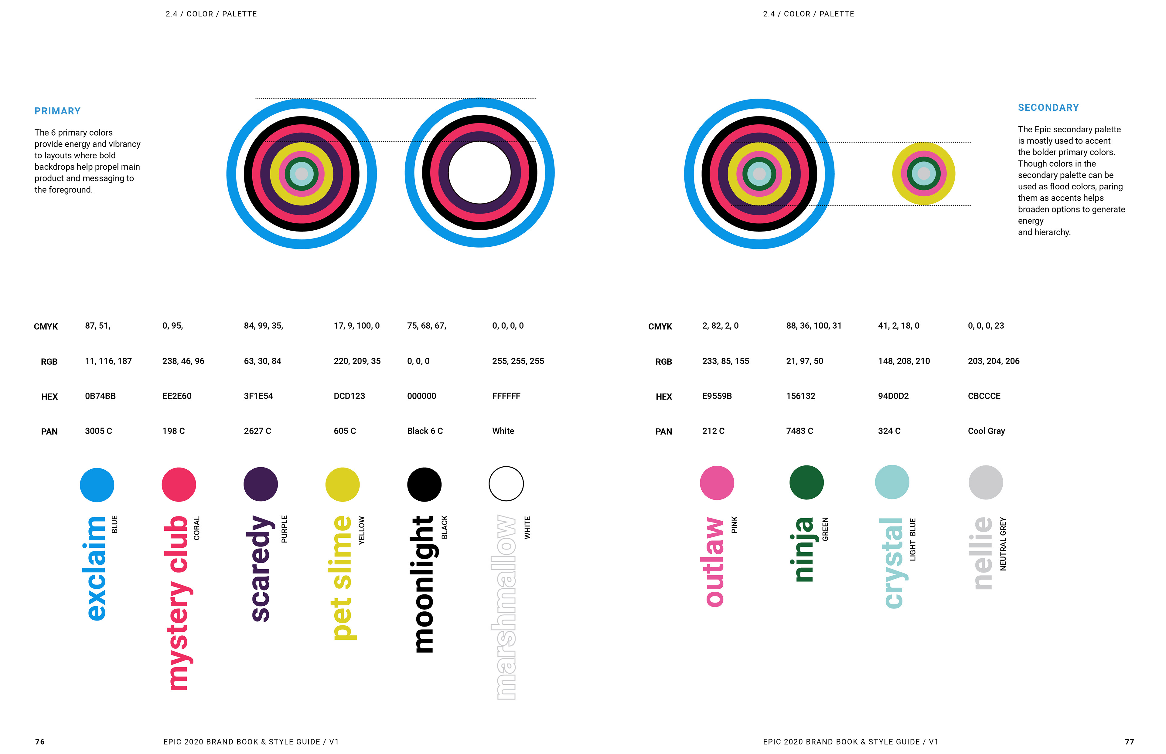
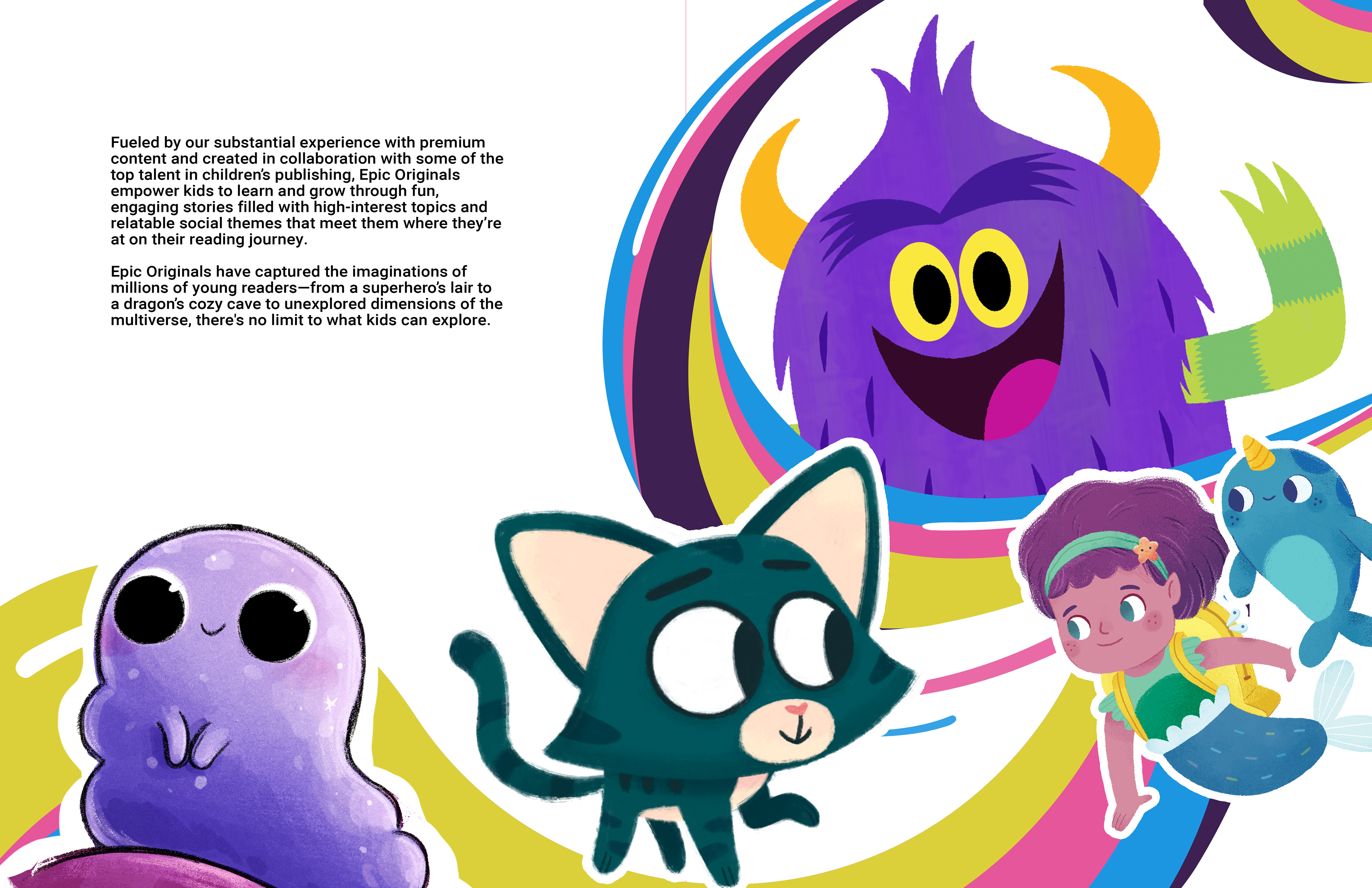
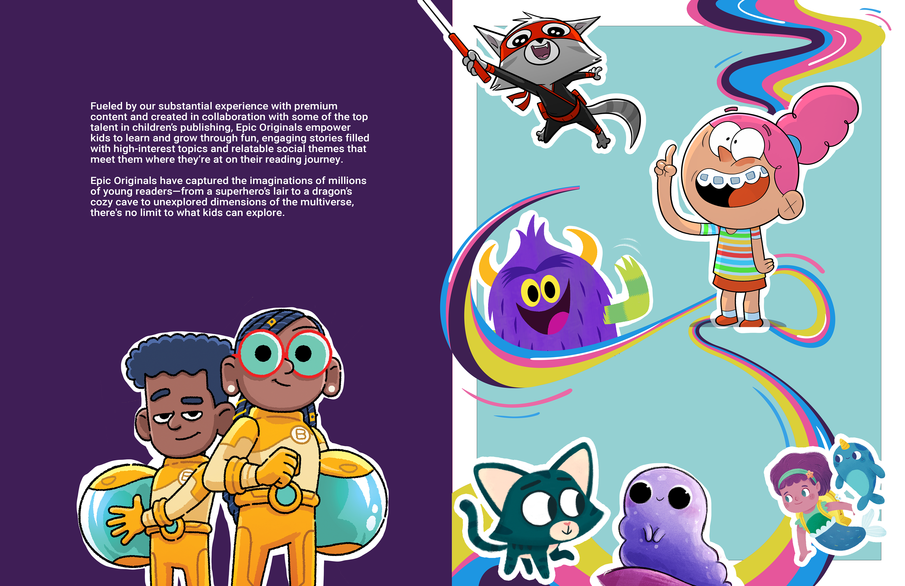
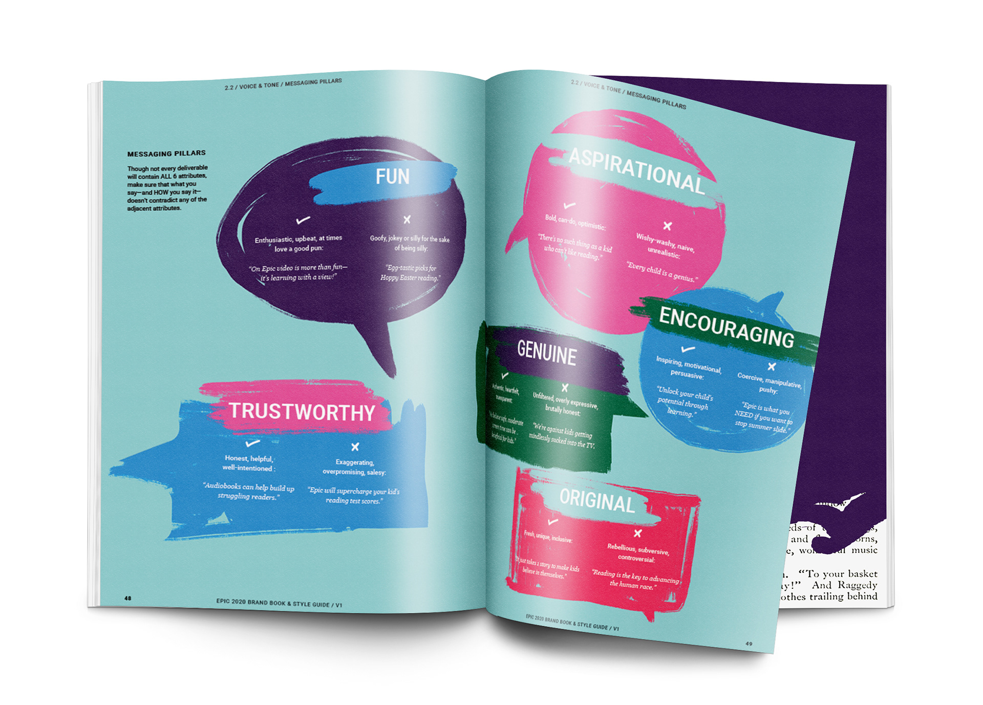
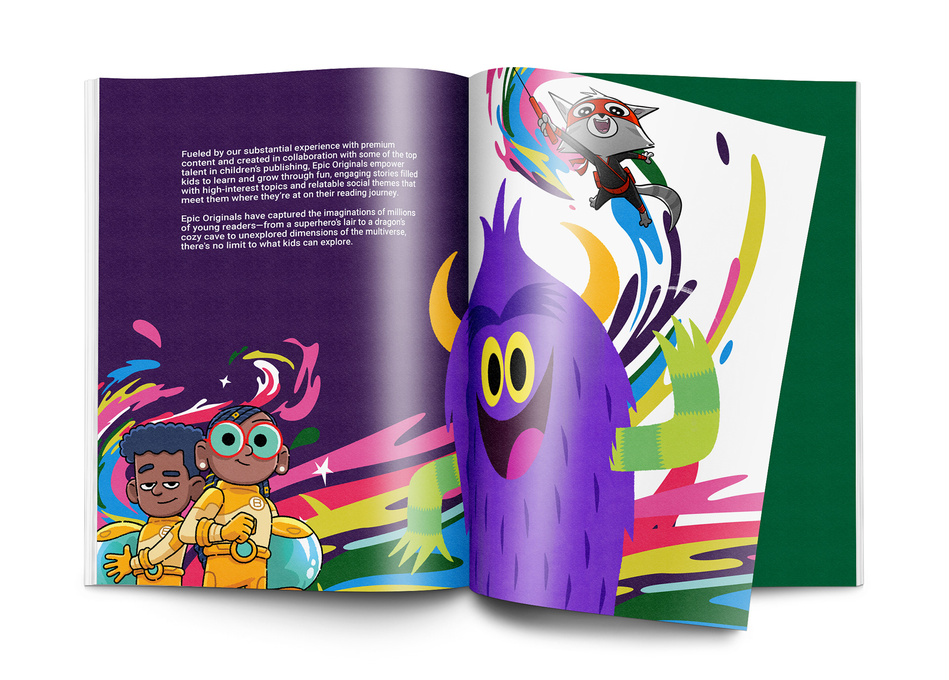
I worked collaboratively with the creative director and the in-house originals publishing team to select colors from our most popular originals series and name them after our most popular originals series and characters.

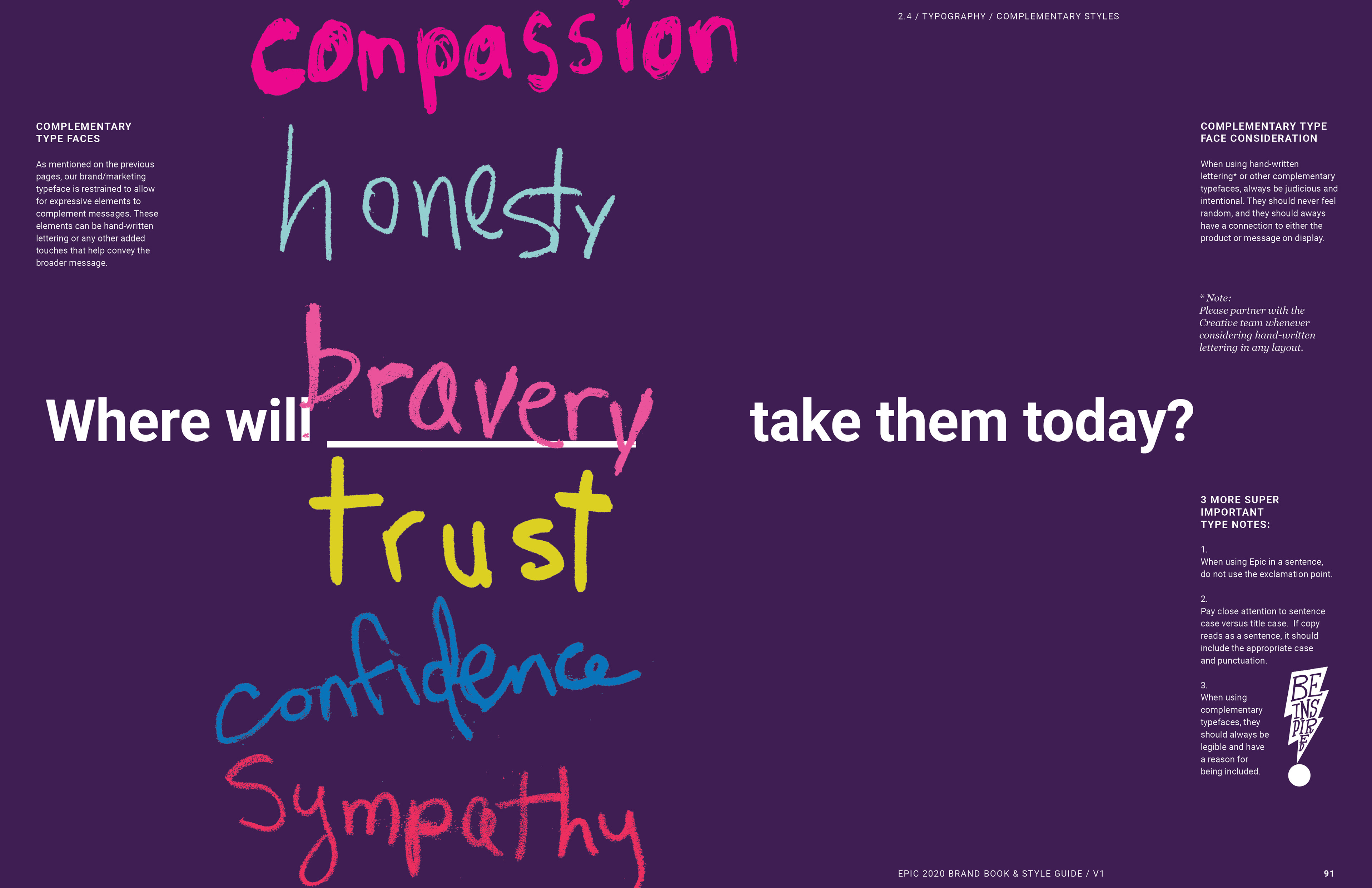
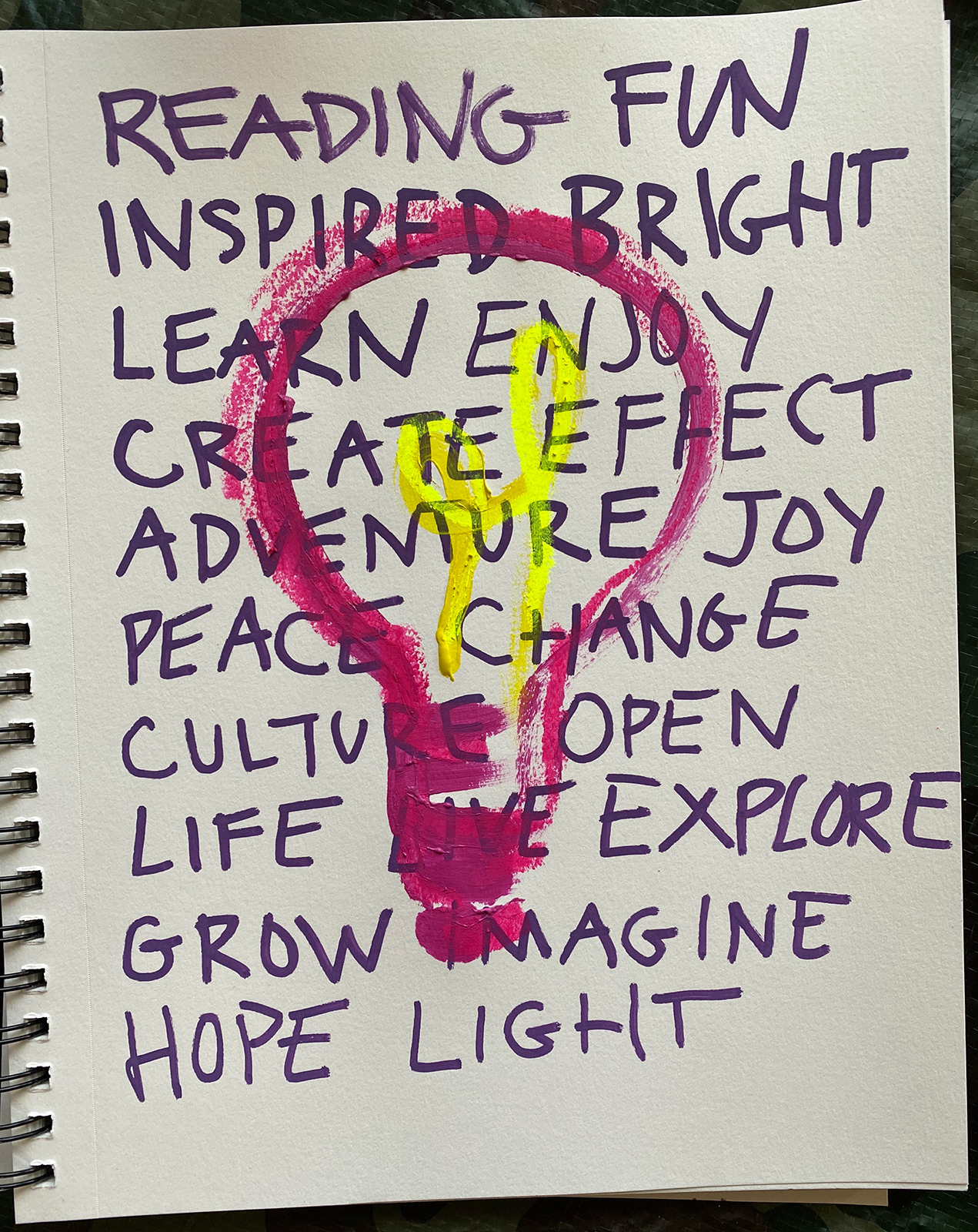
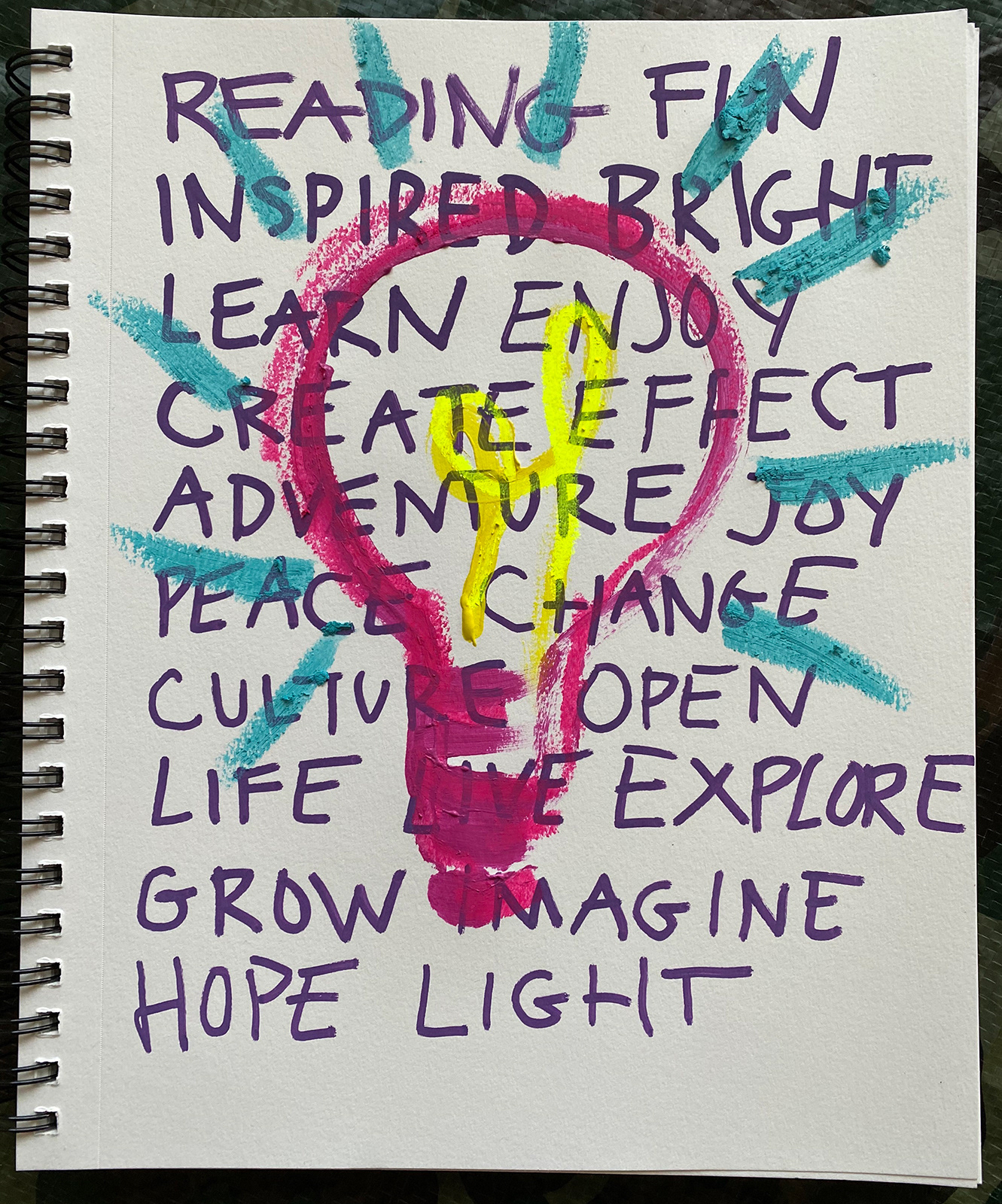
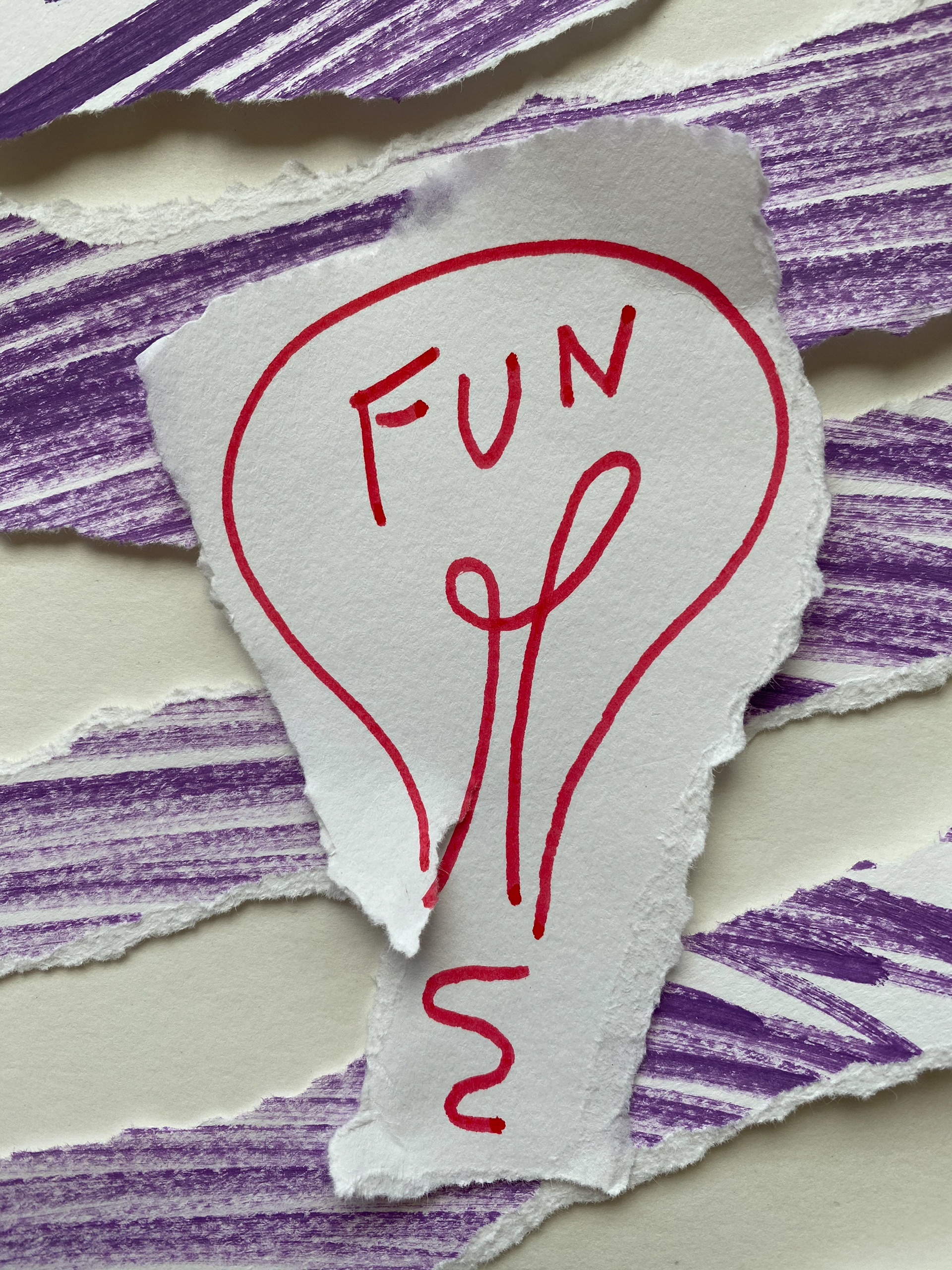
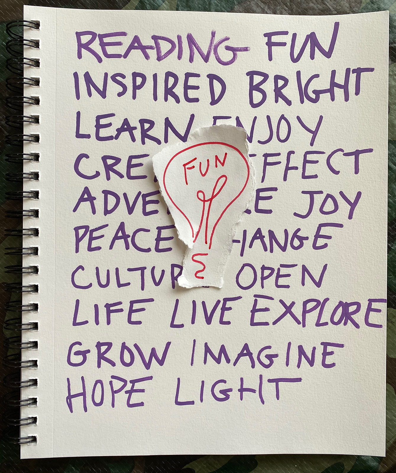
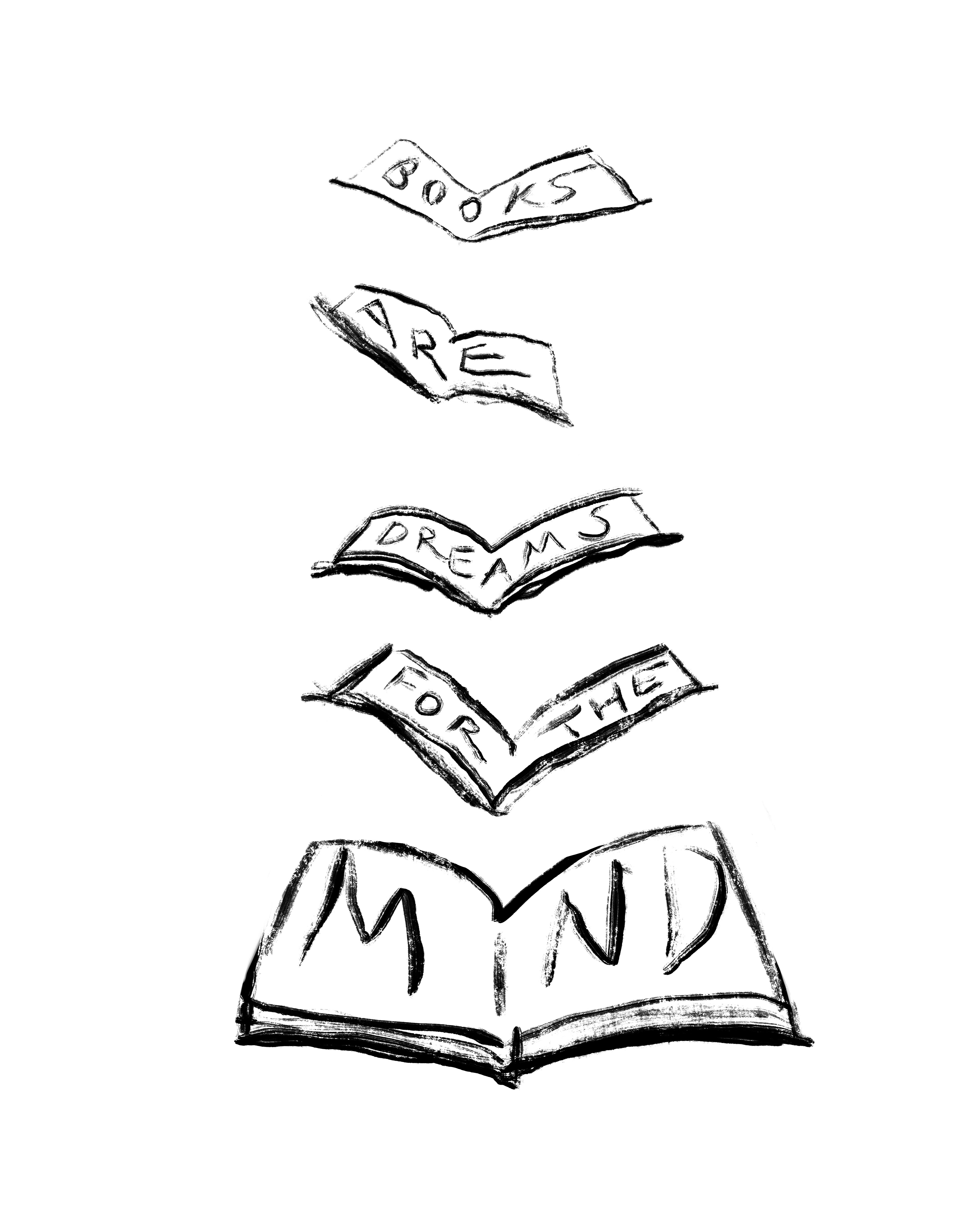
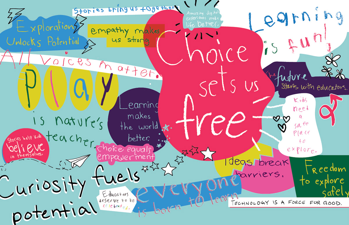
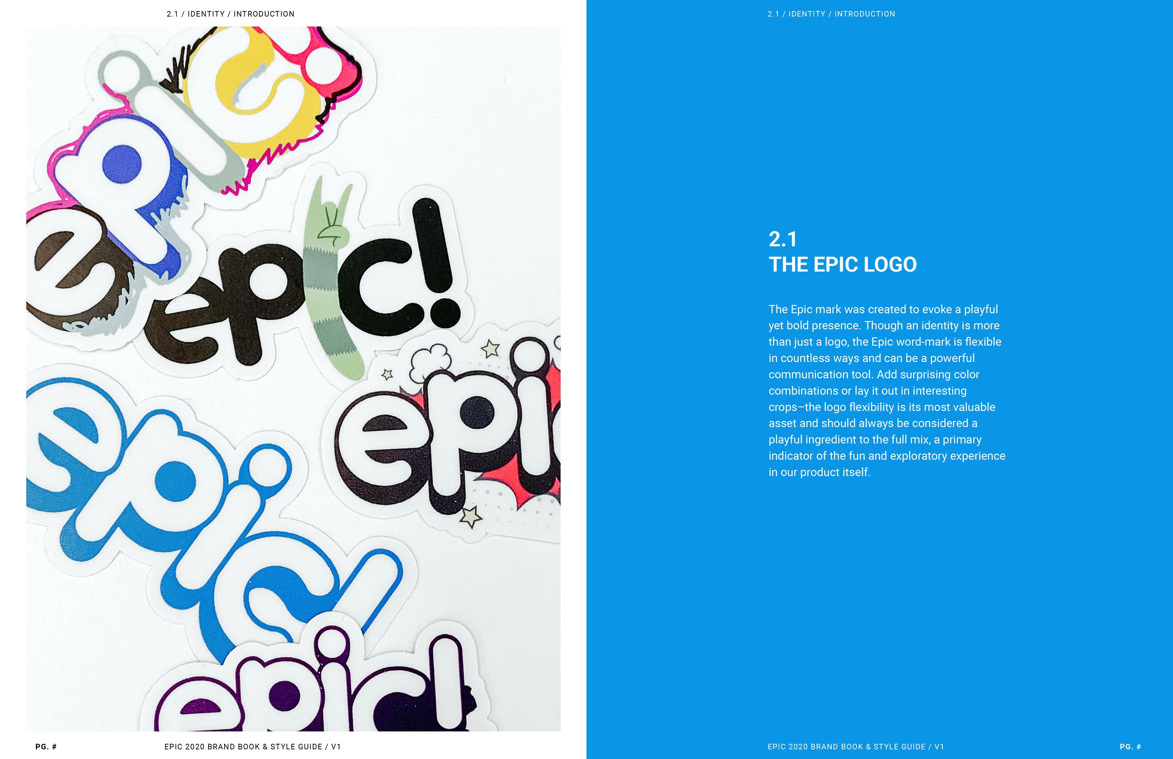
This page encapsulates the balance of rough childlike hand writing with the clean starkness of our new brand font. It represents childlike wonder and creativity and nods to the educational aspect of the brand with the use of fill in the blanks.

Explorations
Here are some of the early stage explorations for establishing the updated brand. I played with different styles, layouts and messaging. I got messy with paints and markers and had a really fun time!
Back to Top